
Remy New York
Empowering Women and Children in Vietnam Through Fair Trade and Opportunity
A UX/ UI Redesign for a Fair Trade B2C Hair Extension Company
the context
Remy New York is a fair trade company focused on supplying ethically-sourced hair extensions and hair care products. Their mission is to use women’s hair to help empower and improve the lives of women and children in Vietnam.
the problem
Remy New York’s previous UI was hindering it from standing out against high-end competitor beauty brands and communicating the quality of its products to its customers. As a result, our team was tasked with developing a minimalist and luxury UI for their website.
the solution
After an evaluation of the wireframes the client provided for the redesign, I pushed to expand the scope of the project to include UX redesign in order to increase sales and opportunities for engagement with the REMY Brand. After client buy-in, our team created a fully functional prototype and a detailed developer handoff for the client to create his new beautiful, modern, and minimalist website.
Tools
Figma, Loom
Deliverables
Style Guide, Prototype, Dev Handoff
Timeline
6 weeks
Role
UX/UI Designer, Team Lead of 5
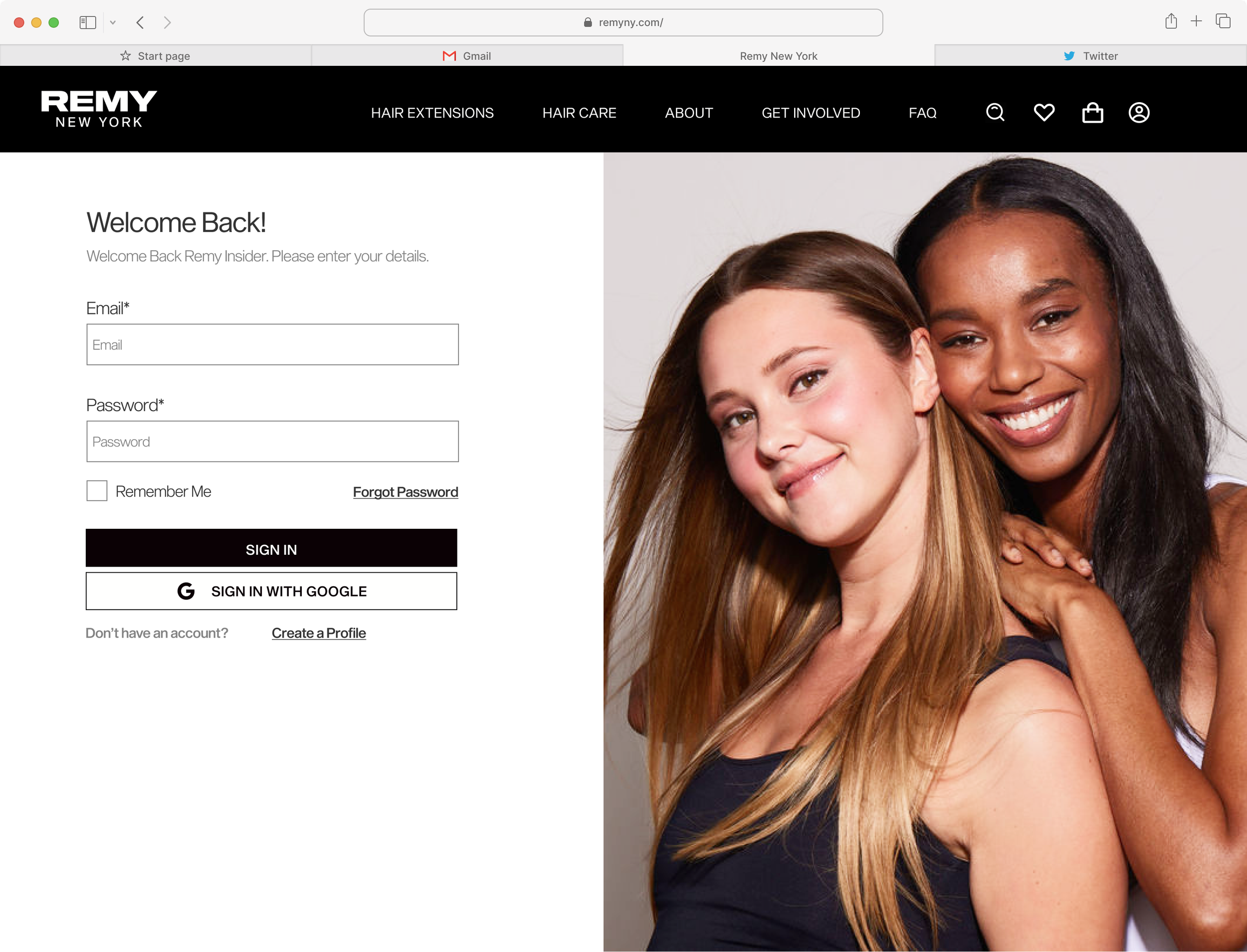
Log In Screen

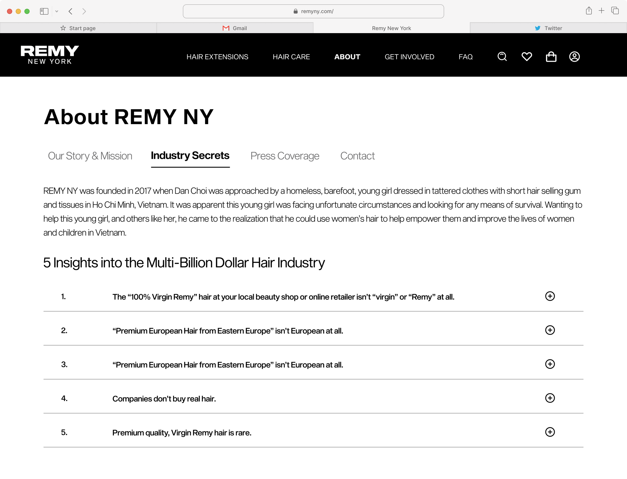

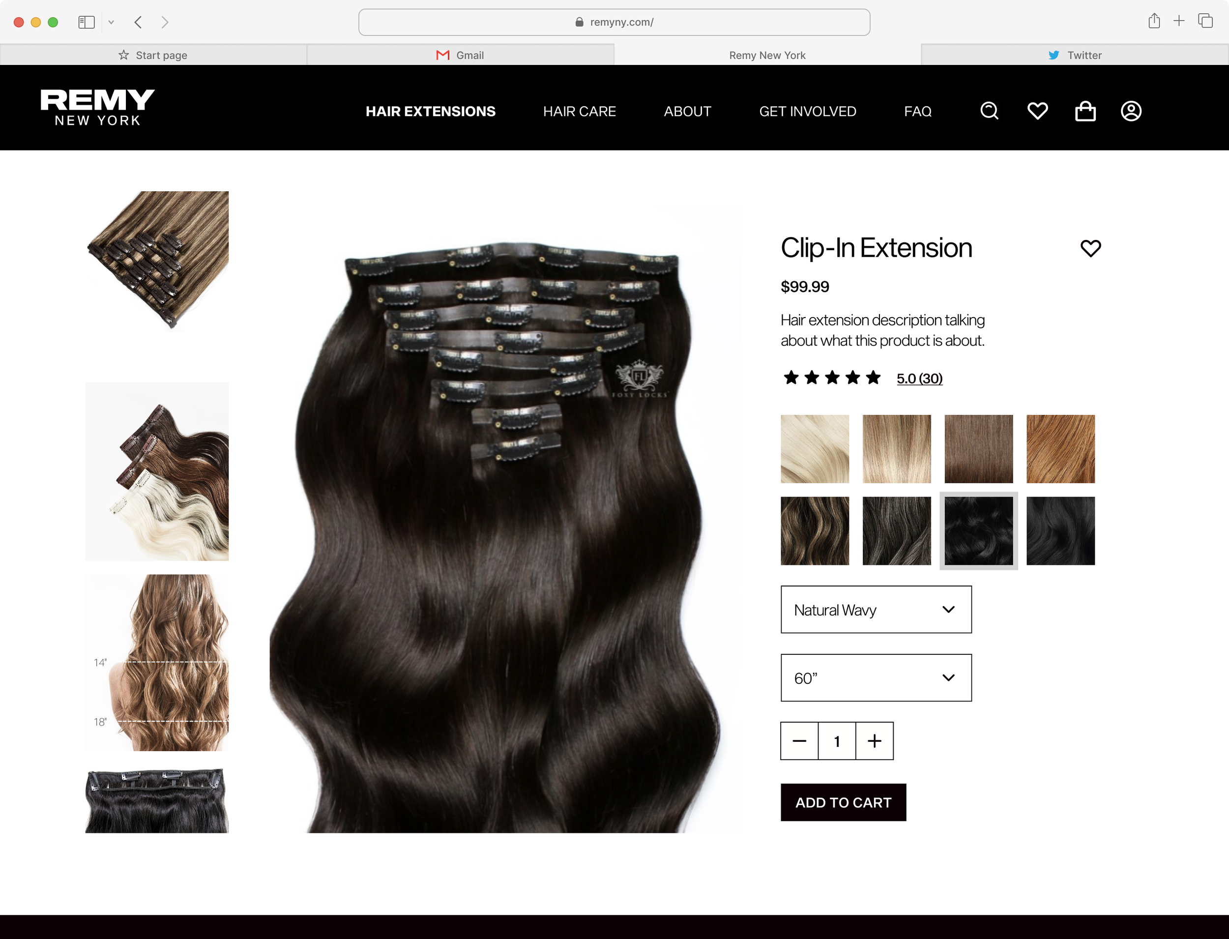
Sample Product Page

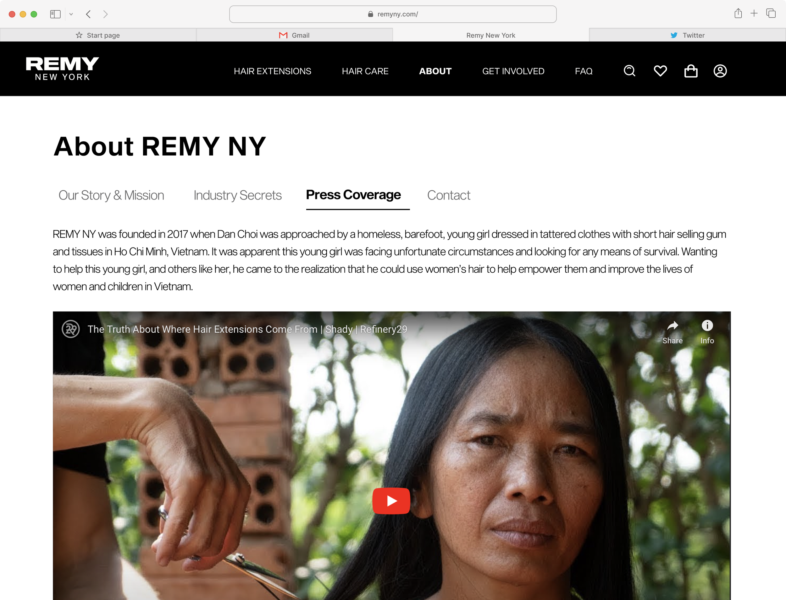
Press Coverage Page

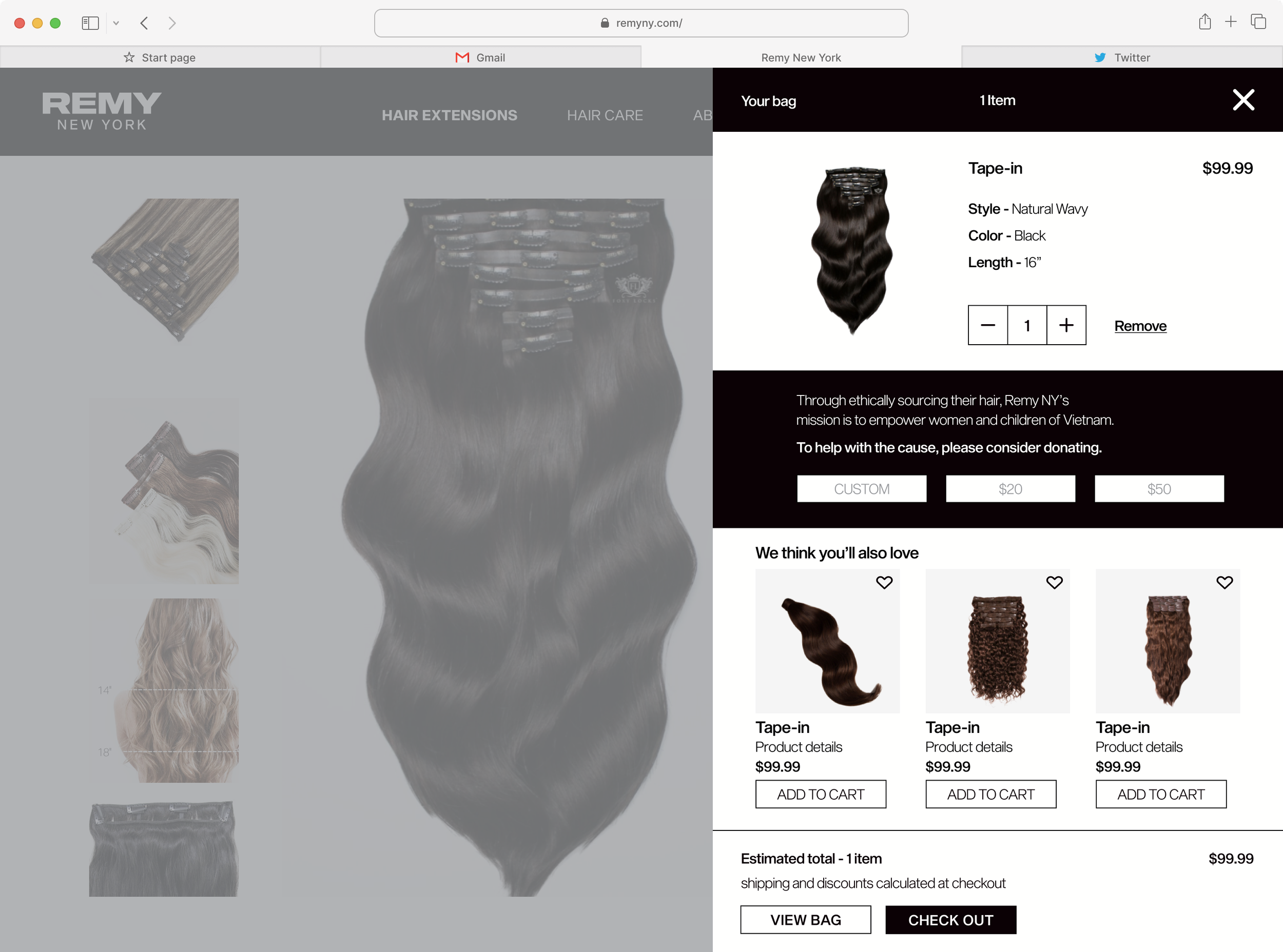

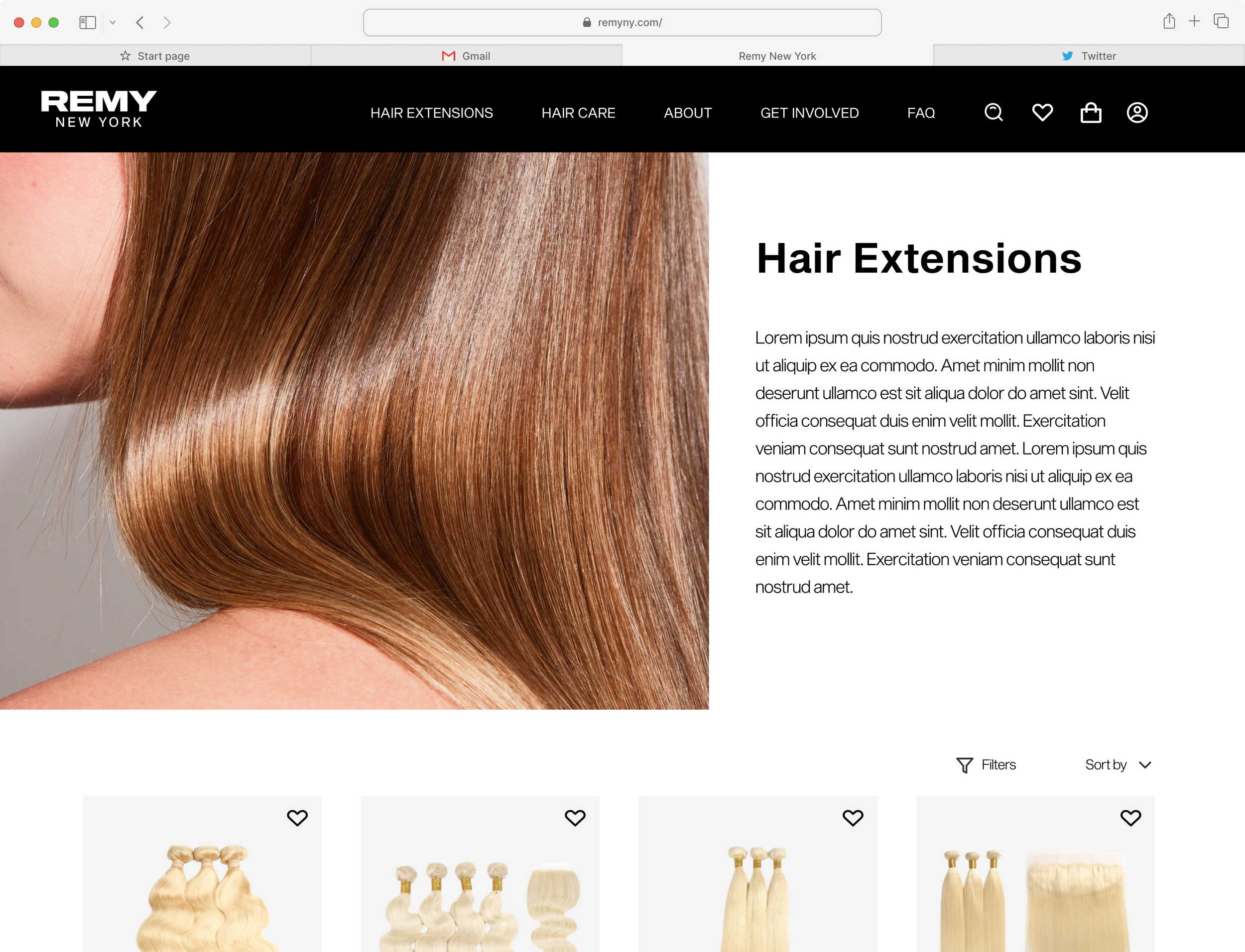
Hair Extentsion

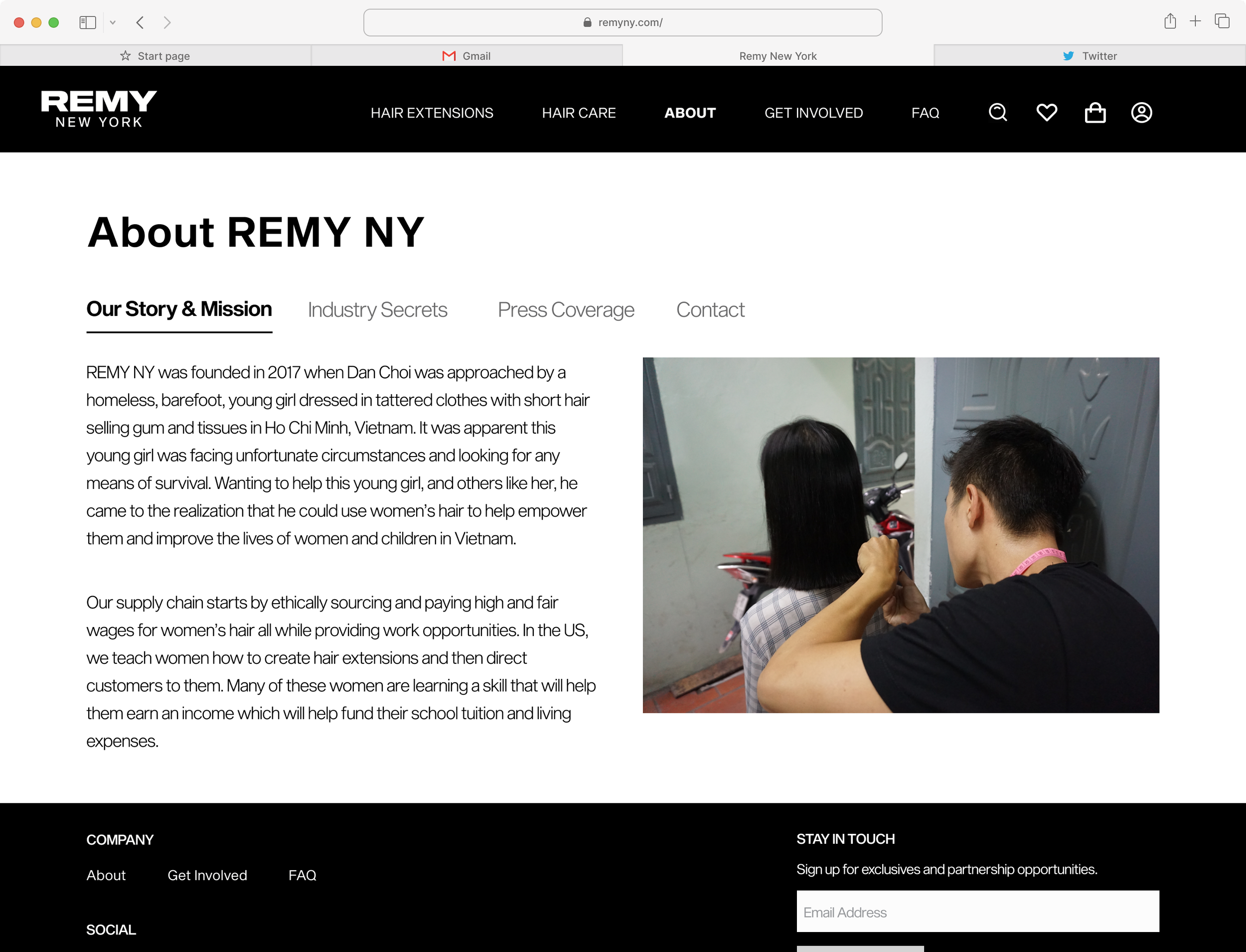
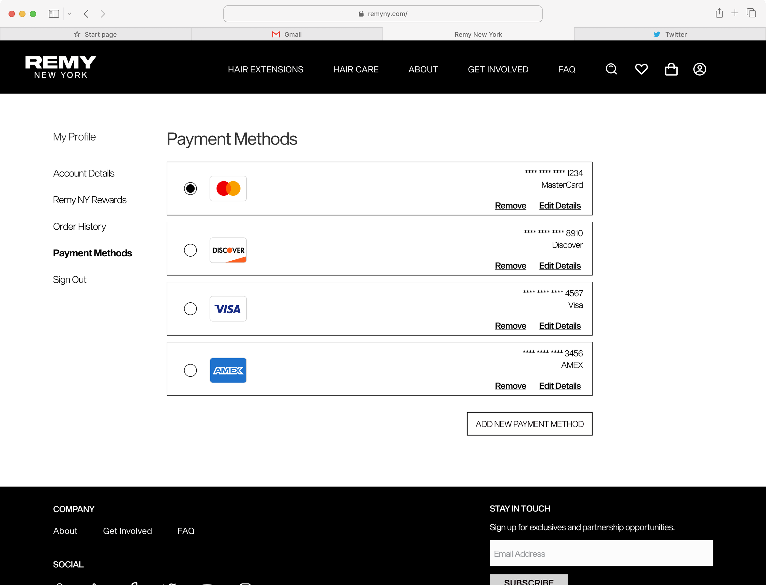
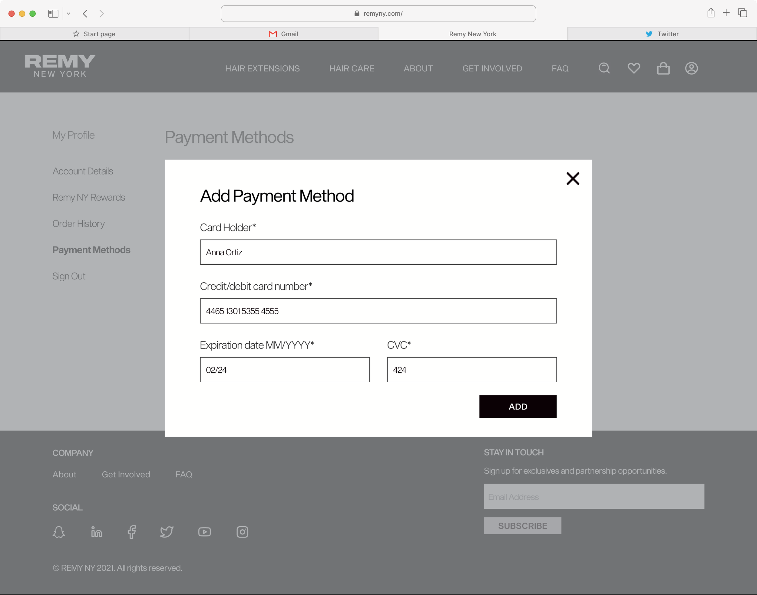
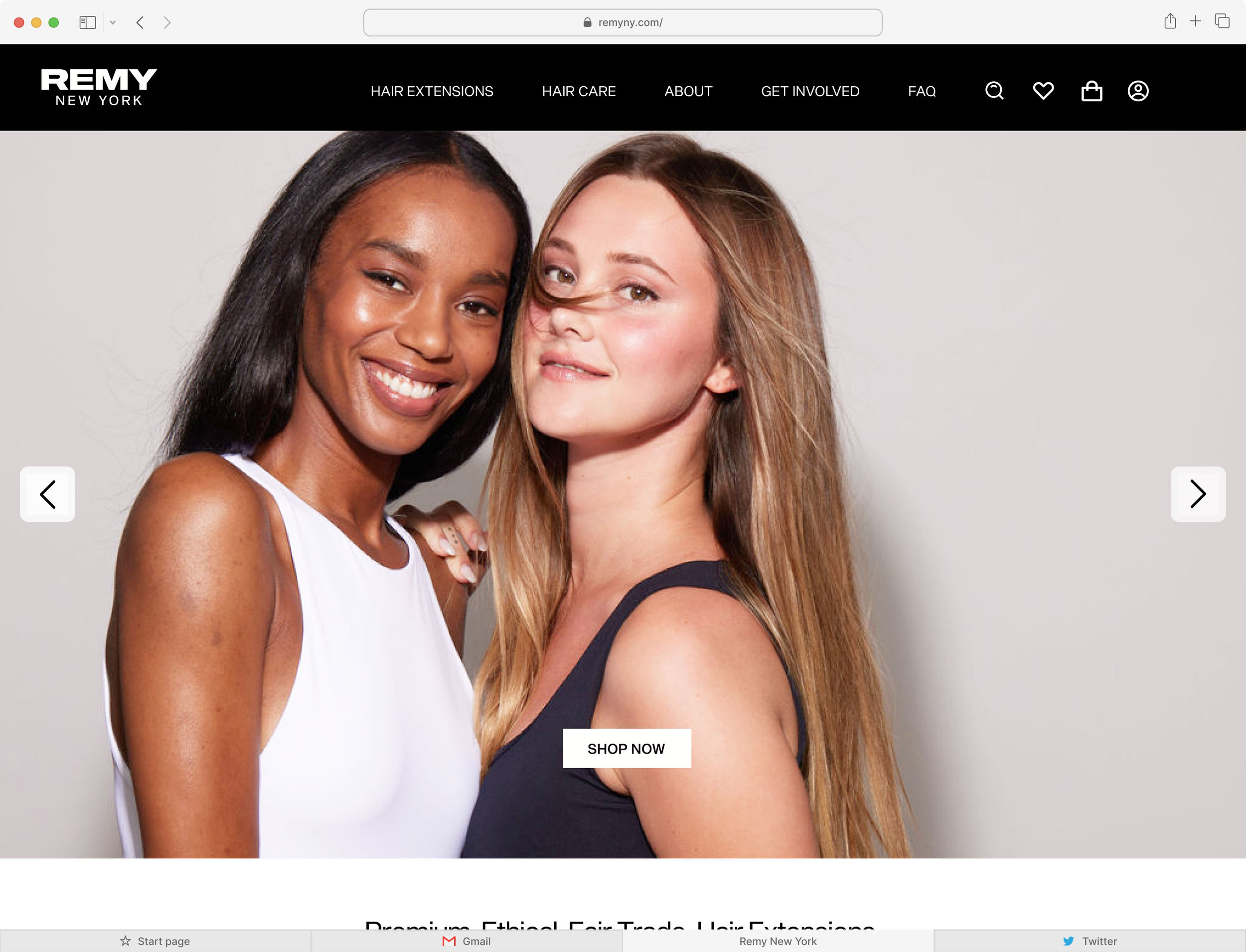

Table of Contents
1 . kick off call with client
I familiarized myself with the client's goals, and vision for the website based on our client questionaire. The client expressed a desire for the site to be aesthetically pleasing, user-friendly, and minimalist. Additionally, the client aspired to convey a sense of luxury and took inspiration from esteemed brands such as Balenciaga and Tom Ford.
🔬 discovery
2. evaluation of existing material
The client already had an existing fully live website. He had also already had med-fidelity wireframes and branding done by an outside organization. I studied each product, as well as the intention behind each of these designs, and began to think of ways to blend the three together. Click to enlarge images.
3. competitive analysis (UI )
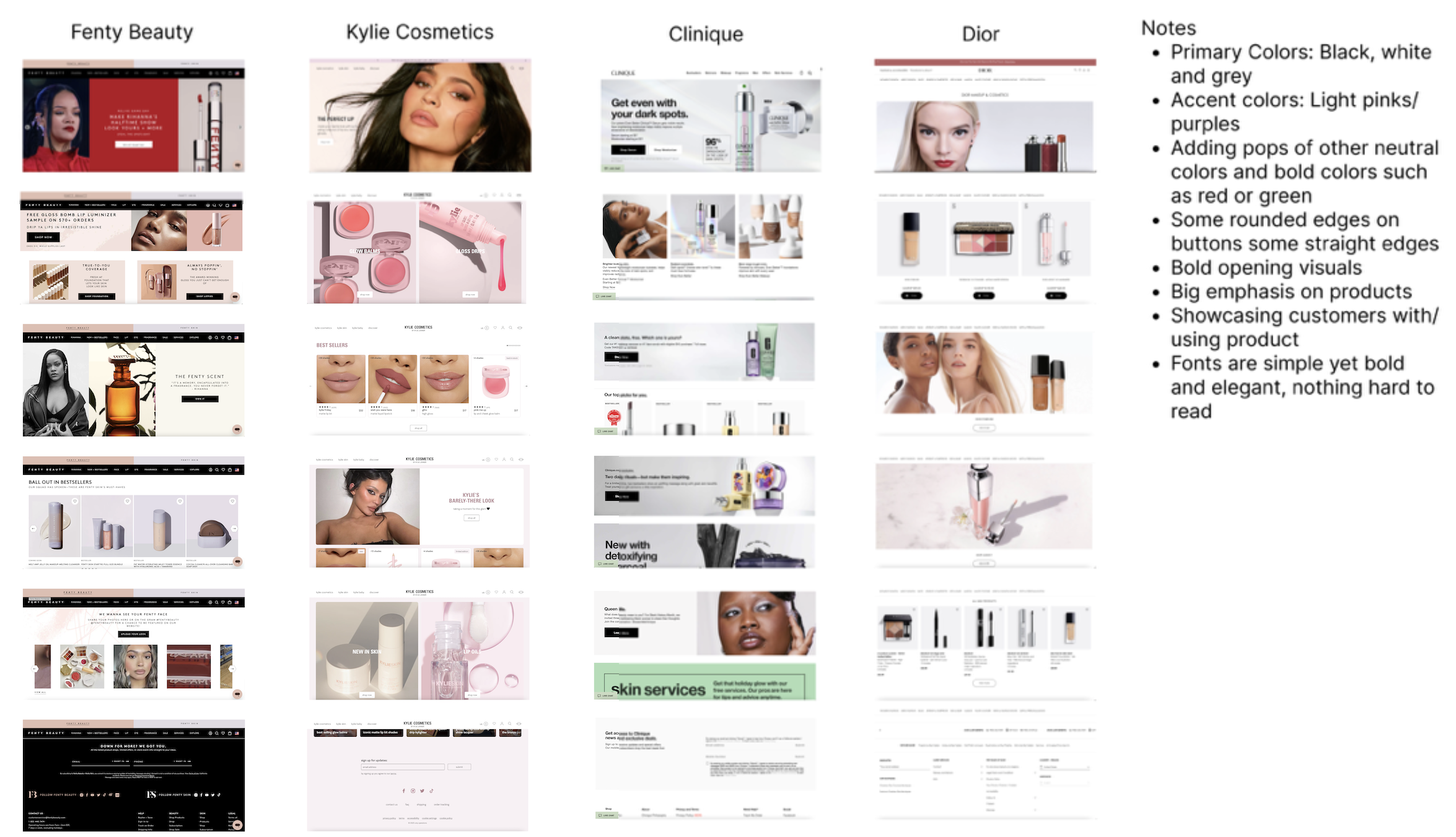
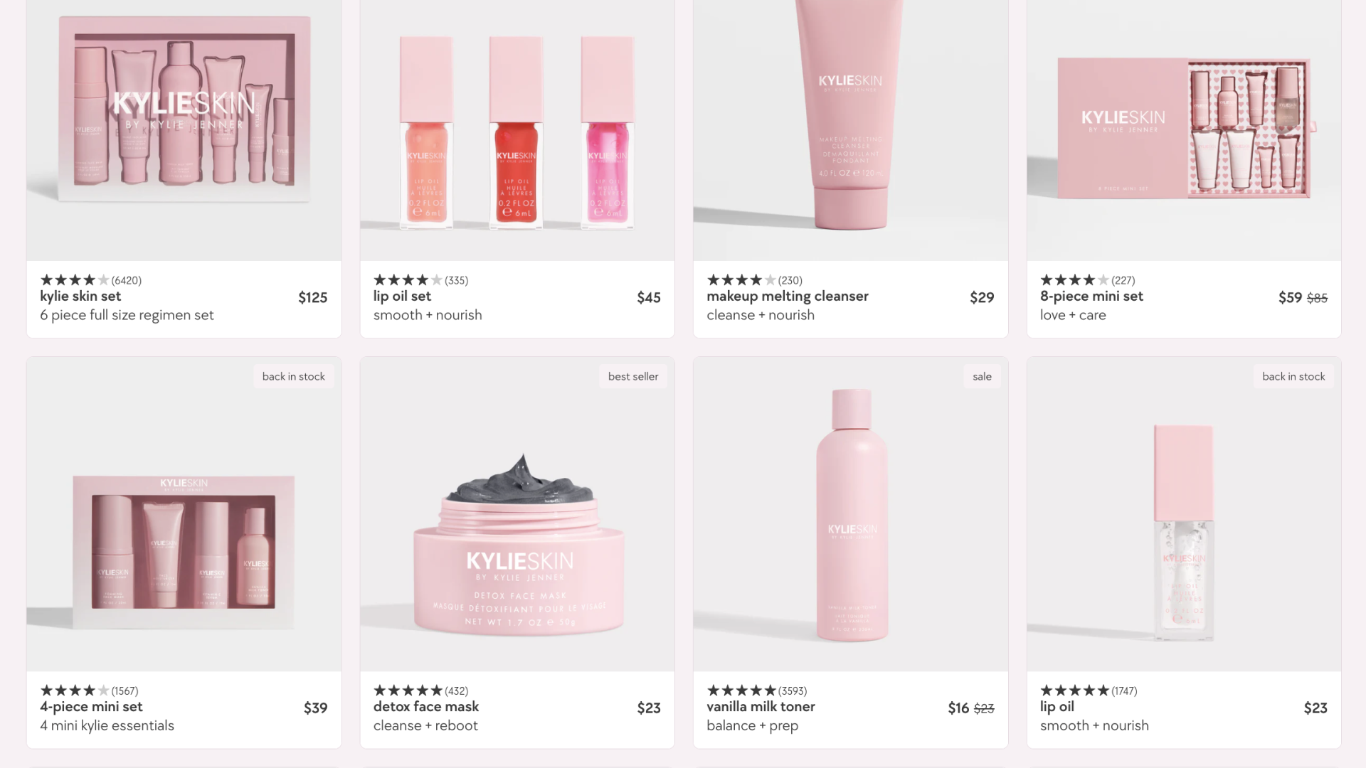
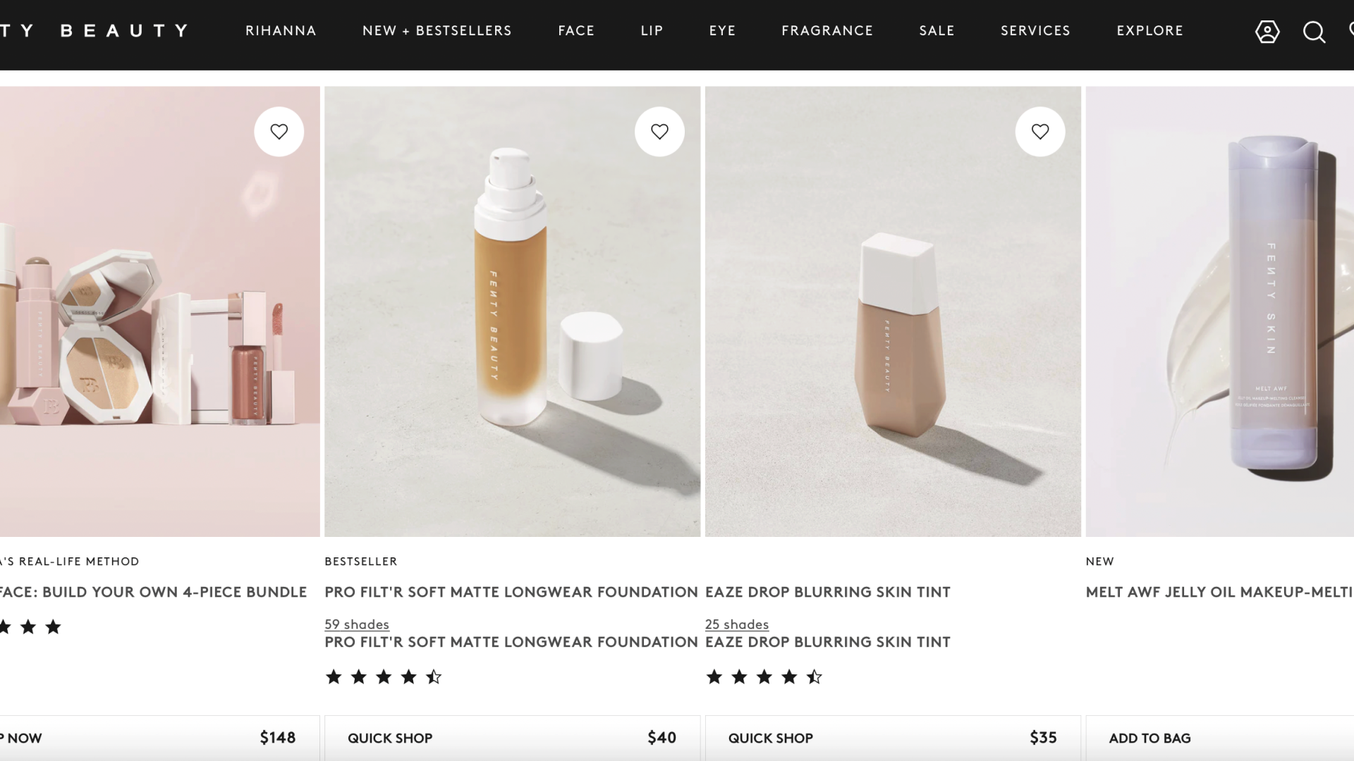
Our team conducted a competitive analysis of various luxury beauty e-commerce websites, direct competitors named by the client, and inspiration the client named. This process allowed us to gauge themes/ features that are competitive in this space and draw inspiration for our eventual design. Scroll through the carousel below to view each UI inspiration documents and their summaries.
key takeaways from discovery
-
They are generally curious or interested in art. They value supplemental information that would help them navigate exhibits on display
-
Item description
Though scope of this project was confined to final UI of the website, I felt that the issues spotted in the wireframes provided would hinder the client in achieving his business goals and ultimately impact the quality of the UI. These two takeaways would be the key issue areas I suggest our team address in the redesign.
💵 push for ux redeisgn - flagging missed opportunities for revenue and engagement
I facilitated a meeting with the client to walk him through the additional UX issues I had observed and to expand the scope of the project to include a UX redesign. Once the client was onboard, I conducted an informal competitive analysis of other mission driven organizations in order to understand how similar organizations were compelling users to engage with and support their brands. Once I had a more refined grasp of best practices, I redesigned the screens I felt could use the most improvement. Here are the changes I made:
-
The inherited wireframe for the home page didn’t include much content for the user to engage with.
I added multiple sections for the user to easily view products, learn about the company, watch videos about REMY’s mission, and engagement with REMY either through social media or its newsletter. This approach ultimately will translate to more opportunities for sales, engagement with REMY’s products and brand. This approach is also inline with market standards for e-commerce brands and mission driven organizations.
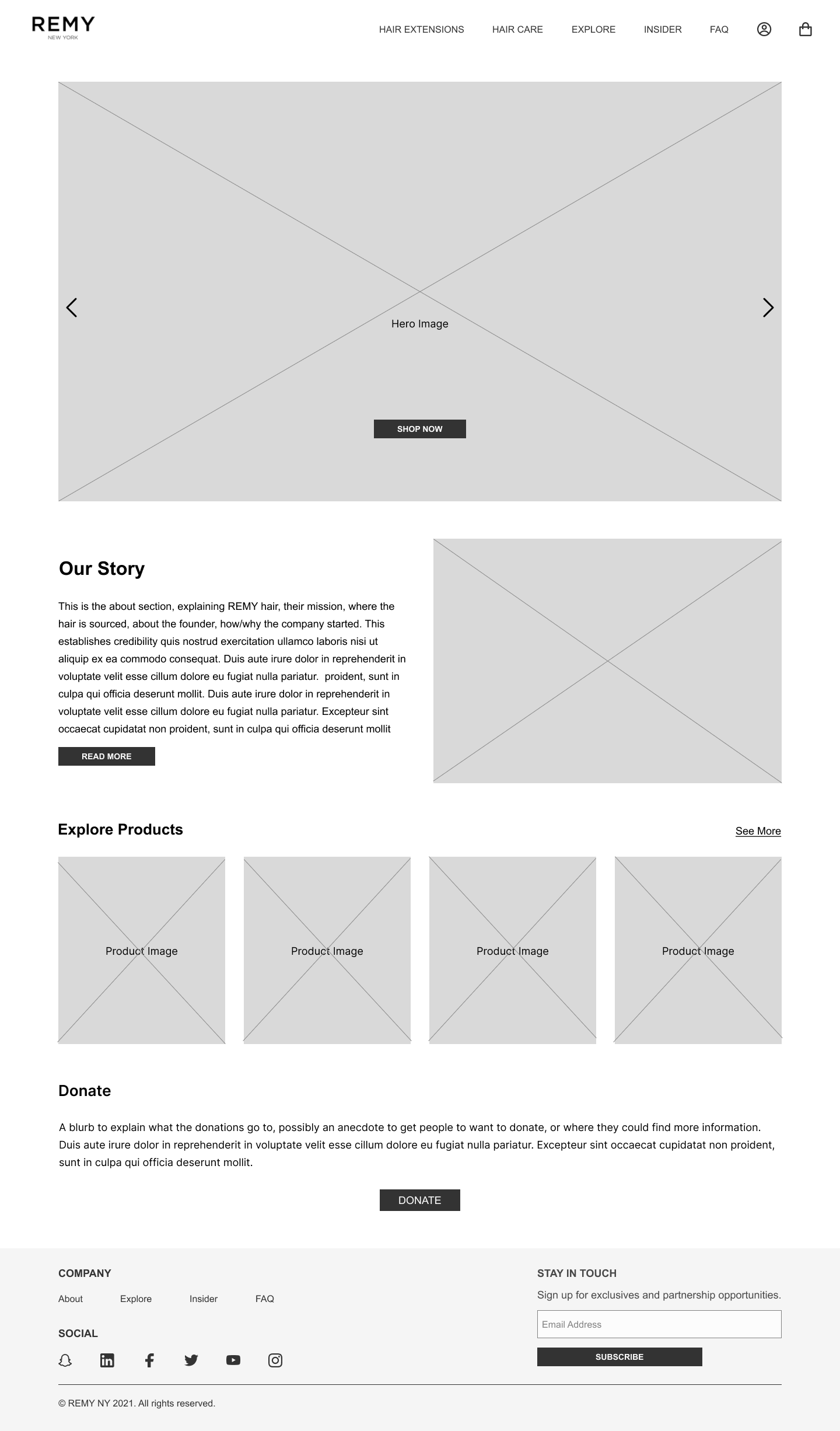
Before
After
-
There were 2 key Issues around Organization and information Architechture
Issue #1: The inhereited navigation bar had two tabs that felt
Solution:
Issue #1: The inherited wireframes scrapped information about Remy’s mission and origin story . In my opinion, this is crucial to connecting with potential customers.
Solution: I chose to change the navigation bar and add a tab “About:’ user to explore and keeps all that info in one place.
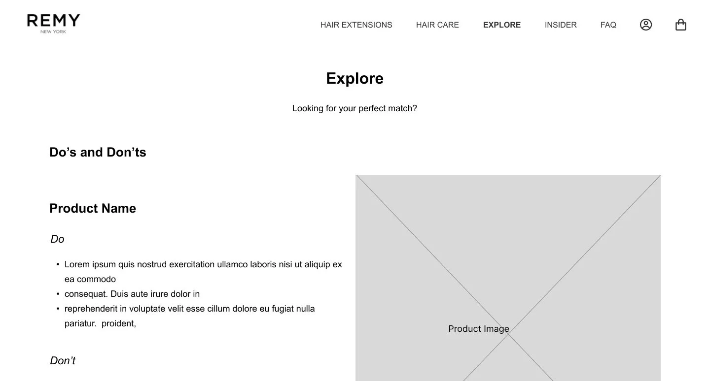
Before
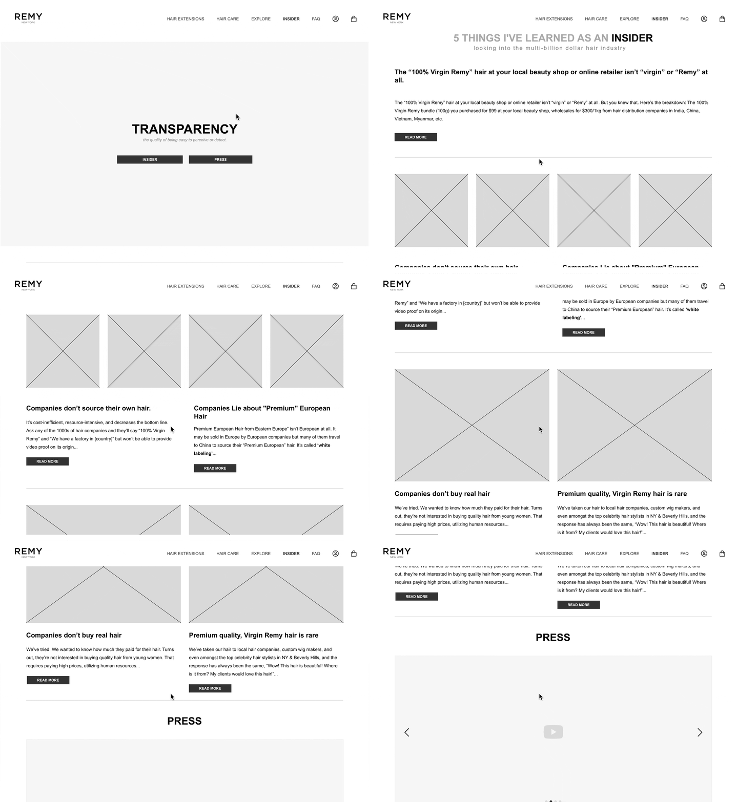
After
-
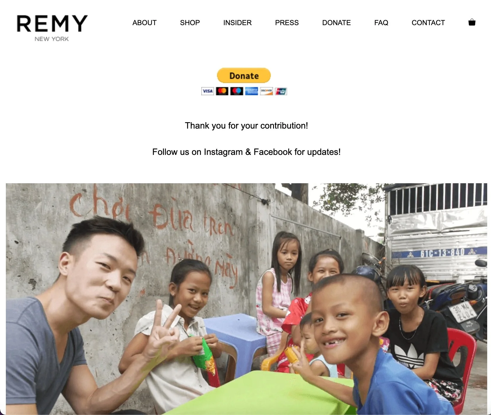
The client expressed he was in need of a donate page. However the inherited wireframes eliminated the donate page in the original website from the nav bar and instead opted to have it be a section at the bottom of the home screen. I believe the “hidden” nature of the donate page will translate to missed opportunities for additional funding for Remy NY.
As a result, I re-introduced a donate page back in to the navigation bar for accessibility and prominence on the website. I also changed the language from “Donate” to “Get involved” as this language tends to be more frequently used in the non-profit space.
Before
After
With approval from the client, our team revisited the UI.
🦋 the evolution of UI choices
1 . UI iterations + client presentation
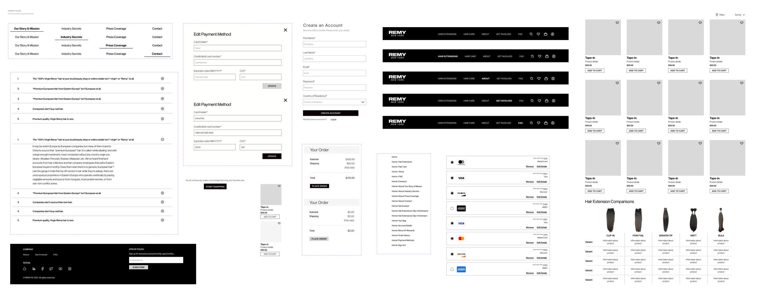
Based on our UI competitive research, facilitated a** Here are my initial designs based on the original wireframes provided by the client. I chose to stray from the bold color choices in client branding due to contrast issues and stick to selections that mimicked the market and client needs.
2. solidify style guide + design system
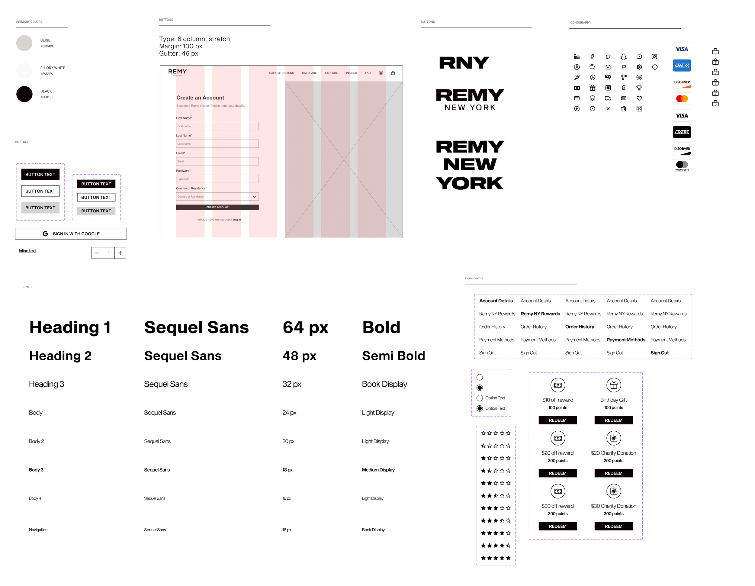
After multiple iterations we settled on a beautiful minimalist iconography, and typography. It was important that the font we selected for the site match the logo from the client branding. From there, we created a design system and implemented text, color and grid styles in Figma for consistency.
3. uncertainty around content = move away from accent color
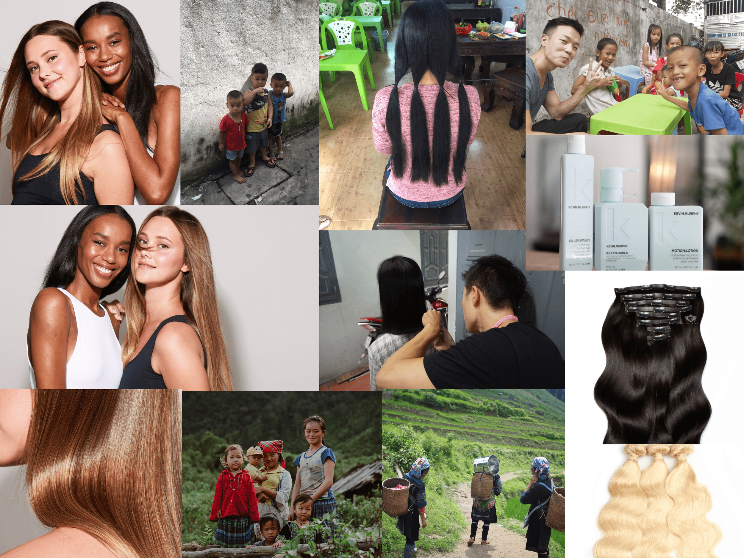
The client informed us he was in the midst of changing his content and was uncertain about the direction it might go in. As a result we leaned away from a pink accent color so the client would have more flexibility when adding content to his site in the future. I pushed to incorporate content that displayed the source of the hair and the real people that would be served by a customers purchase as a means to connect with the customer and communicate the
🖥️ high fidelity screens + prototype
[INSERT PROTOTYPE WHEN DONE]
👩💻 developer handoff
[INSERT WHEN DONE]
💭 conclusion + lessons learned
[WILL ADD WHEN FINISHED] Reflecting on this process, here is what I learned:
-
This was my first experience leading a design team! I learned to delegate, boost morale and manage client expectations.
-
Some aspects of the design could have been fleshed out with client guidance, but due to time constraints we were only able to make informed guesses.
-
Client will move to develop the website. I would encourage the client to add more content, connect their social media accounts and
Thanks so much for reading! For any questions, please send me an email at etadessedesign@gmail.com.