
Stoxup
“Like Yelp, but for stocks…”
A UX/UI Redesign
context
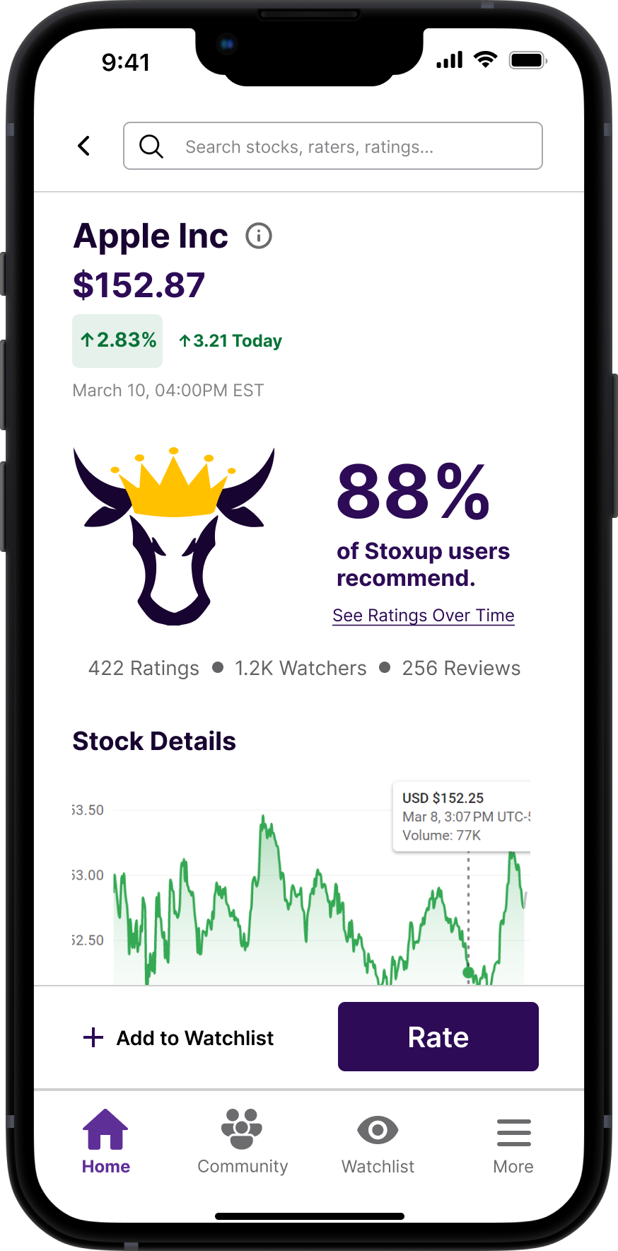
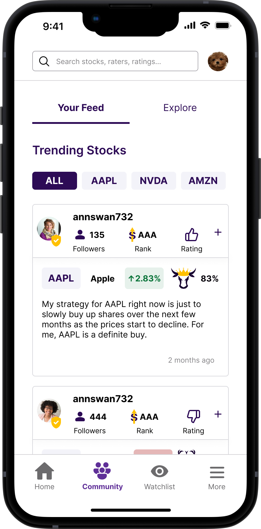
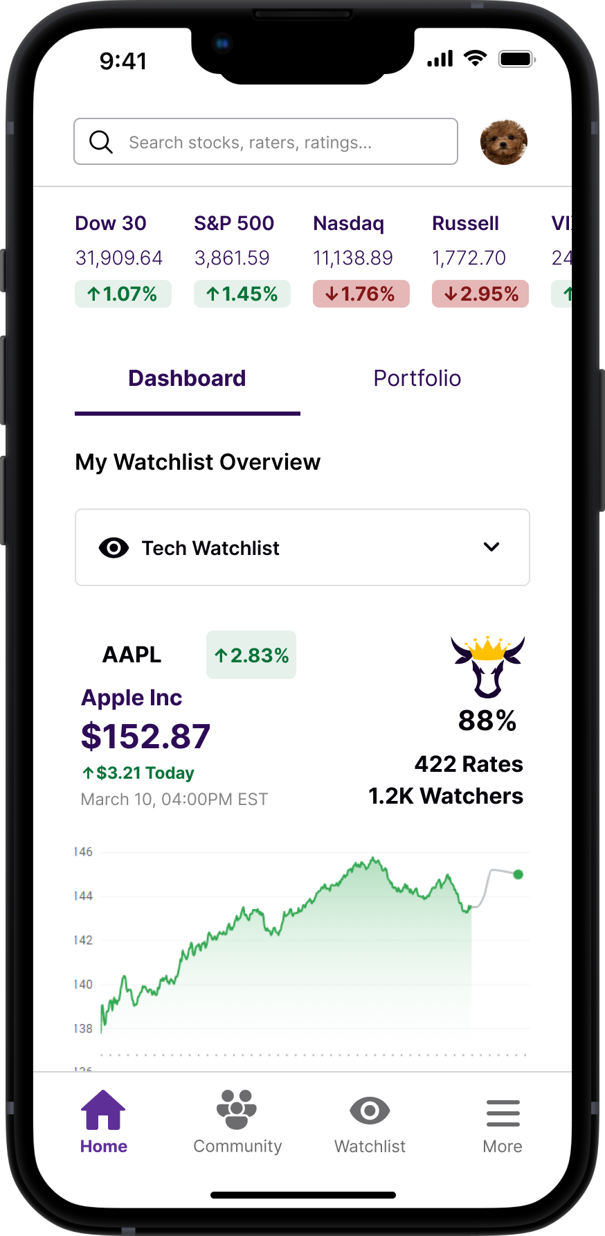
Stoxup is a fintech company that provides a forum for you to rate and review stocks. Stoxup creates a community of stock raters that shed light on public perception of stocks, letting you invest smarter.
the problem
Stoxup was having difficulty retaining and engaging users on their website. While users were exploring their page, they were not leaving reviews or making accounts. As a result, Stoxup sought user feedback and redesign on their existing design of their website.
the solution
Our team decided to redirect from a redesign of the mobile desktop to a redesign of their mobile app in order to address and implement solutions to the user testing results more efficiently.
Role
UX/UI Designer, Team of 5
Tools
Figma, Miro, Maze
Deliverables
Prototype and Dev. Handoff
Timeline
6 weeks







🔬 discovery
1 . understanding clients goals and pain points
I took the time to familiarize myself with the client’s goals, existing frustrations, and desired solutions.
The client identified 3 goals for this redesign:
Drive users to create account / log in - increase personal engagement with app
Provide users with a quick and easy way to provide public opinion of stocks that is not too financials or data heavy
Have users rate stocks and encourage (but not force) users to write reviews
Client also requested features and flows for us to build out:
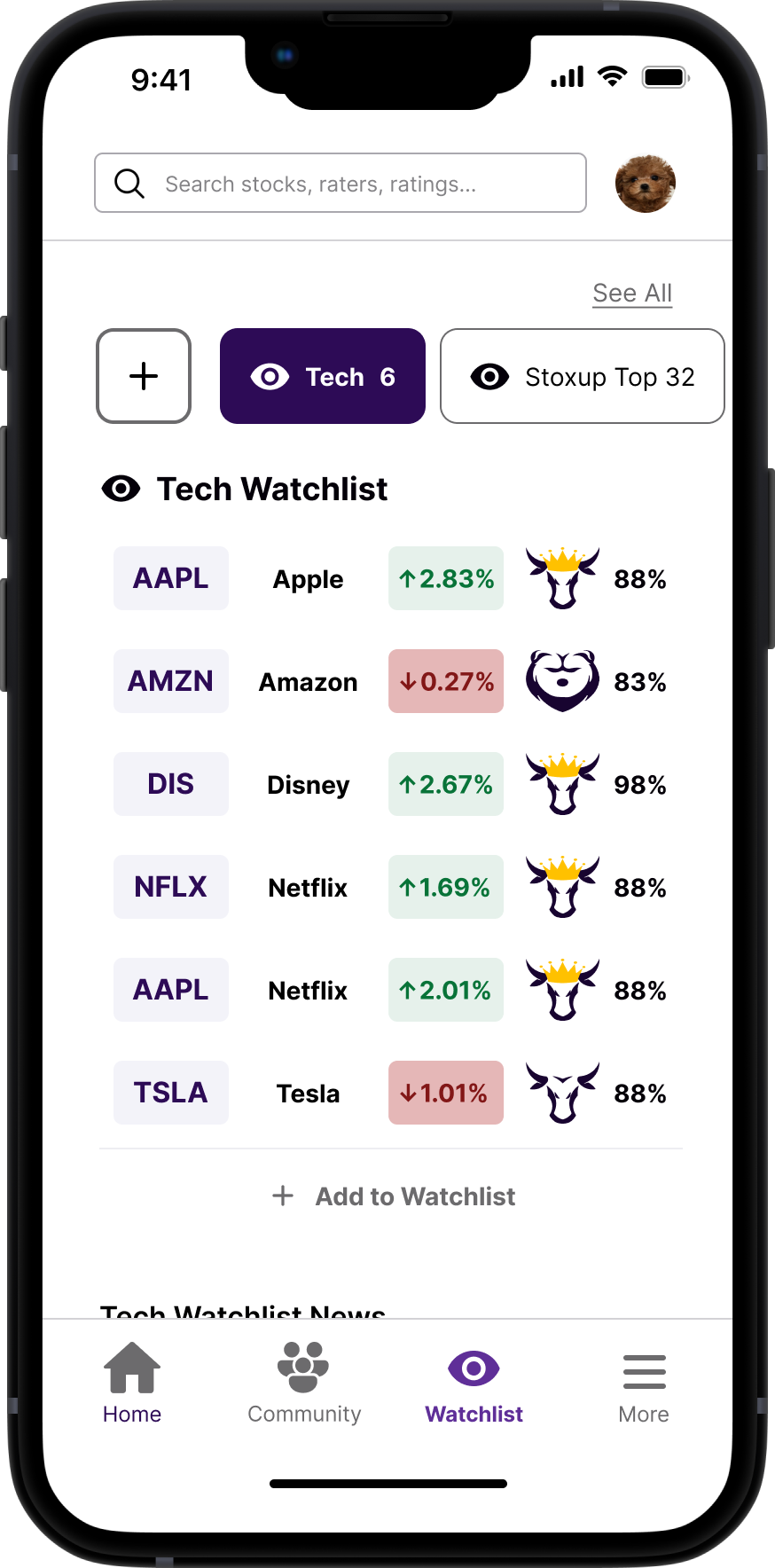
Watchlists - Where users can track their favorite stocks and see news updates about them
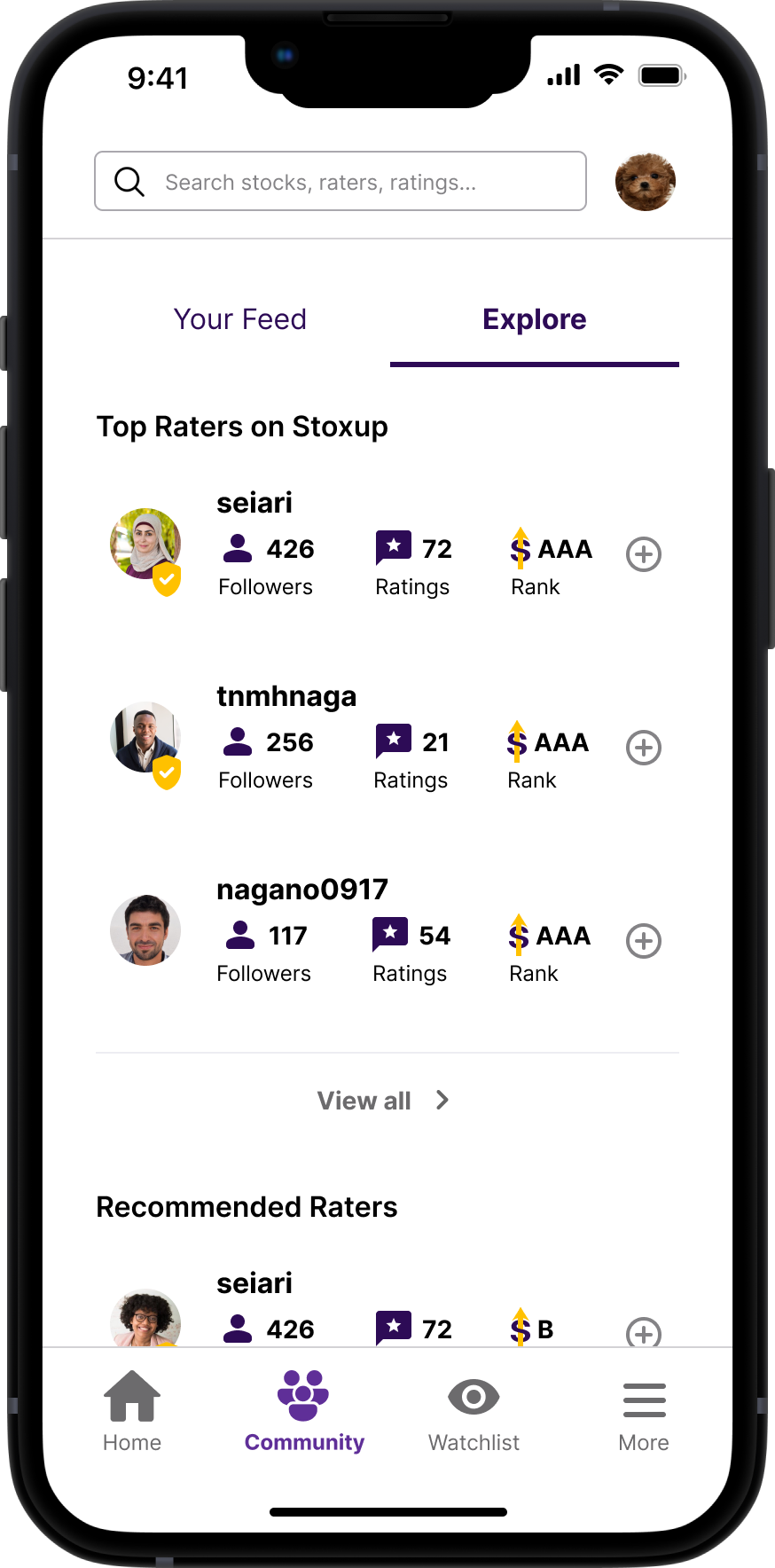
Community - Where users can easily see who the “Top Raters” on Stoxup are, and the Top Rated Stocks on Stoxup
A Built Out Stock Rating System - A user flow for rating a stock.
2. heuristic evaluation + usability testing
Planning: We created this research plan to outline our research questions, hypothesis of outcomes, methodology, participant characteristics and schedule. My hypothesis for usability testing was informed by my informal heuristic evaluation of the prototype.
Unmoderated Usability Testing: In order to collect the relevant sample for this usability test, our team distributed a screener survey distributed through in-person channels and via social media platforms that assessed a potential testers age, interest in stocks and investing, and interest in the stock market. Once the testing population was confirmed, we performed unmoderated user testing using Maze on seven participants who were aged 18+ and follow or are interested in stocks, cryptocurrency, or financial planning. We documented our results in more detail in this test report.
key insights from discovery
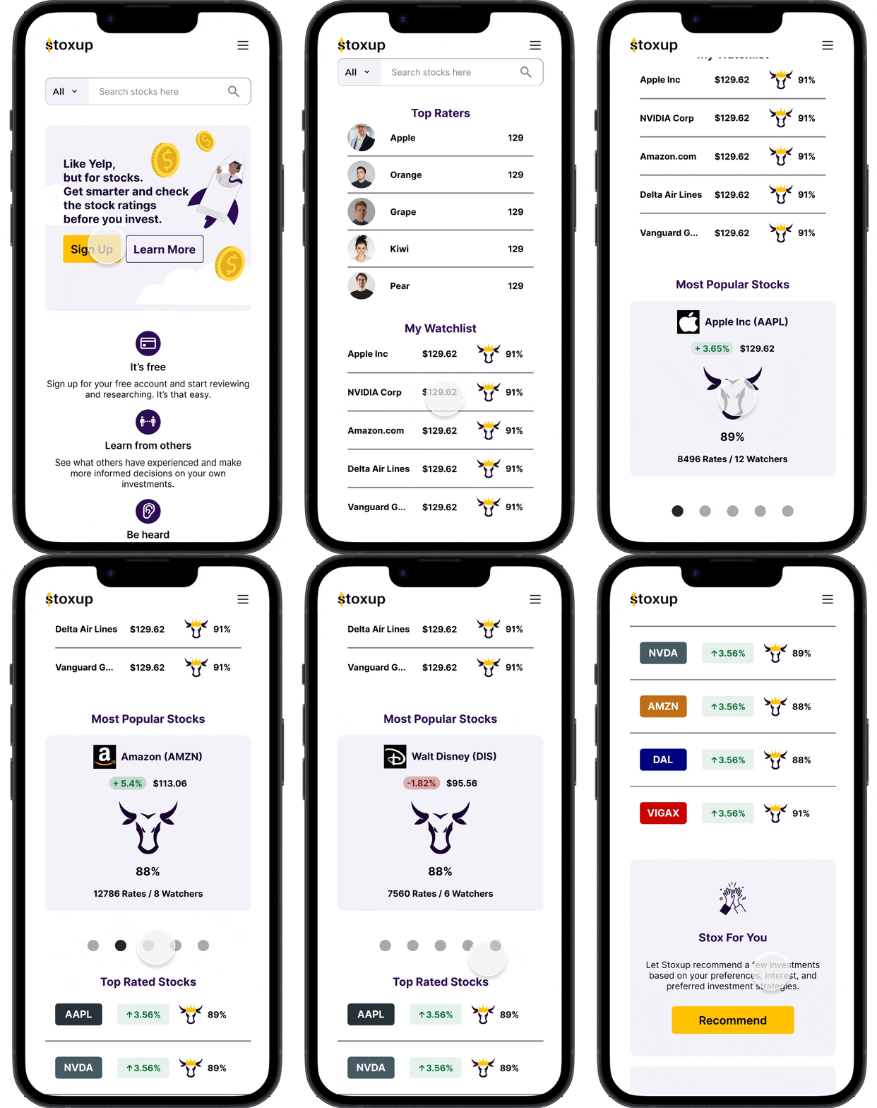
We identified a few key usability issues from the testing.
-
Description text goes here
-
Item description
-
Item description
-
Item description
-
Prototype did not include an option to Log in from the Home Page
Clarify difference between Top and Popular stocks with client
Clarify what score next to raters means with client
UI - needs consistent spacing
Noted other not captured in usability testing but are still central to the success of the app.
💻📲 ideation & push to switch to mobile app
1 . competitive analysis
I conducted a competitive analysis of both financial apps and review/ rating companies to get a better sense of typical flows, features, that would make Stoxup competitive in this space.
2. switch to mobile app format
After an analysis of the usability issues and competitive analysis of similar rating and financial products, our team decided it was best to switch the scope of our redesign from the mobile version of the website to a redesign of the mobile app.
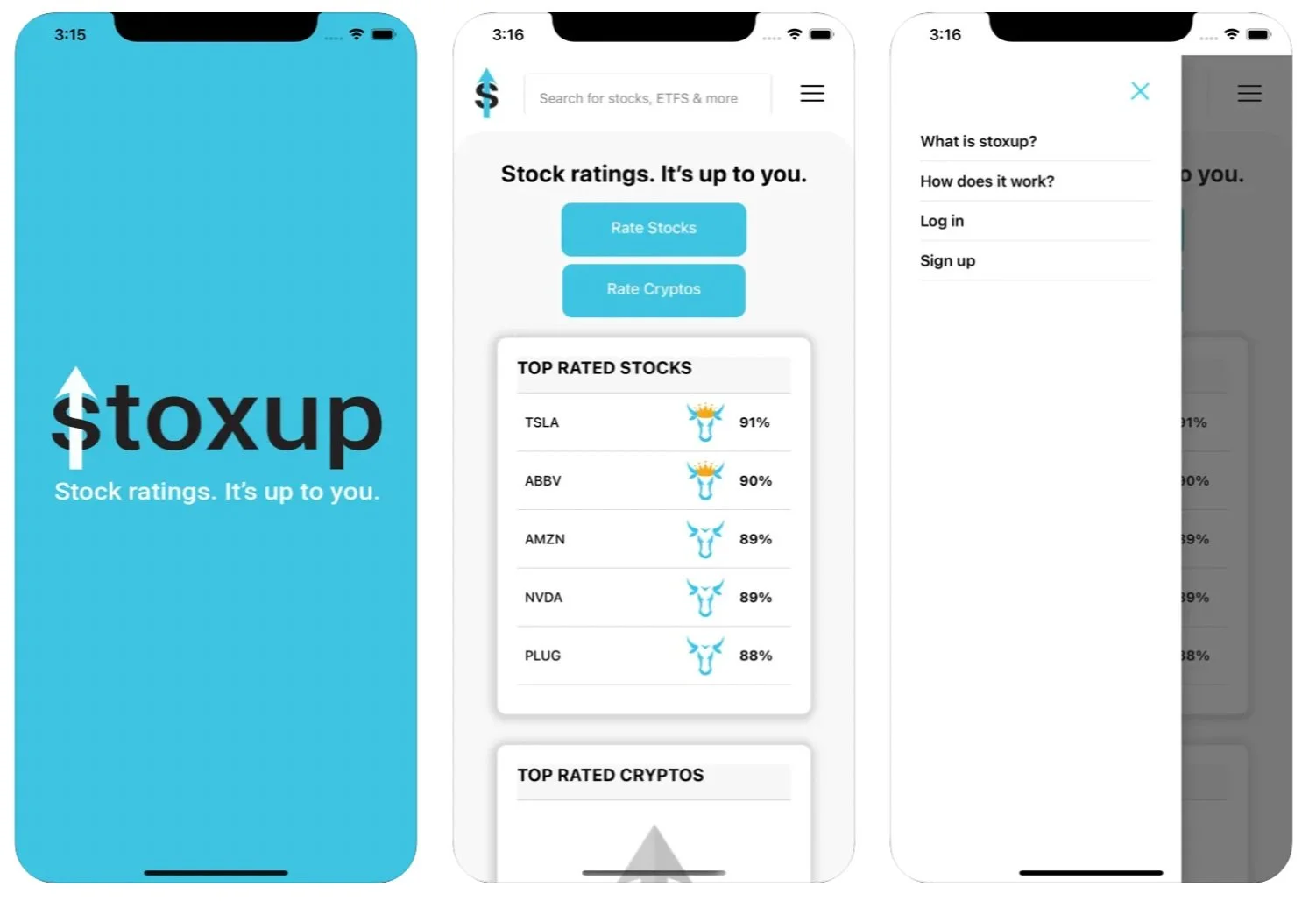
A mobile app format would better address the usability issues we uncovered and is more standard practice in this space. Stoxup had already released a rudimentary app, so our team took the time to study its format and organization.
3. userflows & sitemap
settled on organization of information based on client goals and market standards.
✅ client buy in and scope expansion
-
Description text goes here
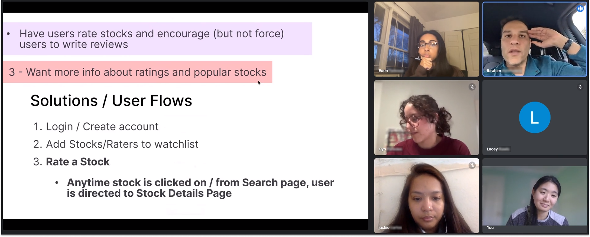
I facilitated a meeting with the client to propose our new changes and direction. I also took the opportunity to ask more about rating system, top raters, etc. While in the meeting, he introduced a new feature for us to incorporate; a basic portfolio feature. We compiled the notes from this meeting and dove into high fidelity screens.
✅ design system
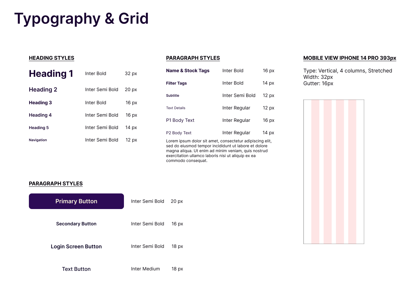
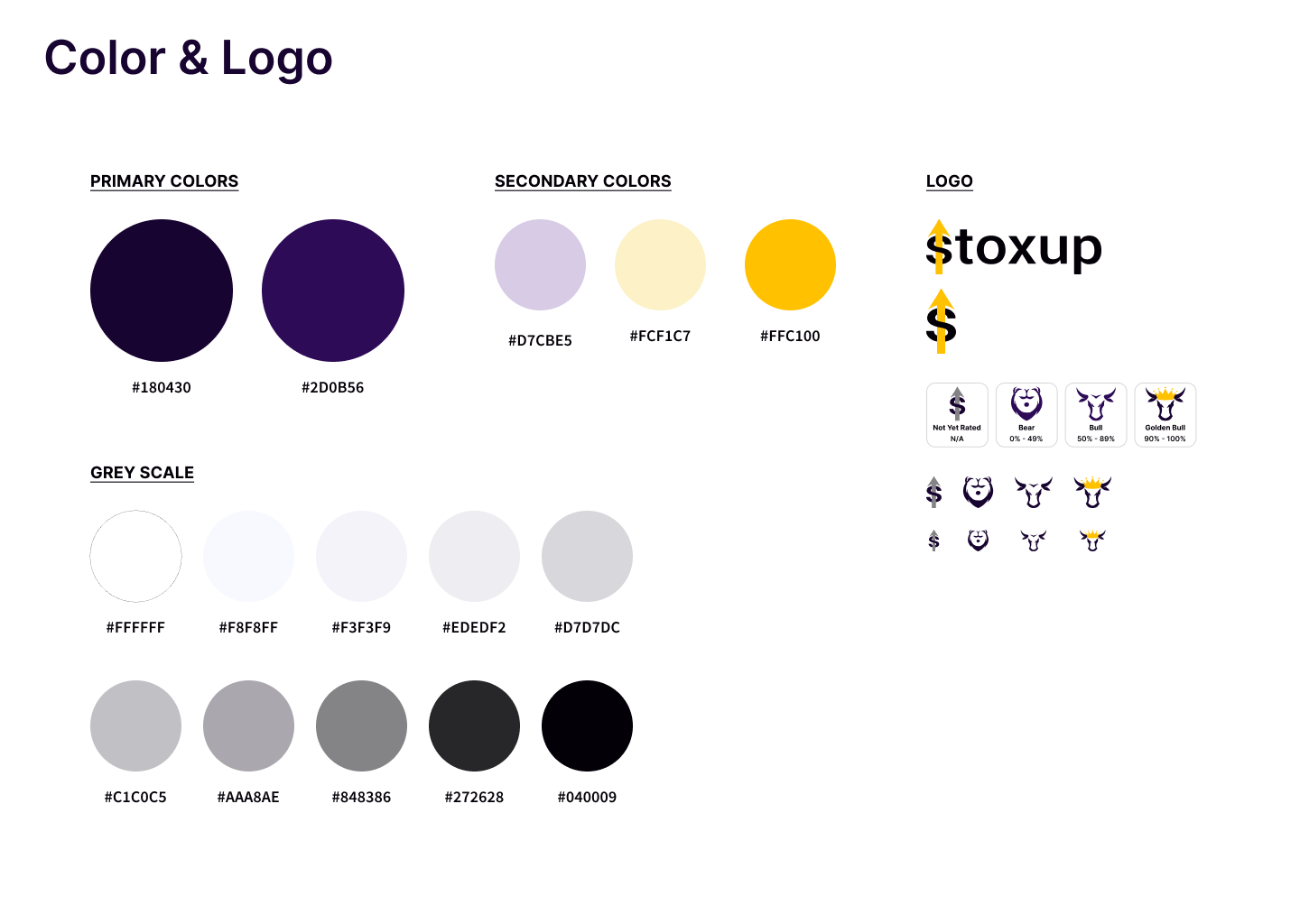
As a team we organized the inherited style guide.
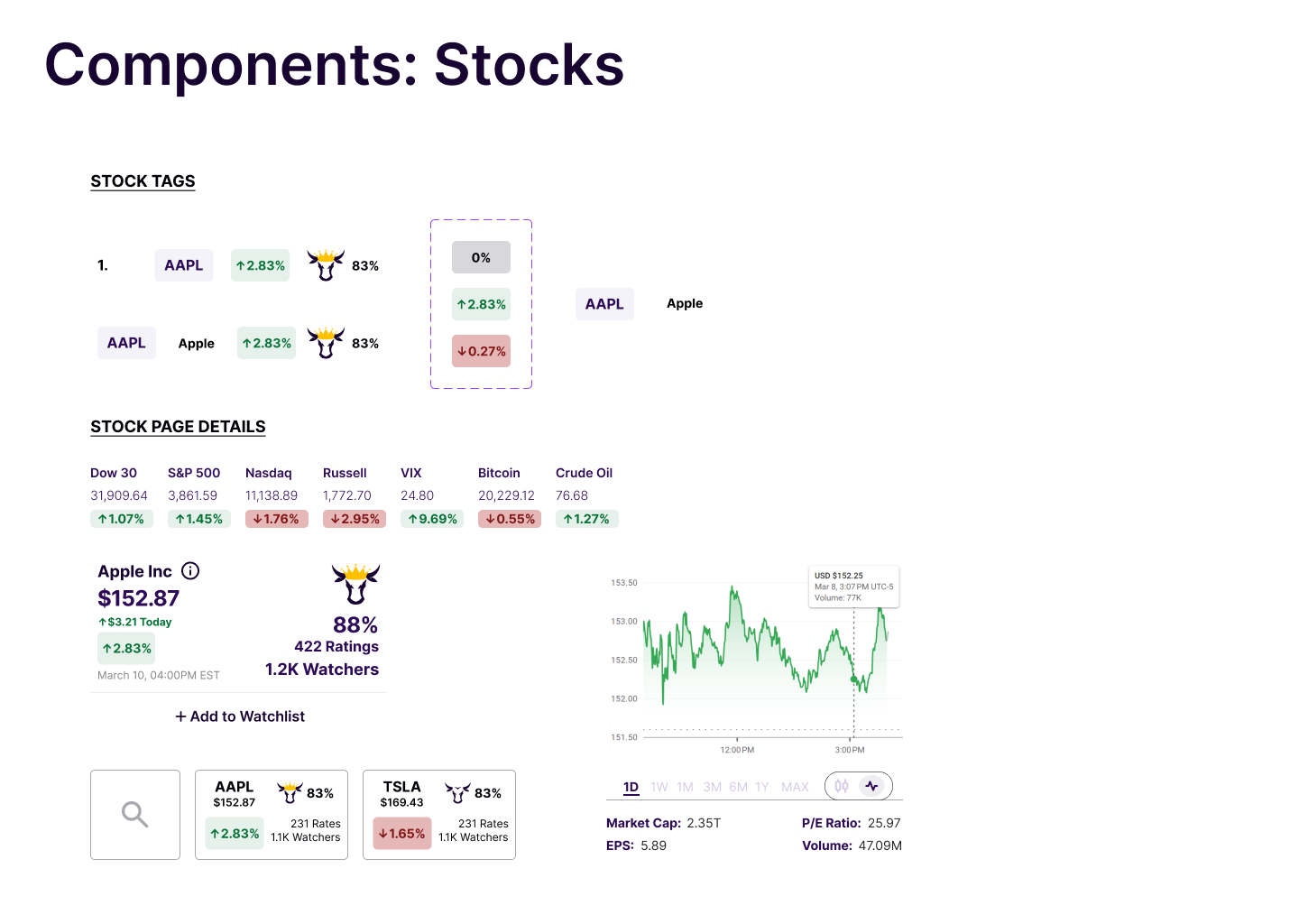



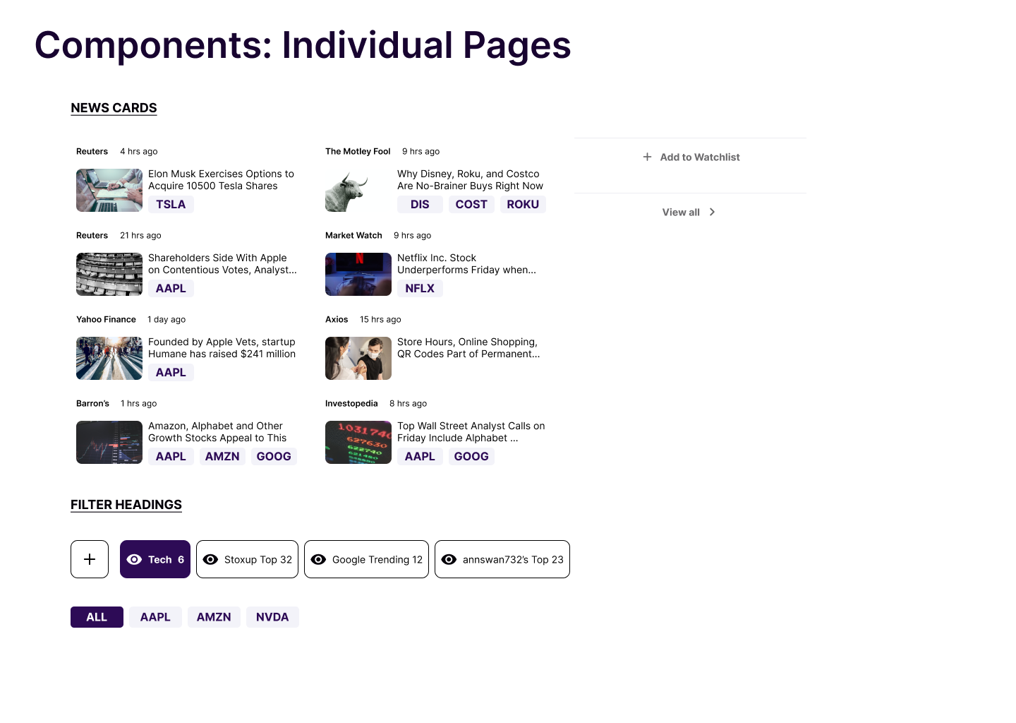
high fidelity screens + solutions
after countless iterations, we
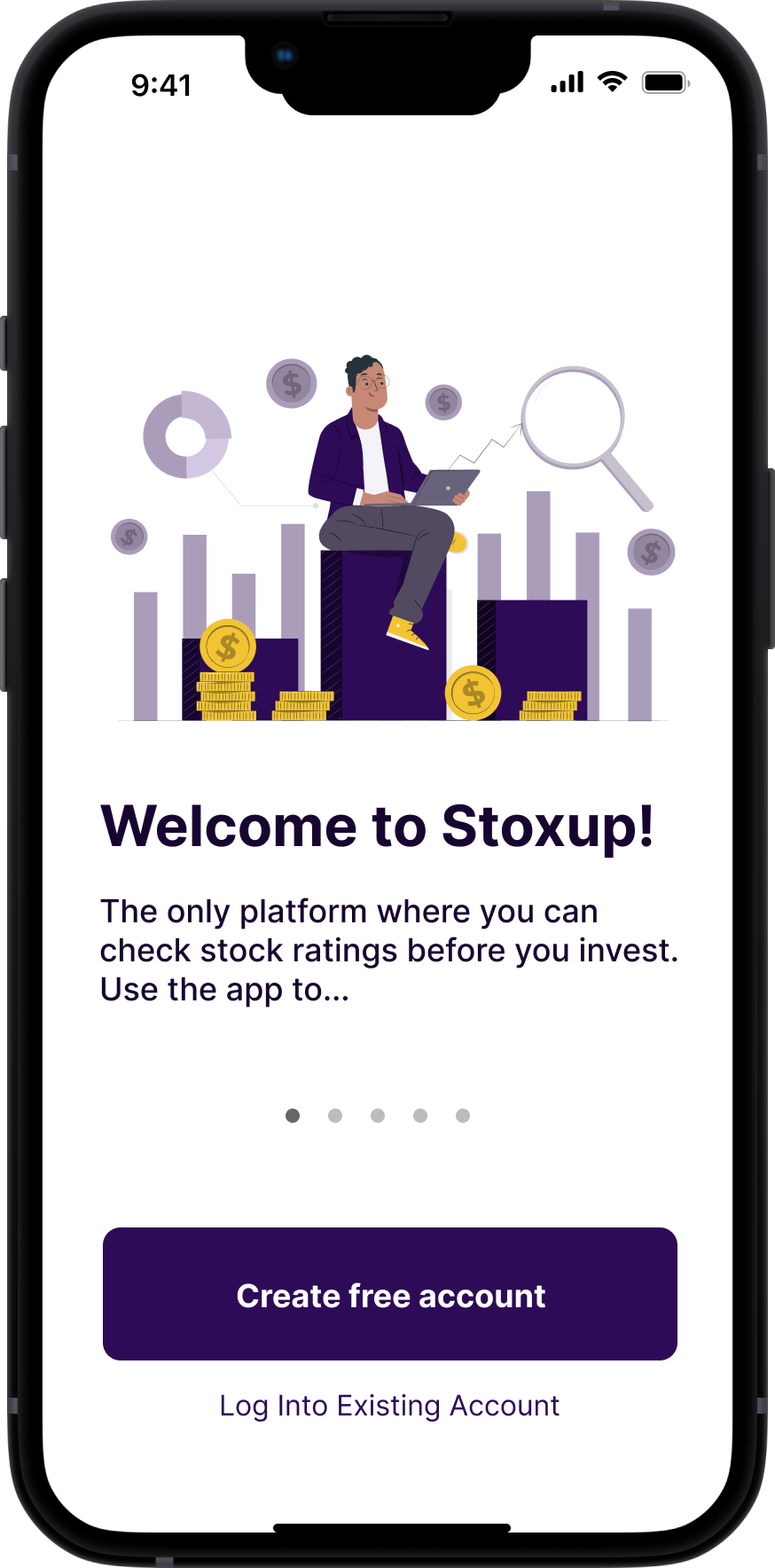
Clear log in flow
Simple minimalist UI
Clarifying Information for users on raters
Allow users to rate, not data or finance heavy
View reviews
Simple Portfolio
Profile
👩💻 developer handoff
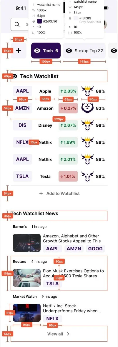
annotated prototype with measurements etx
💭 conclusion + lessons learned
I feel so grateful to have been able to explore a digital solution for an organization I deeply admire. As a result of this project, I’ve grown more confident in my wireframing and prototyping skills in Figma, as well as my ability to conduct interviews and usability tests. Reflecting on this process, here is what I learned:
-
-
-
Build out rater profiles
User engagement with raters