
Museum of Contemporary Art San Diego - Mobile App
An iOS mobile app to enhance the MCASD patron experience and build a pathway to museum membership in the era of COVID.
My Role: Sole UX/UI Designer & Researcher
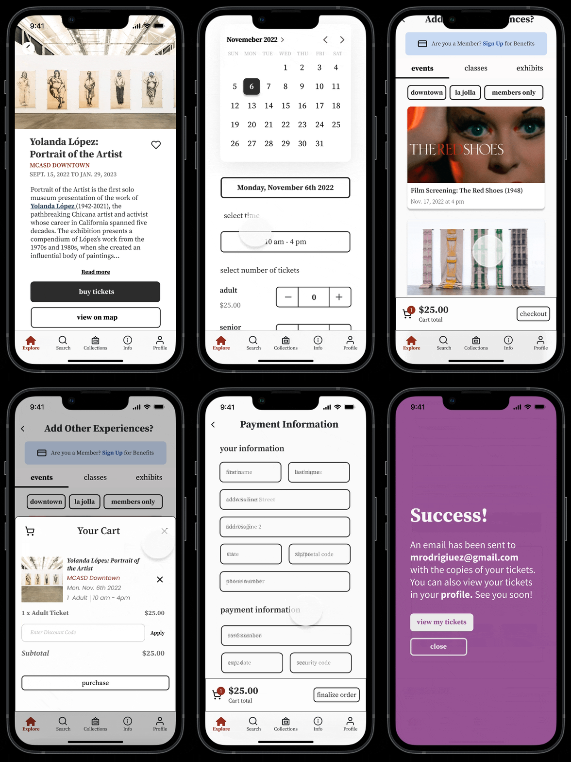
Ticket Reservation

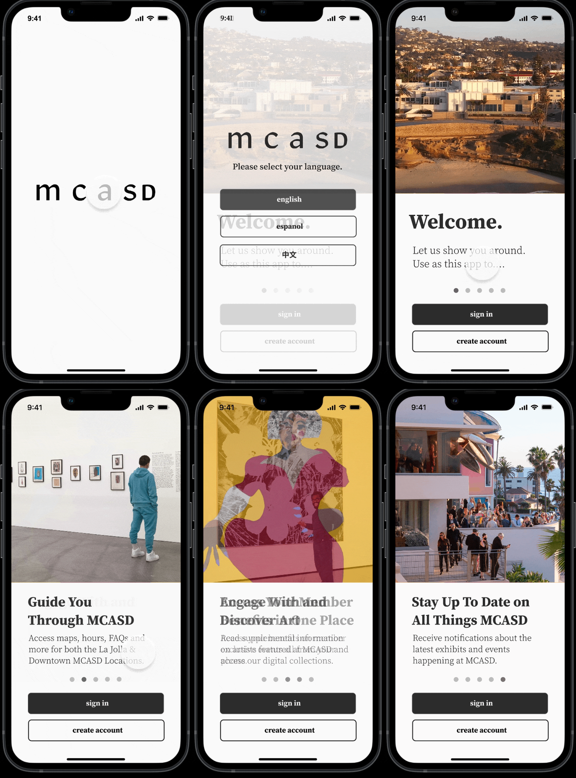
Language Selection and Onboarding

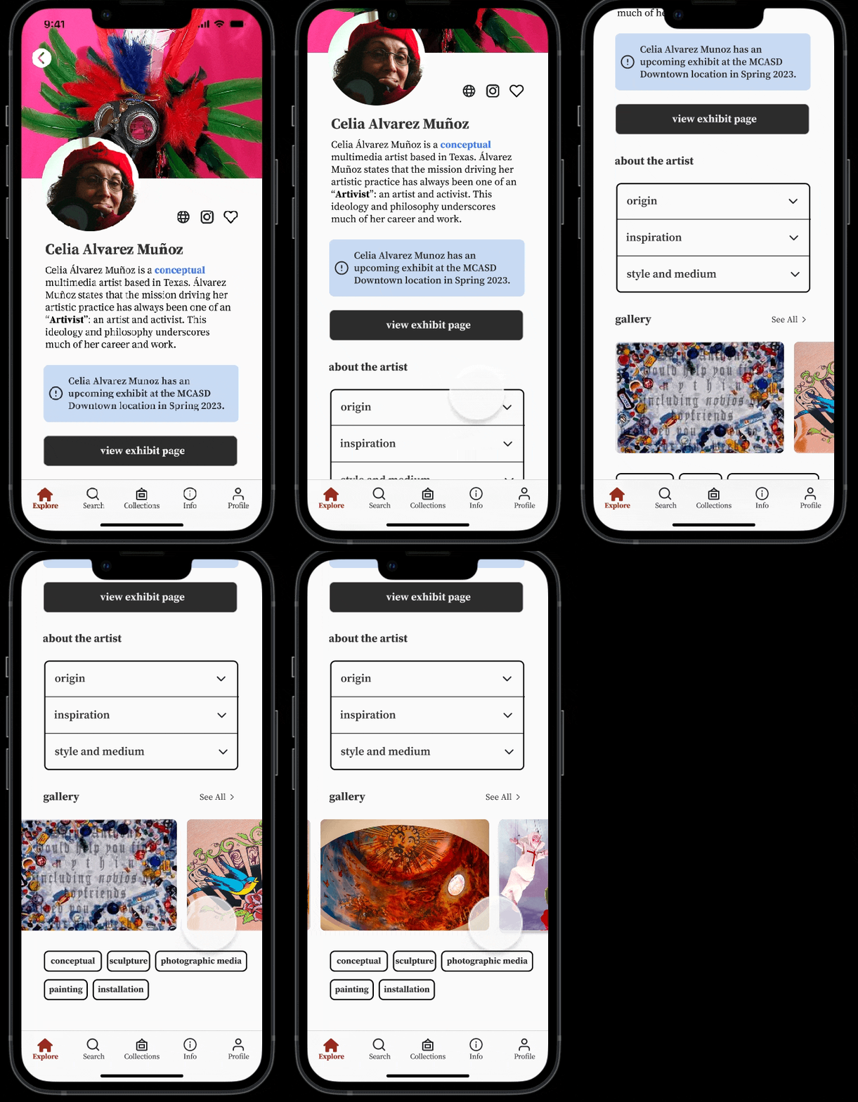
Artist Bio Page

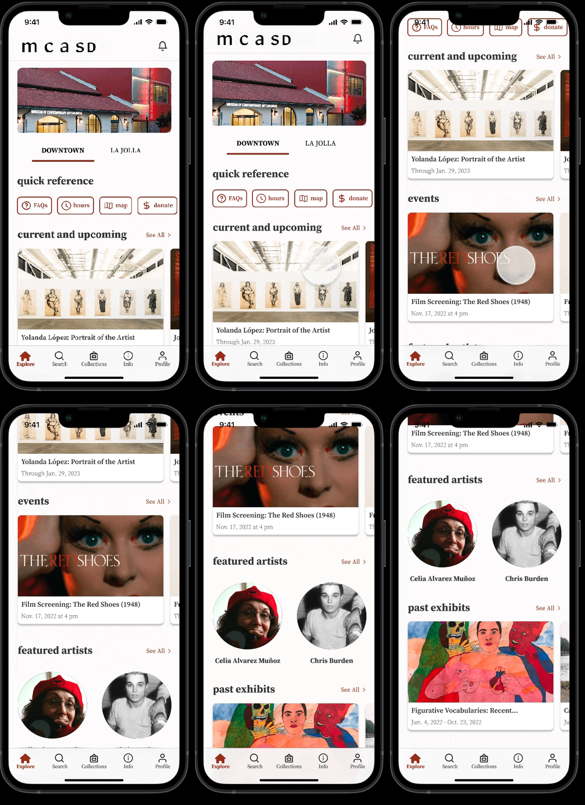
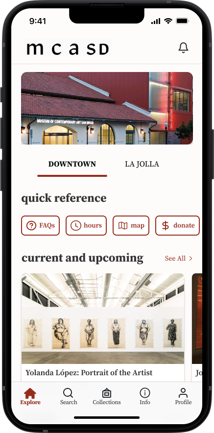
Homepage (Downtown Location)

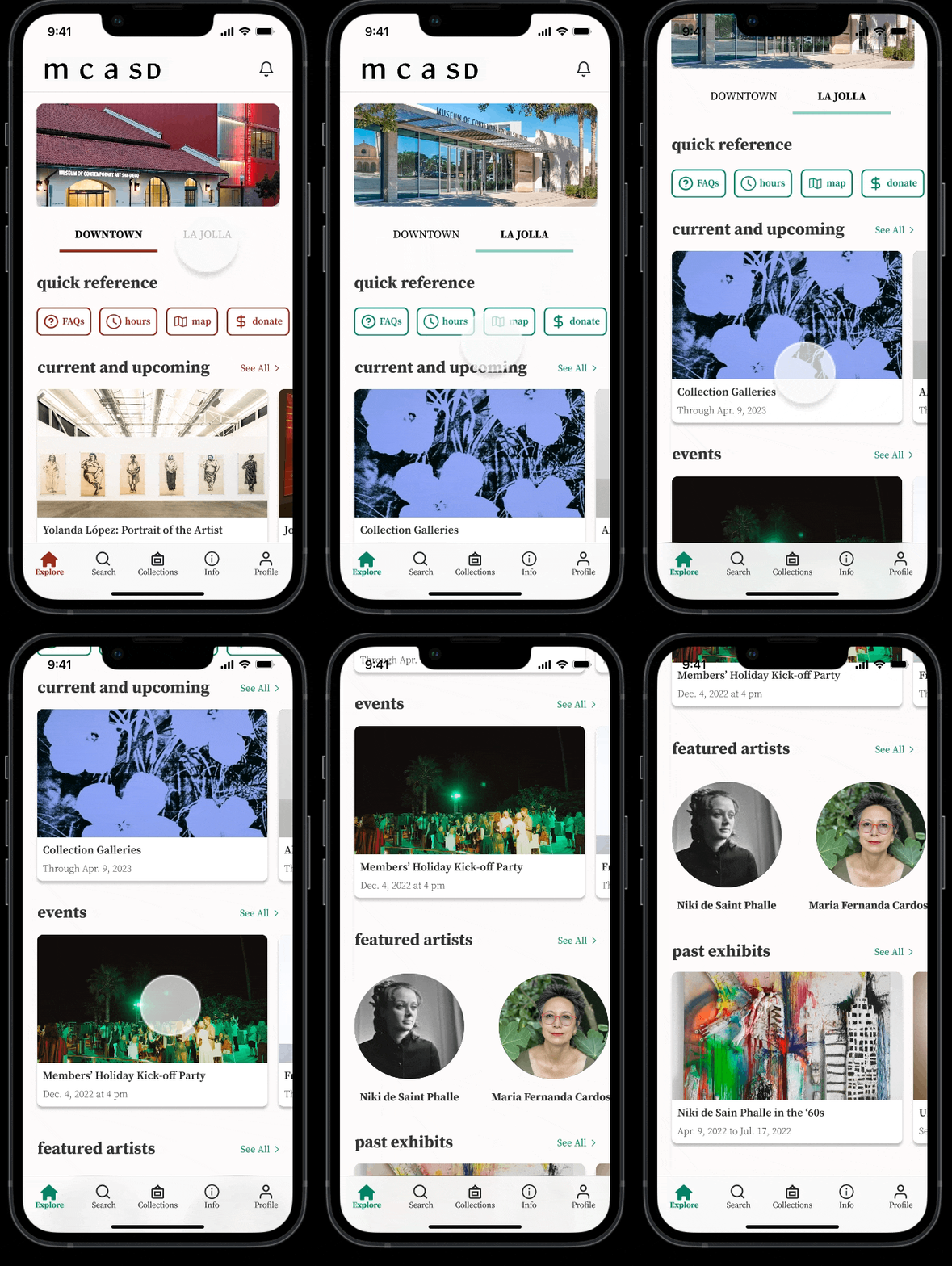
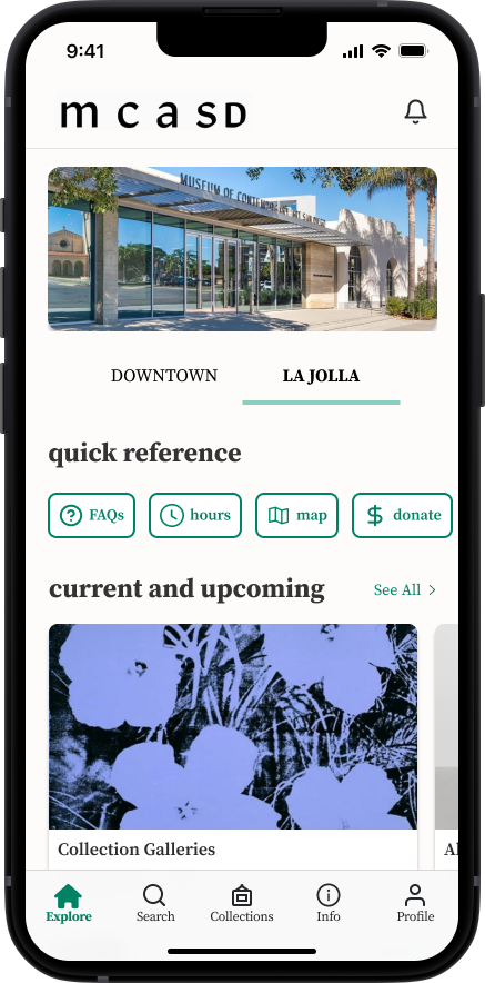
La Jolla Location

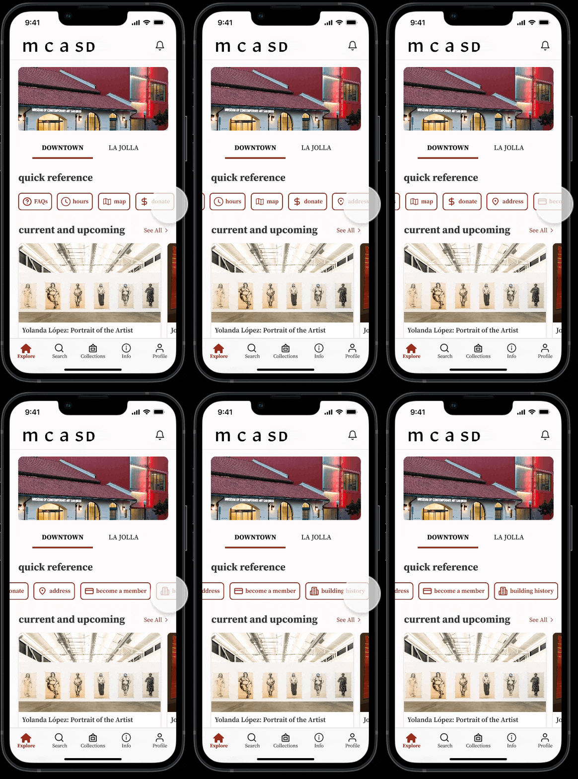
Quick Reference

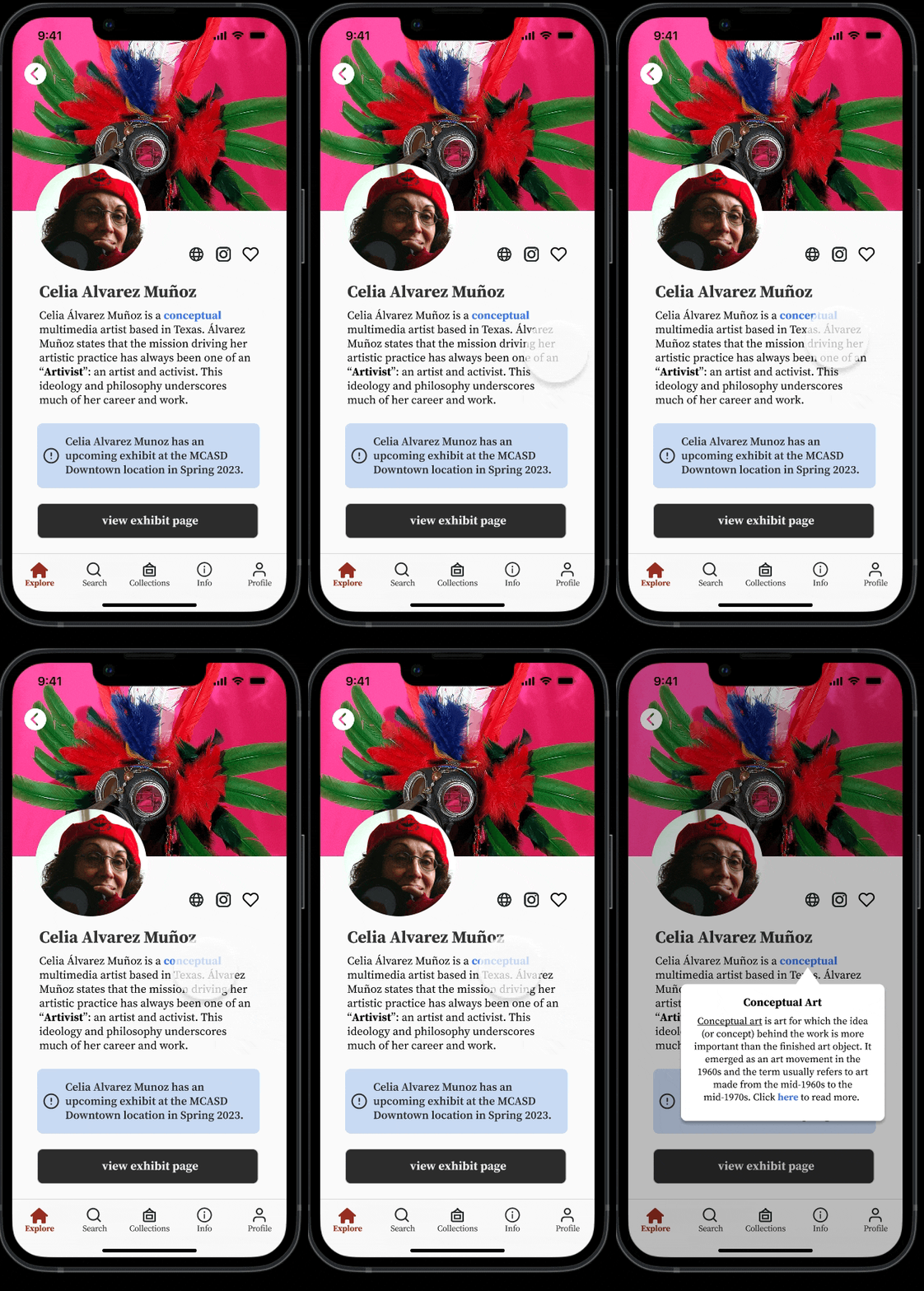
Read More About Art

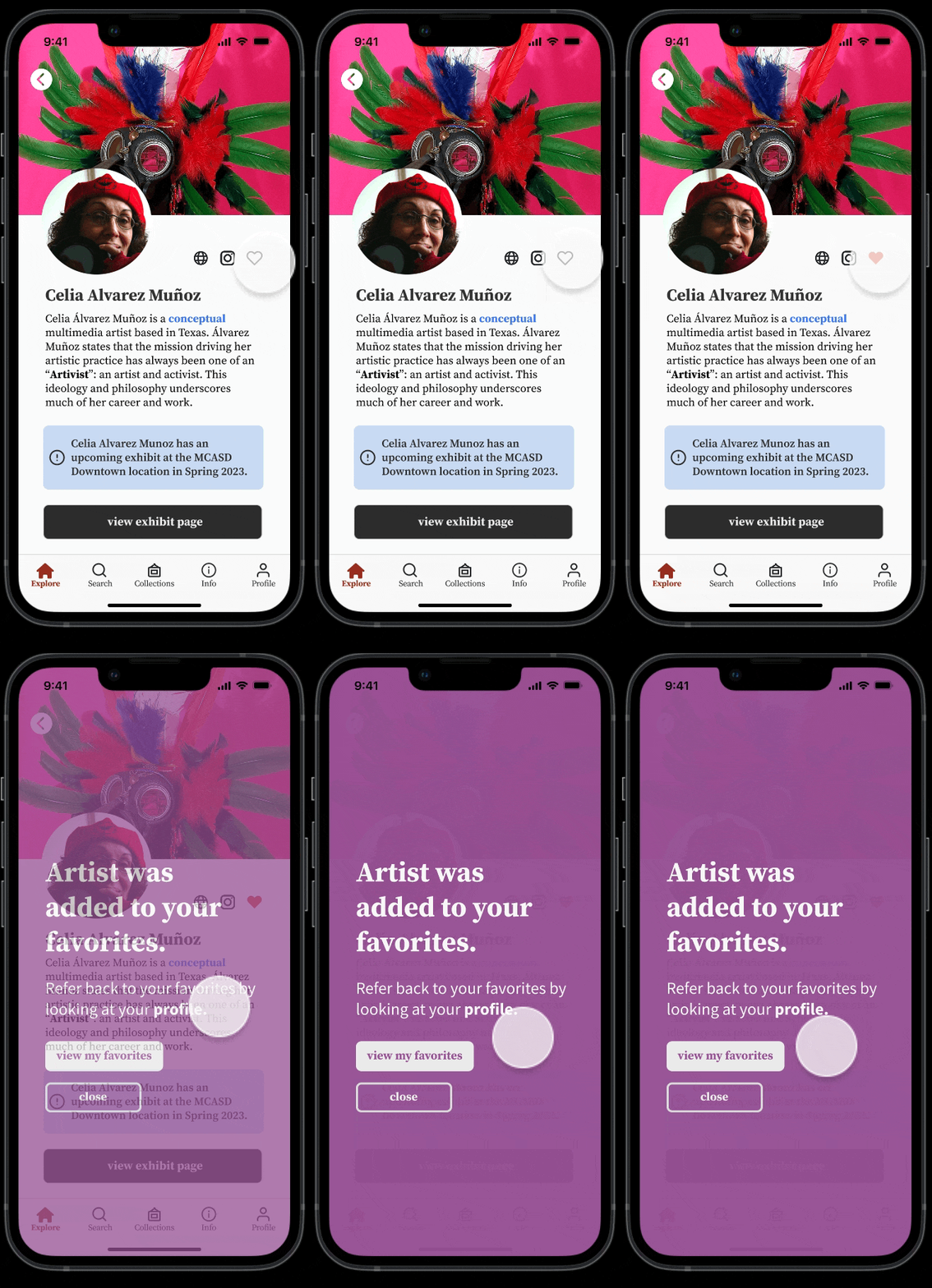
Favorite an Artist

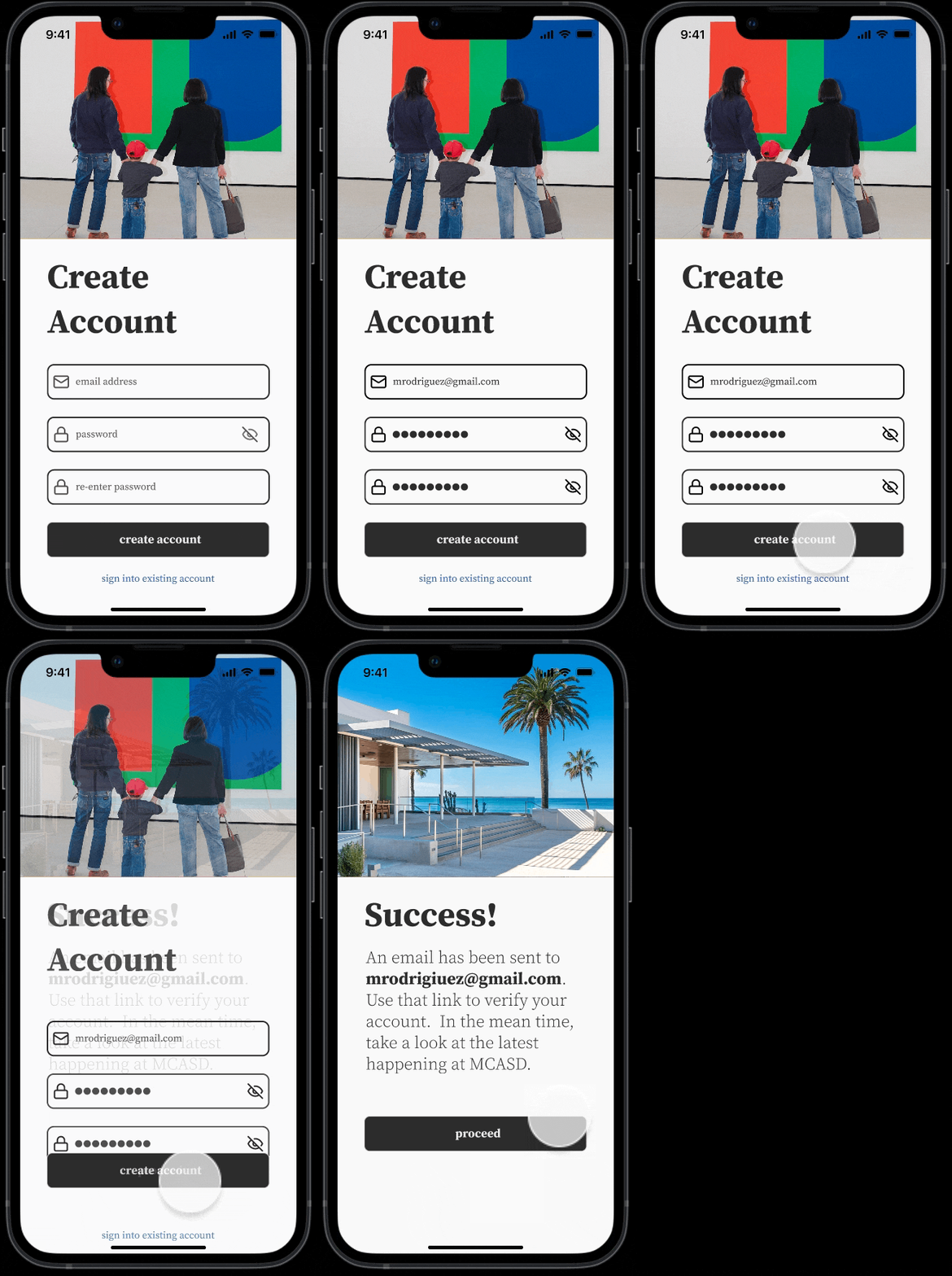
Create an Account

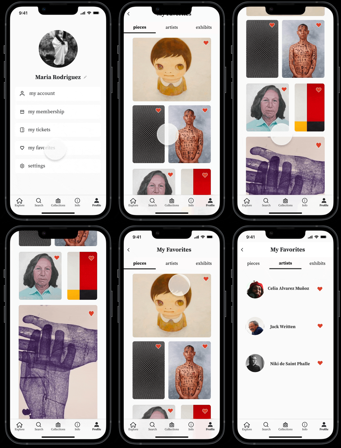
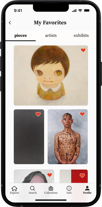
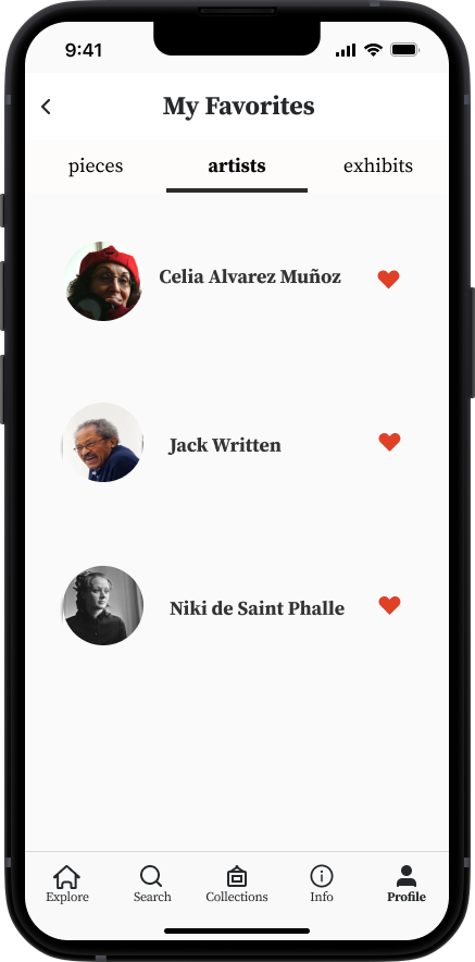
Favorite Pieces and Artists

THE PROBLEM
The Museum of Contemporary Art SD experienced a sharp drop in museum attendance and consequently museum funding.
“ How Do We Bring People Together When COVID Has Kept Us Apart?”
Research suggests that both the pandemic and a generational shift in values are the primary reasons people are no longer attending museums. Though museums are now beginning to see a slight resurgence in attendance, these changes have pushed museums around the world to adapt to post-COVID needs and match the value systems of Millenials through digital offerings, diversity, and accessibility.
THE SOLUTION
A Native Mobile App Fostering Sustained Engagement with MCASD & a Pathway to Membership.
I designed a mobile app that offers its users ways to stay engaged with MCASD’s exhibits and events in and out of the museum, access their member benefits in one place and become members more easily.
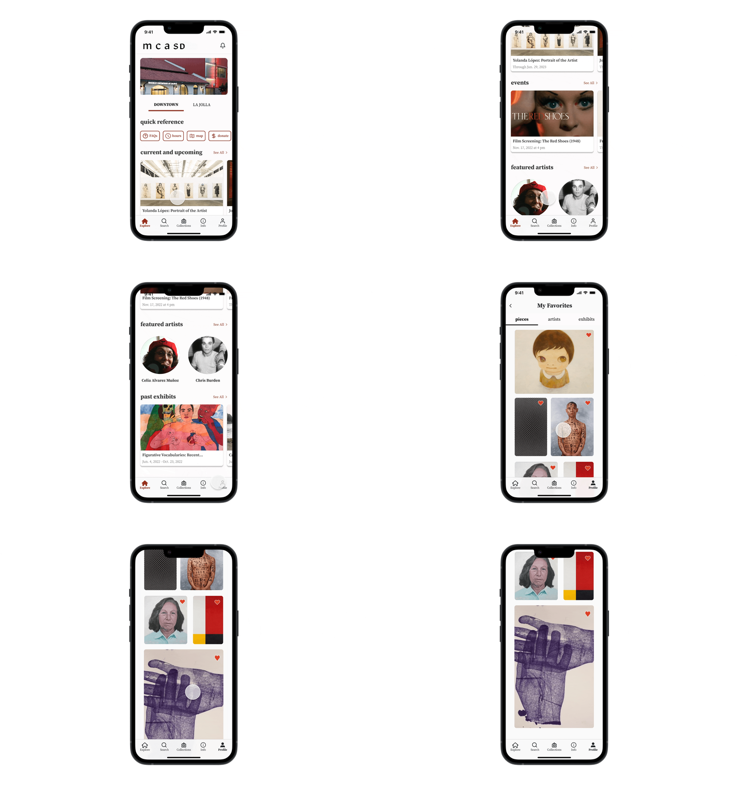
TABLE OF CONTENTS
CLIENTS GOALS
MCASD seeks to engage and educate the San Diego community about art, and to increase their funding by increasing their membership.
I interviewed 2 staff members from the Education and Engagement Team & 1 from the Membership Team to explore their needs. I summarized the immediate needs of MCASD against their constraints.
COMPETITIVE ANALYSIS
How Are Others Solving this Problem?
With clarity from stakeholder goals from staff interviews, I conducted a competitive analysis outlining the features 6 official museum apps offer their users and 4 indirect competitors apps marketed at art lovers/ art communities. Afterward, I mapped out the features from all competitors that are both in alignment with stakeholder goals and standards within the market.
USER RESEARCH
How Do MCASD Patrons & Engage with Art?
With a clearer idea of the landscape of this space and how client needs might be translated to mobile app features, I pivoted to exploring user needs. After sending out a screener survey via social media, I conducted interviews with 5 MCASD patrons to get a sense of what real patrons value from their MCASD visit experience. Using affinity and empathy maps, I compiled themes amongst interviewee answers to identify user values and pain points. Based on these maps, I noticed distinct similarities among patrons of similar age ranges and created two user personas to reflect these groups. Scroll through the carousel below to view the interview notes, maps user personas, and their summaries.
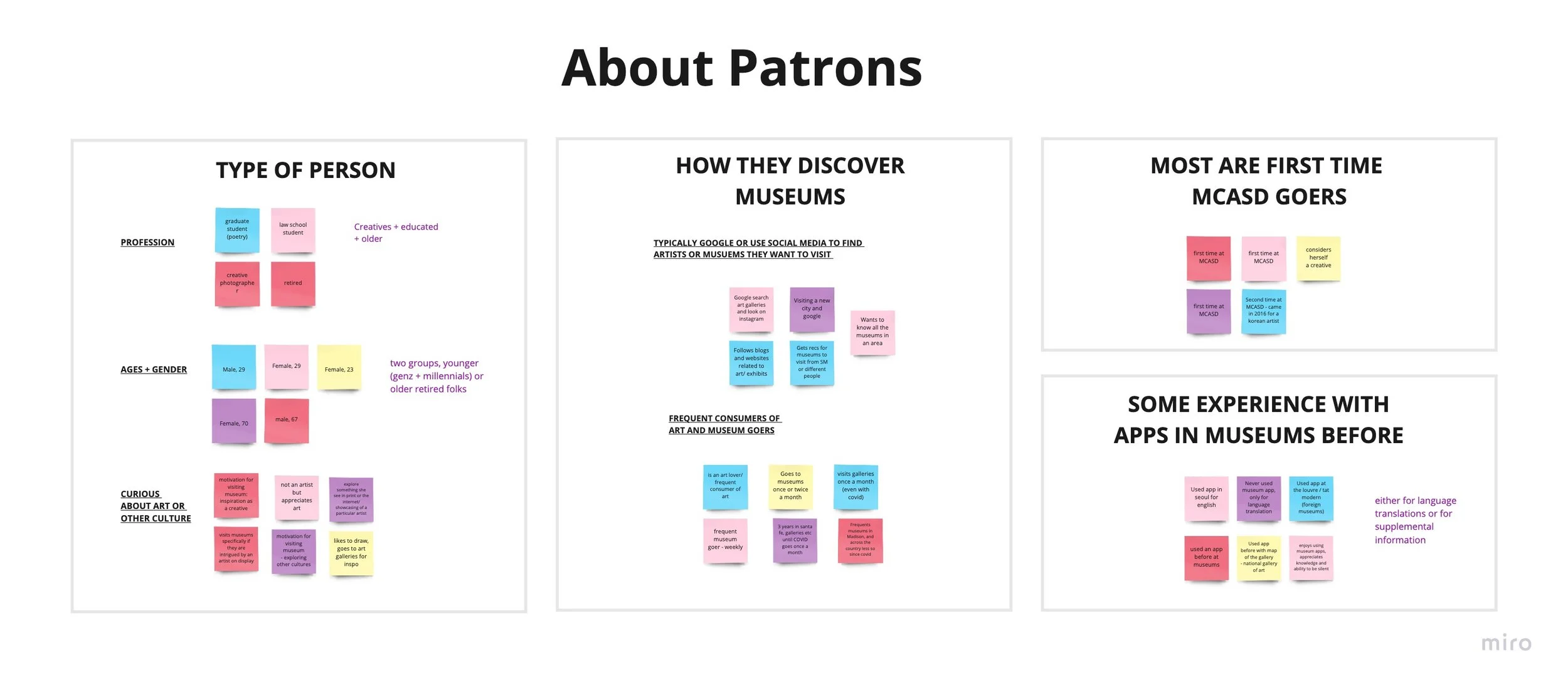
Themes Amongst Patrons - Most are folks of all age groups with a curiosity or interest in art. They typically discover MCASD online and visiting for the first time. They have some experience with apps but mostly for language translation purposes.
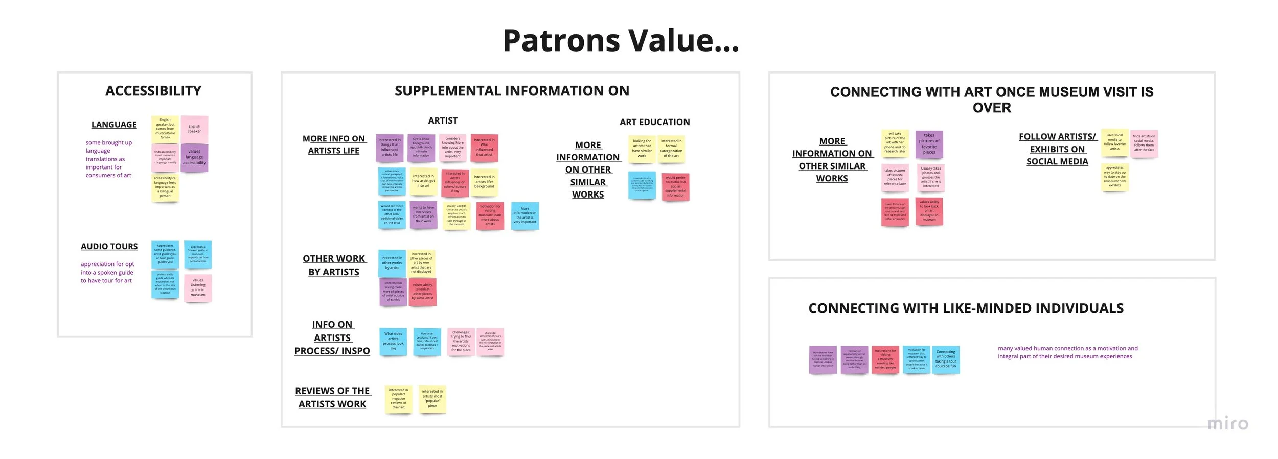
Patrons value education around art as well as accessibility around that access. They are looking for ways to connect with the museum and artists when their visit Is over.
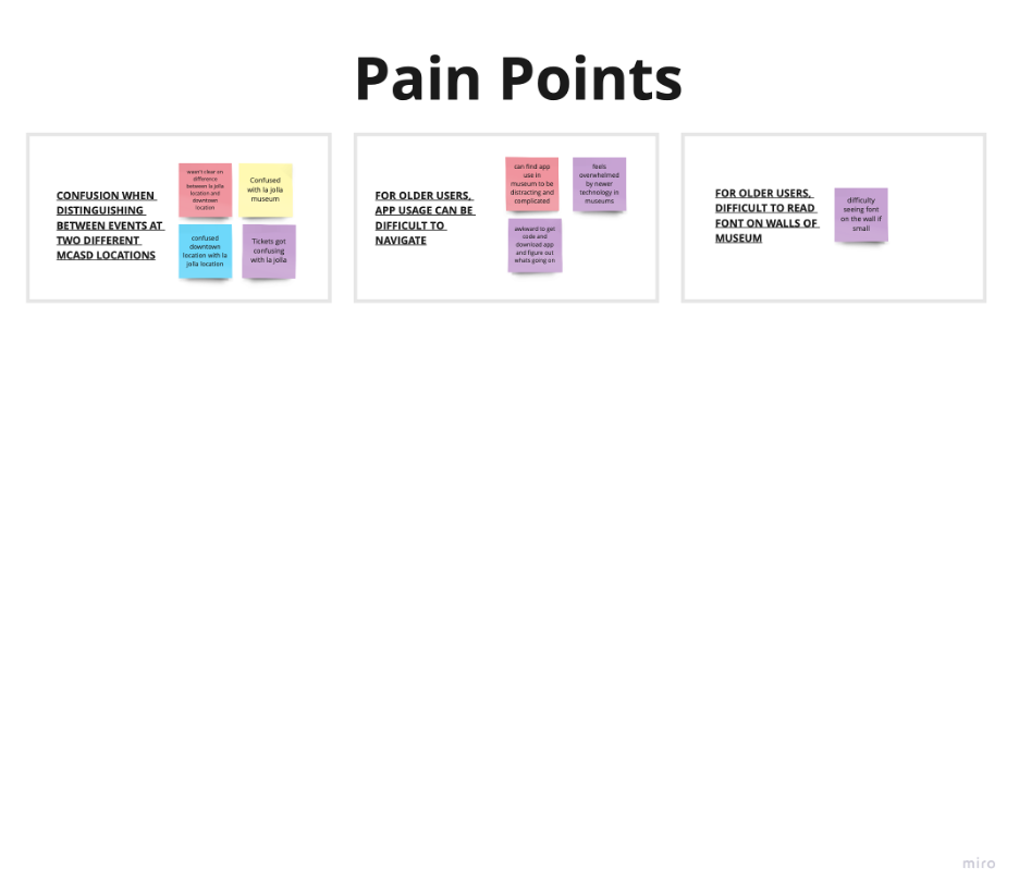
Patrons have difficultly distinguishing between the 2 MCASD locations based on MCASD's website. Additionally, older patrons find technology difficult to navigate.
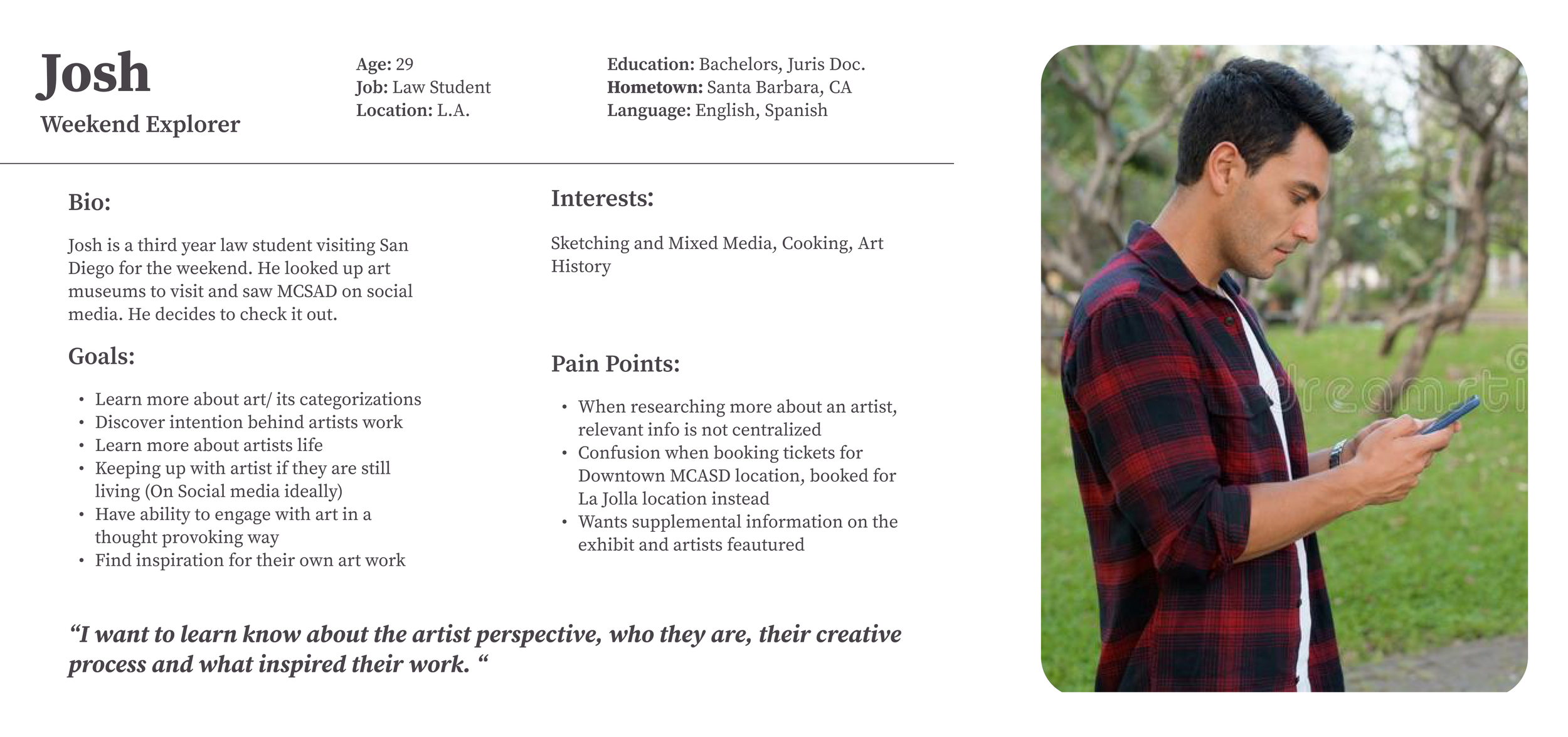
User Persona #1 - Reflecting Gen Z/ Millennial Responses
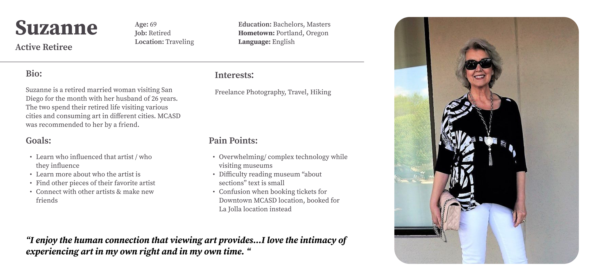
User Persona #2 - Reflecting Gen Y/ X Responses
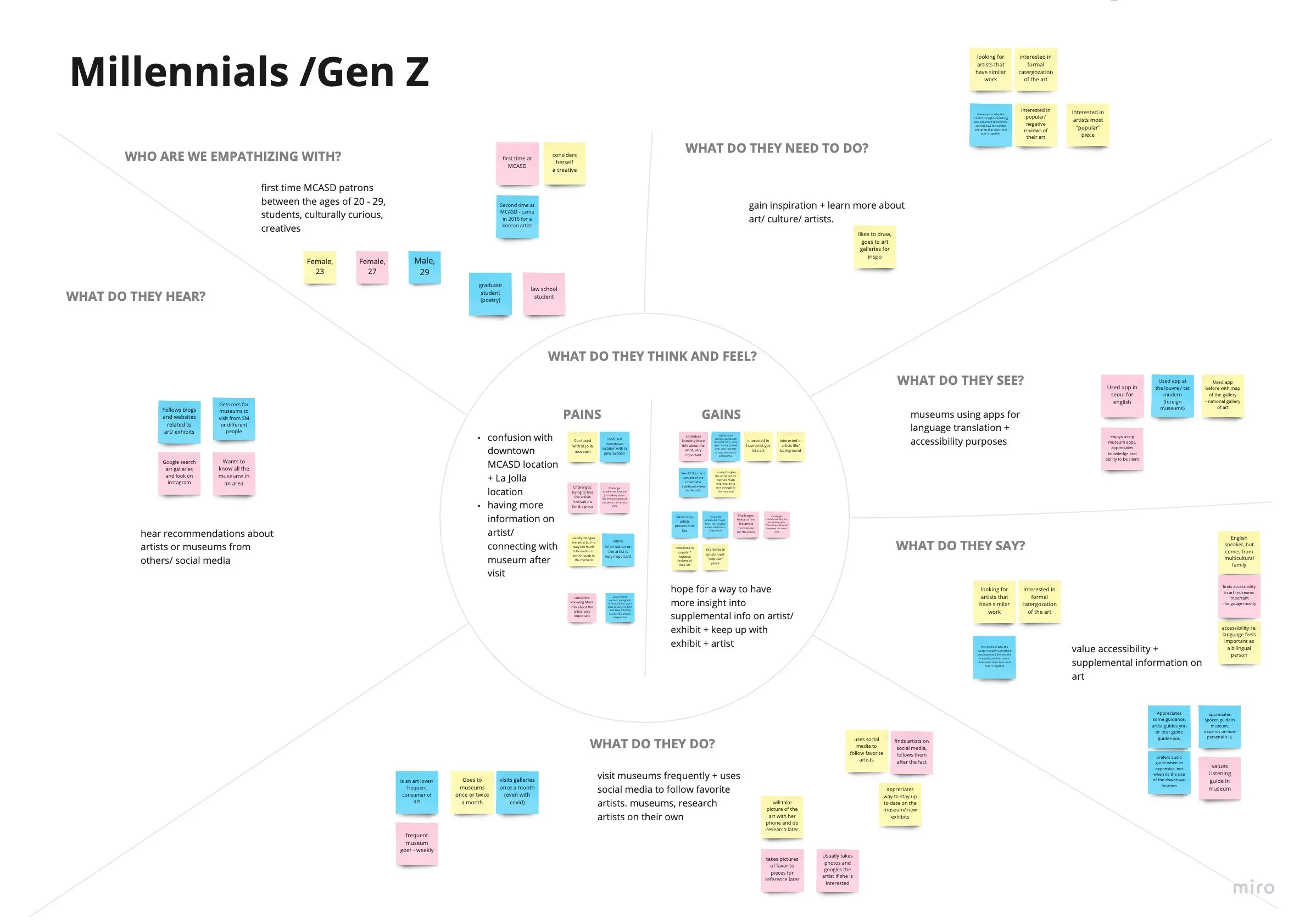
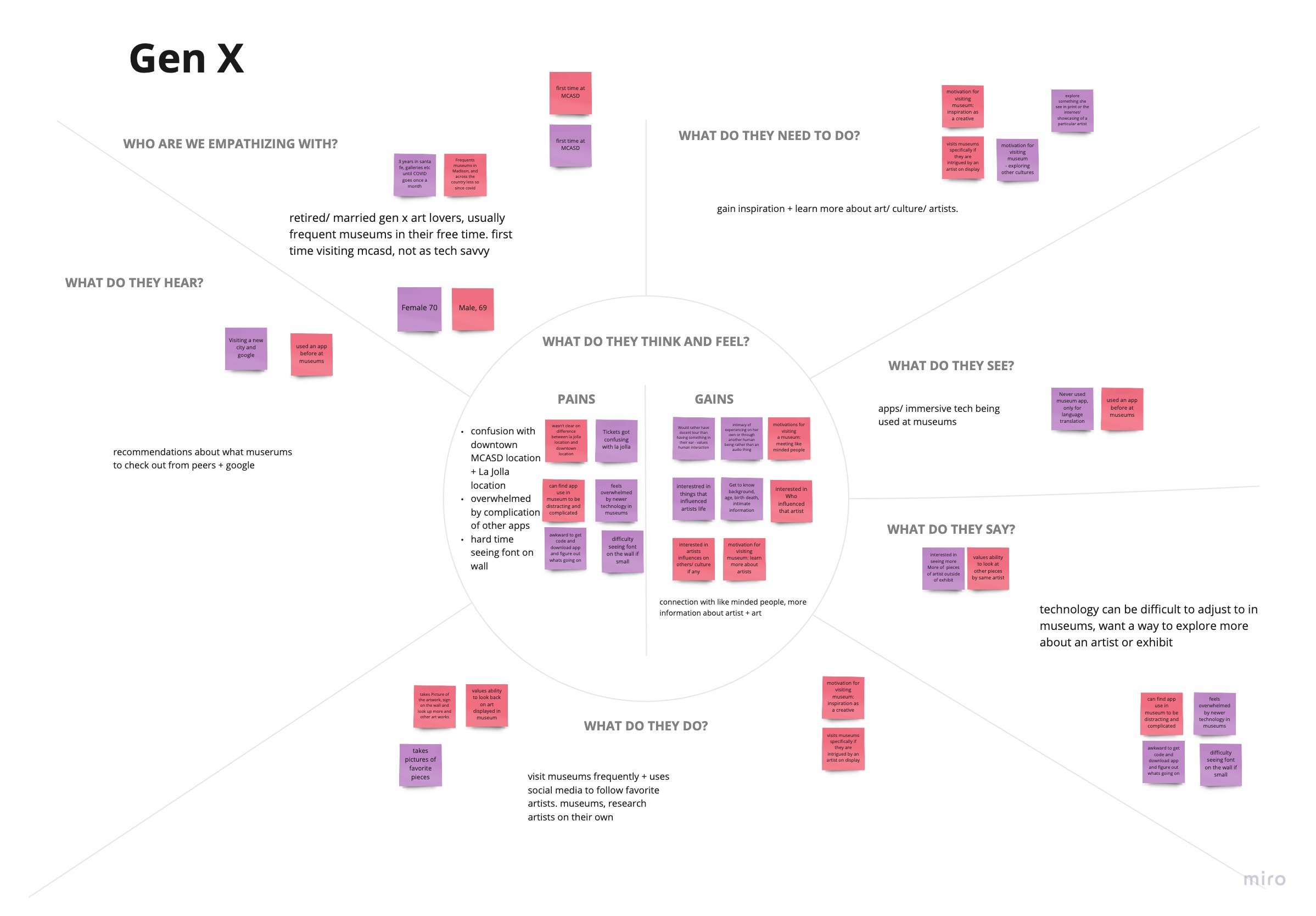
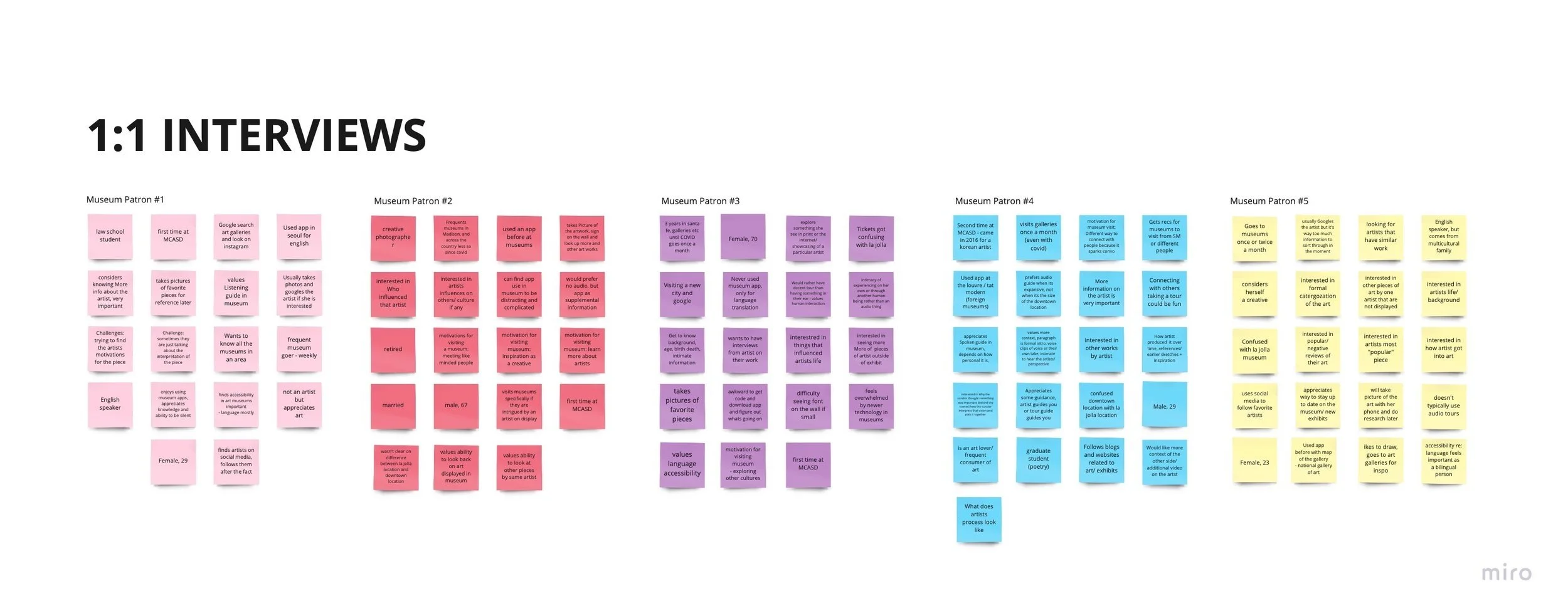
Notes from 1:1 Interviews with Patrons
KEY TAKEAWAYS FROM DISCOVERY
Patrons Value Education, Accessibility, and Engagement. They Also Identified Two Major Pain Points….
-
They are generally curious or interested in art. They value supplemental information that would help them navigate exhibits on display.
-
Patrons seek to remain engaged with both the museum and the artists featured at them. Most of those surveyed are seeking a way to connect with art and artists that resonate with them, either for inspiration or entertainment.
-
Interviewees discussed accessibility in two ways; making educational content about art more easily digestible and available to patrons and/or having that information be more available to different populations, such as non-Native English speakers and those with special needs.
-
Almost half of the participants interviewed mentioned confusion around knowing which location of MCASD they have booked tickets for. An app should clearly distinguish between the two.
-
Those in generation X expressed a frustration with navigating technology generally. A mobile application needs to be simplistic, easy to navigate, and not take away from the experience of the museum, but add to it.
-
Most of the apps studied use the format to provide the user with an audio tour, augmented reality, supplemental information on an artist, or digital collections for the museum.
-
Most of the apps studied use minimalist typography and color palettes (typically black white and various grays)
When the color palettes of the studied stray from this norm, the use of color matches the theme of the respective museum
These findings confirmed for me that a mobile application is a viable solution to patron and client needs. A mobile app has the ability to easily provide supplemental information, a way to stay connected to the museum, and tools for accessibility right at the fingertips of museum-goers and members.
IDEATION
How Might We’s & the Minimum Viable Product
This research and synthesis provided me with enough insights to start sketching to generate ideas and establish concepts to tackle users’ problems. I used How Might We’s and User Stories to put everything in perspective, synthesized the participants, and generated creative solutions while keeping me focused on the right problems to solve. I then started working on the MVP (Minimum Viable Product) by sorting the stories from highest to lowest priority to create fundamental values for users. I then crossed out anything that would not be possible due to constraints clients laid out initially.
PUTTING IT ALL TOGETHER & VALUE PROPOSAL
Factoring in Stakeholder Goals, Market Standards, User Needs, and Constraints, I Created the Following Guide for the Features and Capabilities of the App.
In Summary, the App Will Allow Users To….
Engage with Art in and out of MCASD - Preview MCASD galleries and collections right from your phone, Favorite your favorite exhibits and artists on display, Reserve your tickets at both MCASD locations, Access digital collection
Access a Museum Guide - Access maps, hours, FAQs and more for both the La Jolla & Downtown locations.
Stay Up To Date on All things MCASD - Receive push notifications for MCASD events and exhibits.
Access Member Benefits in One Place - Access Member benefits such as guest passes and info on exclusive events
HITTING THE DRAWING BOARD
Sitemap & Userflows
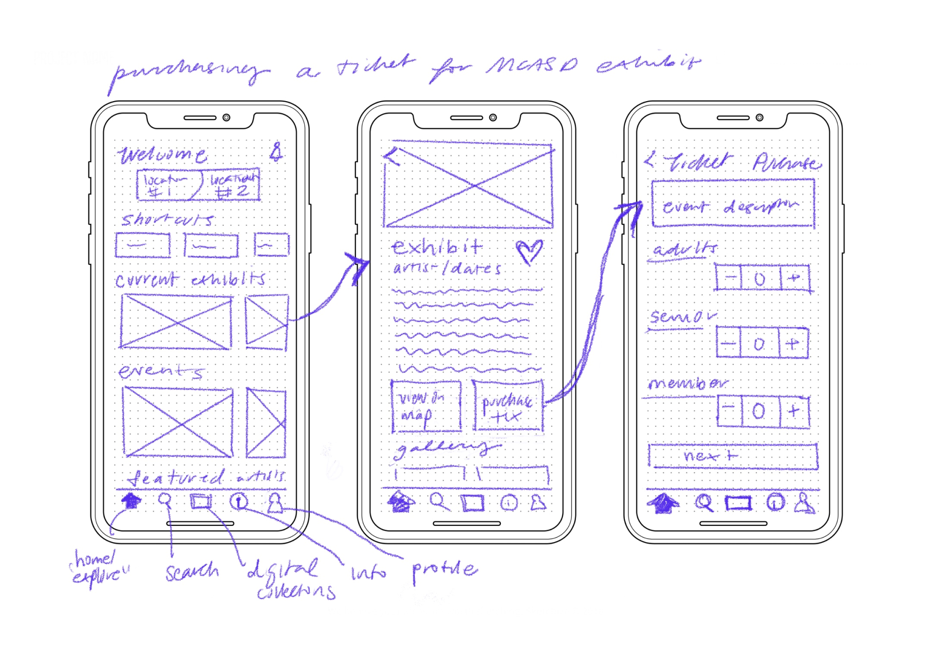
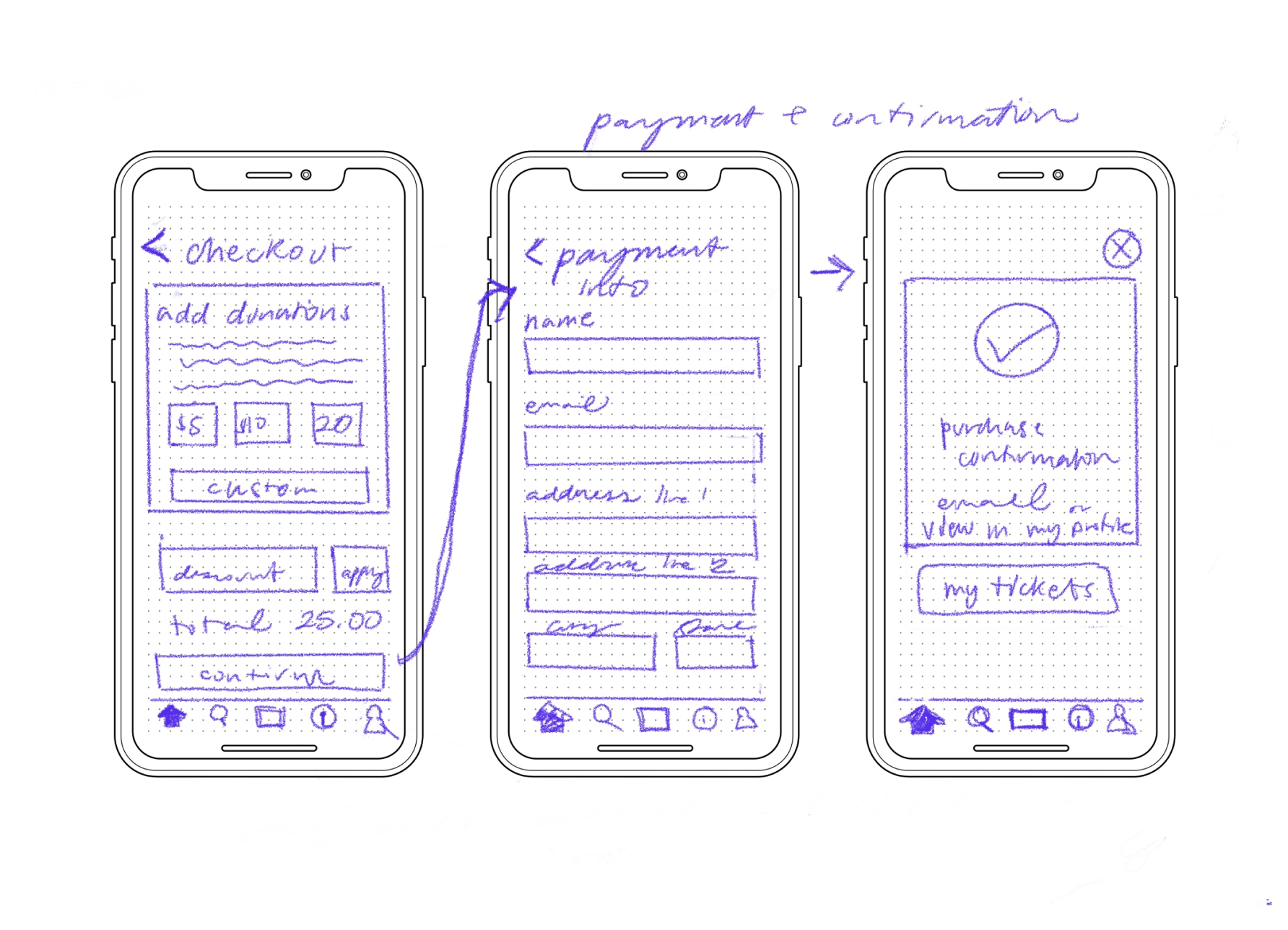
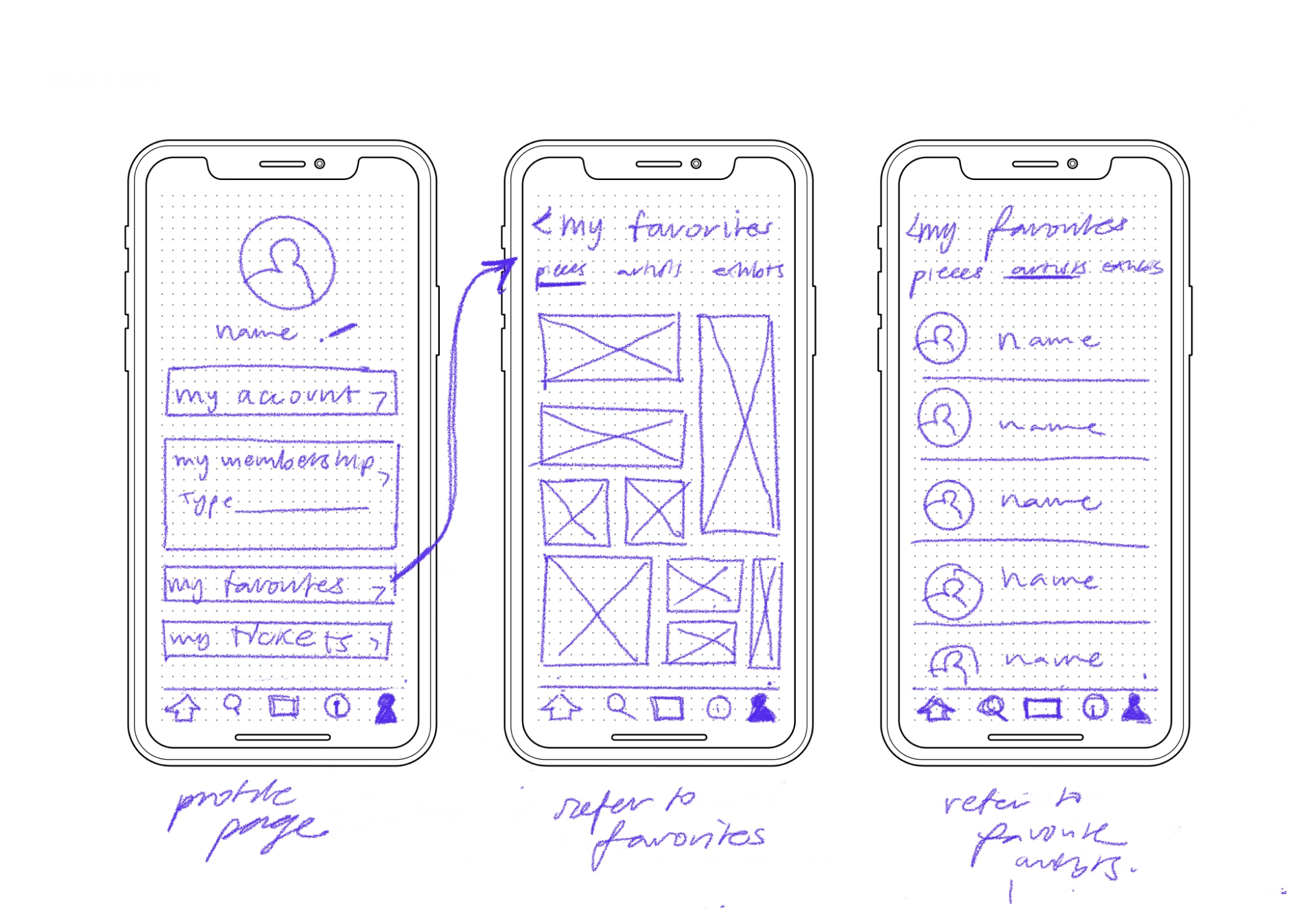
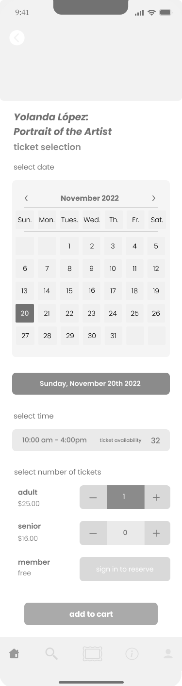
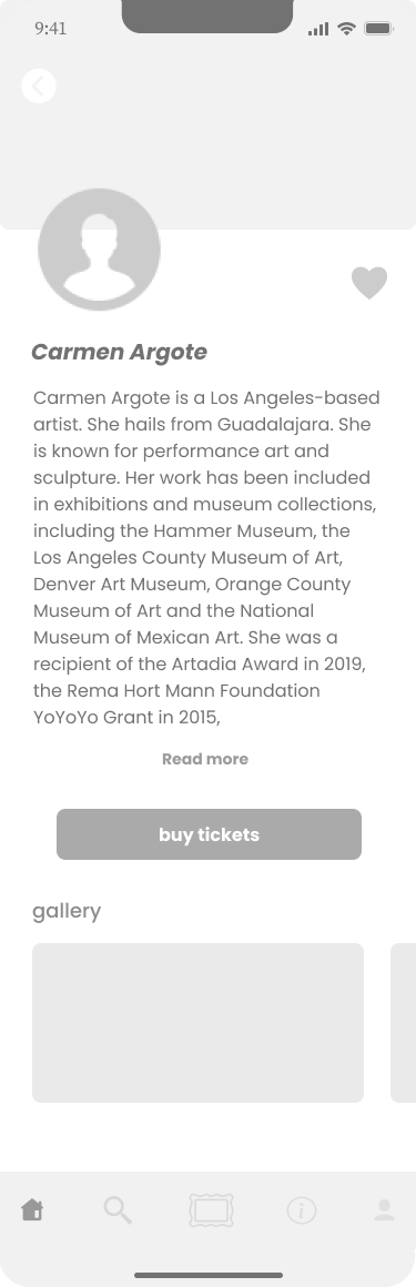
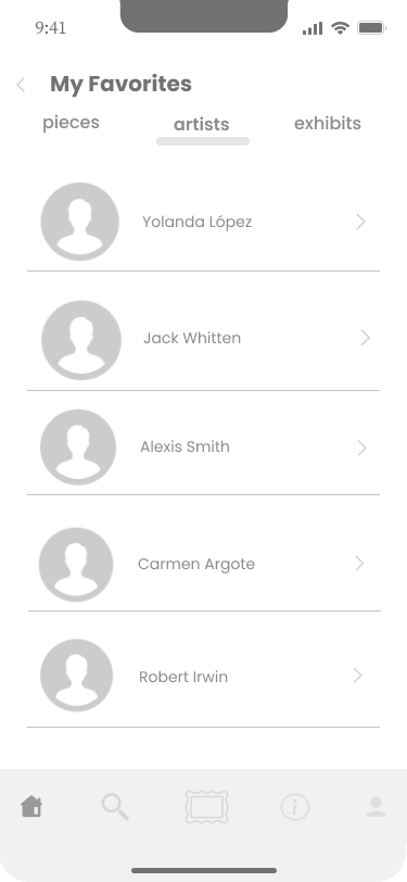
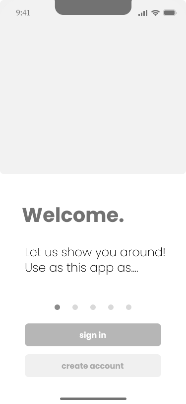
I created a sitemap to organize the features and information based on the chart above. I also created three Userflows in alignment with user needs to base the prototype on: 1. Viewing and Reserving a Ticket for an Exhibit 2. Exploring More about an Artist and Their Art Style 3.Referring Back to Favorites
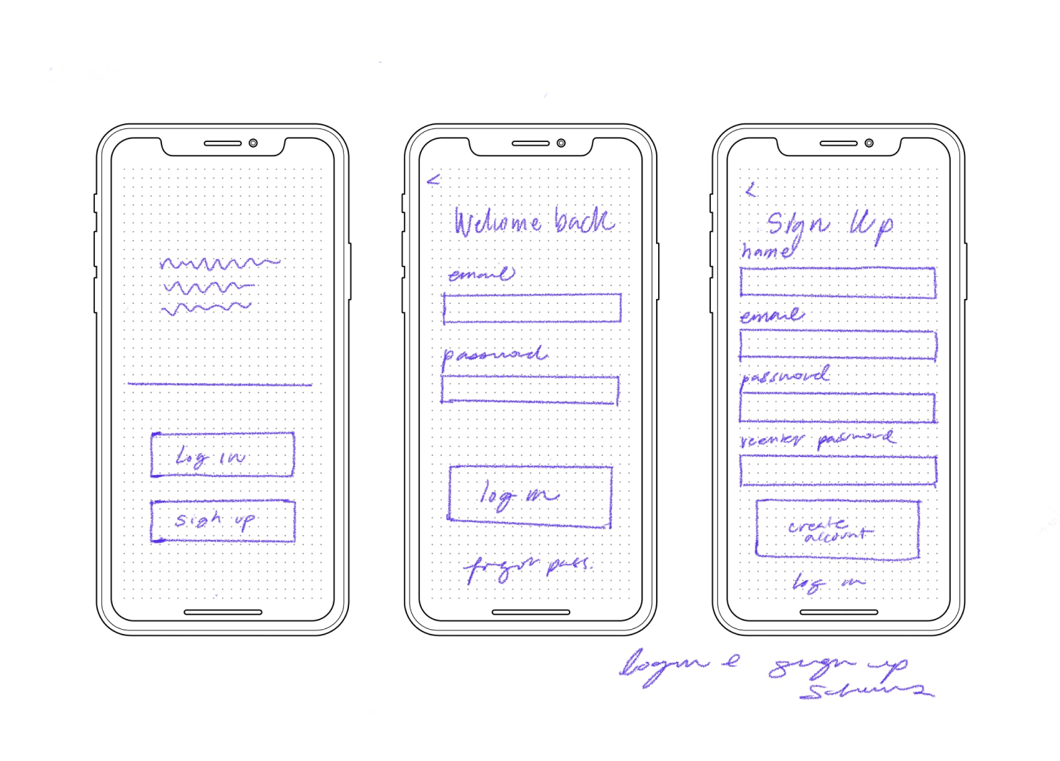
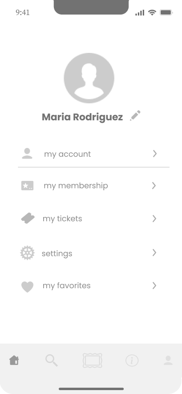
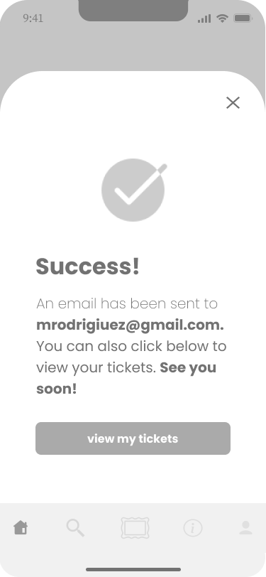
Sketching & Wireframes
With a clear idea of how a user might navigate the app, I began sketching and eventually constructing low and mid-fidelity wireframes.
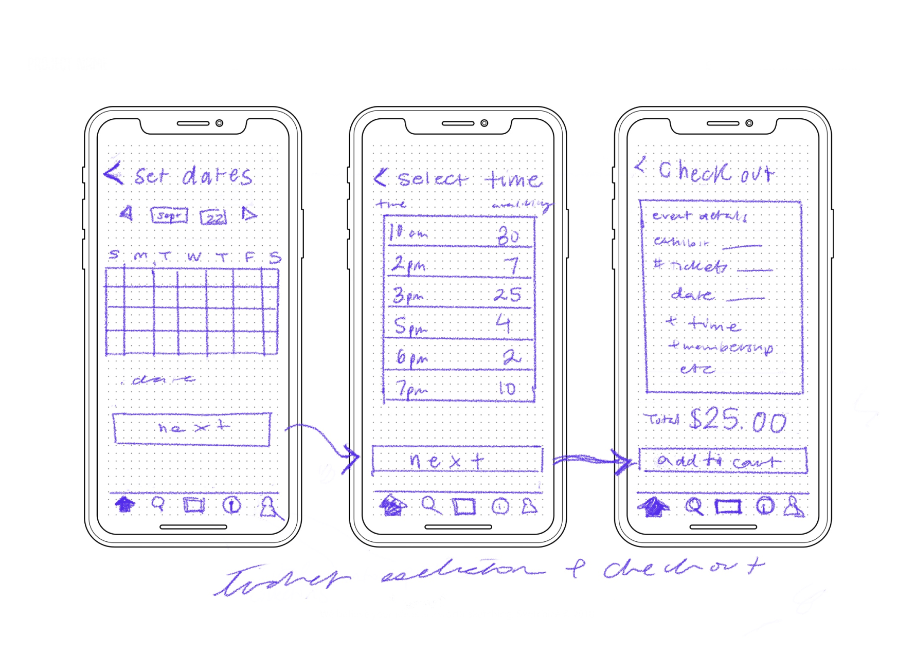
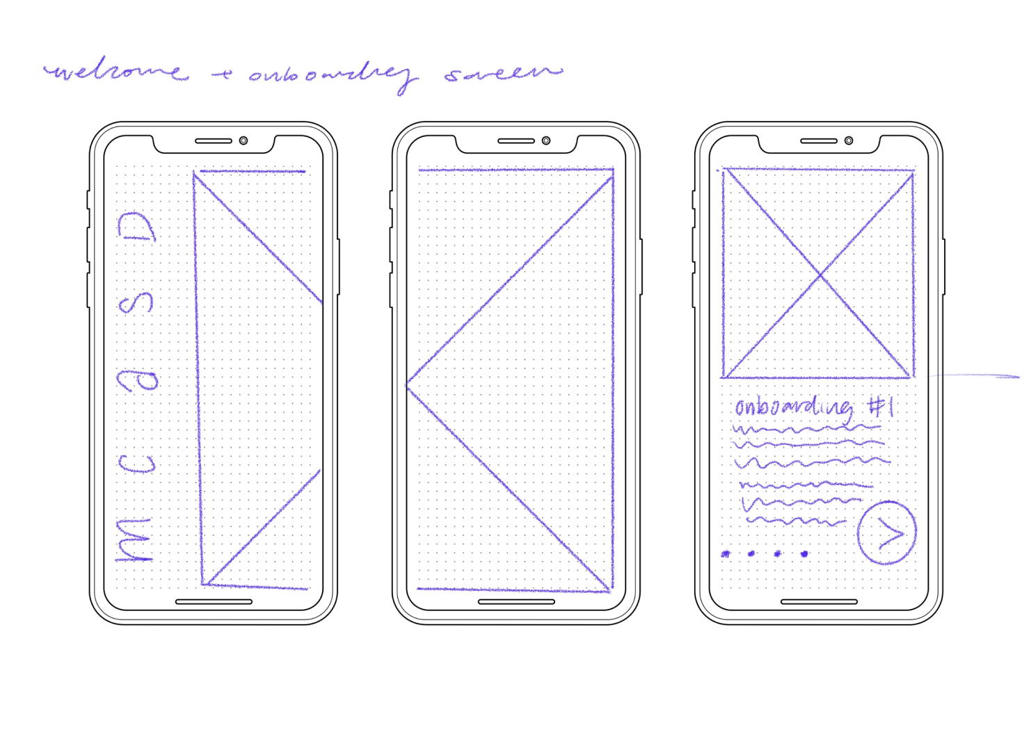
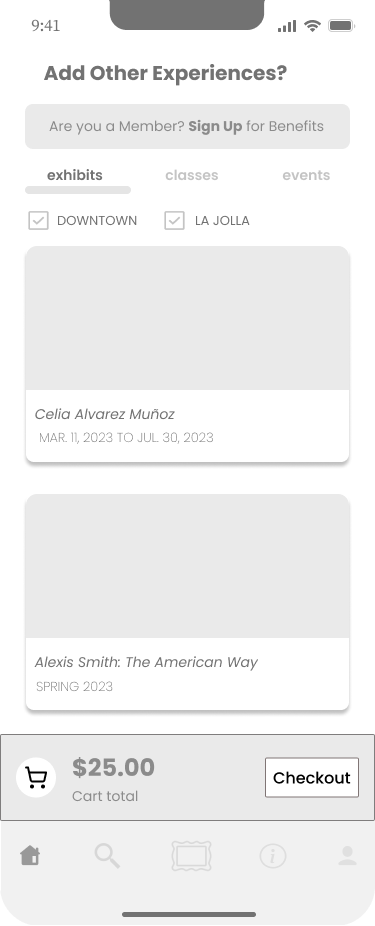

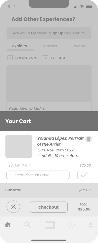

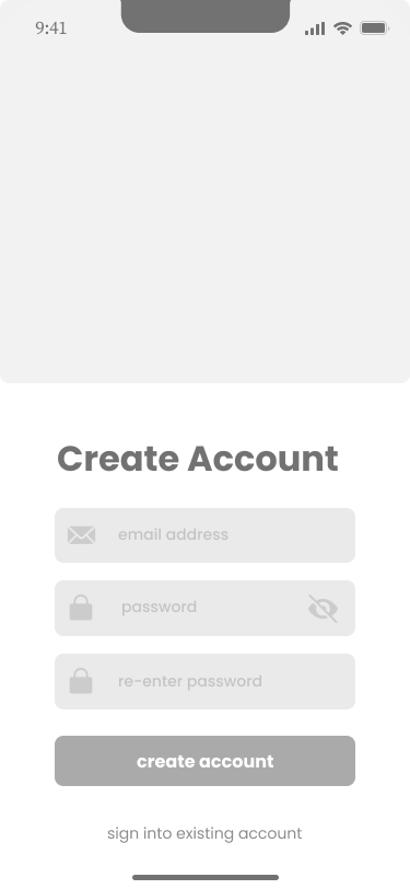







Brand Platform & Moodboard
I studied the MCASD website to draw from their branding and create consistency between the app and the website’s design. Afterward, I created the following moodboard and style guide, pulling from MCASD’s branding and other art museum apps for inspiration. I made slight changes to the typography and color selection for accessibility purposes and to give the app a more modern feel.
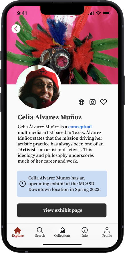
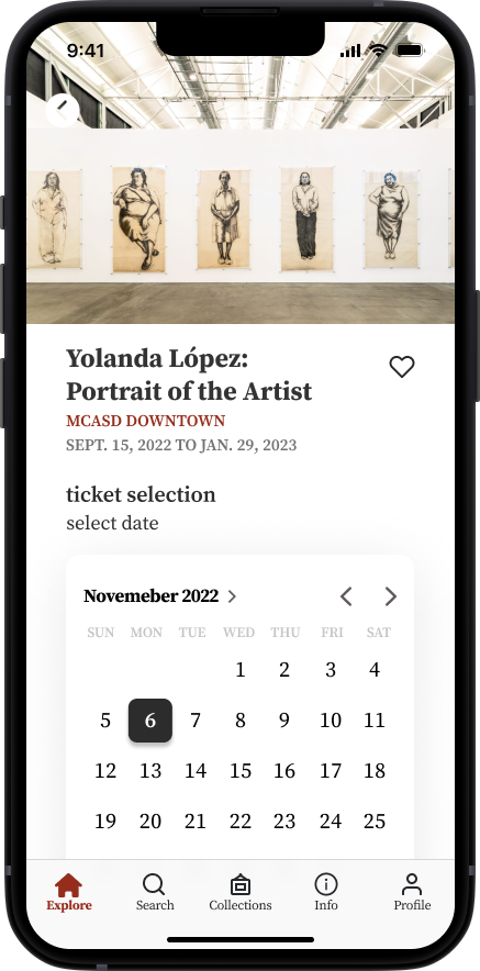
Hi-Fis & Prototype
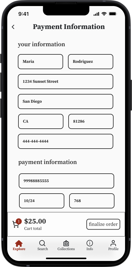
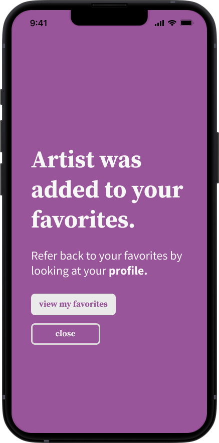
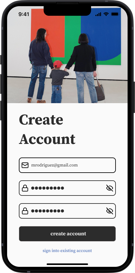
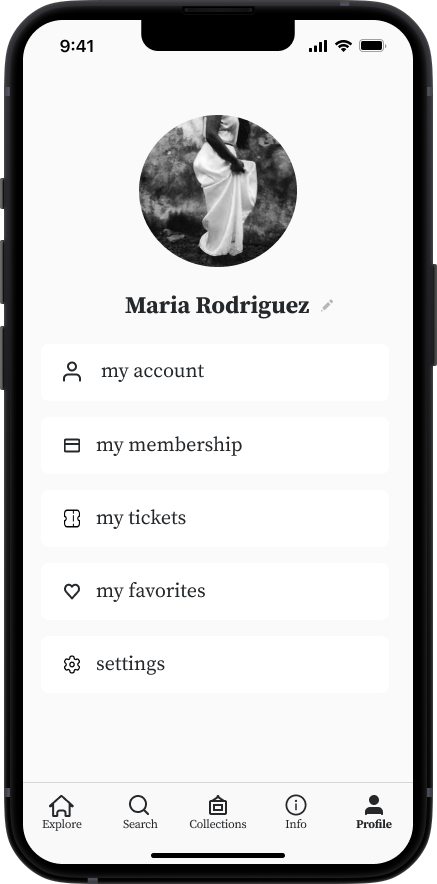
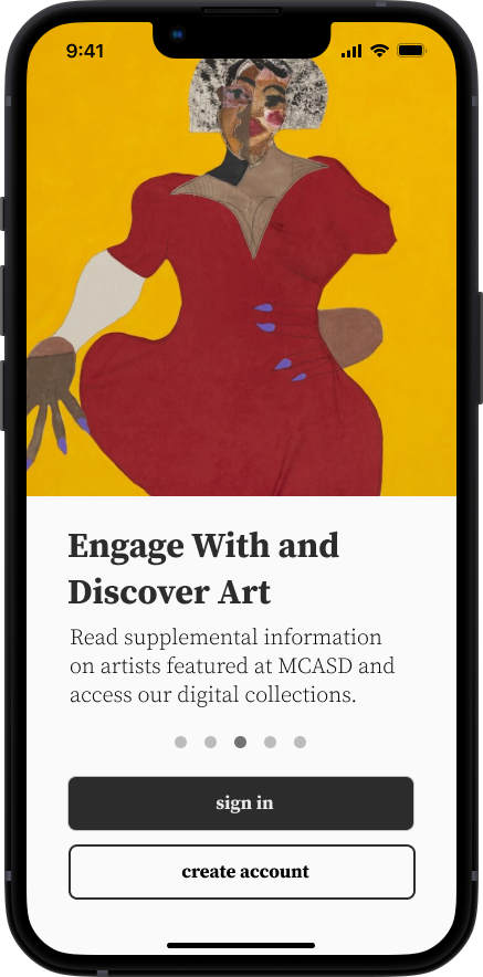
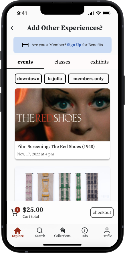
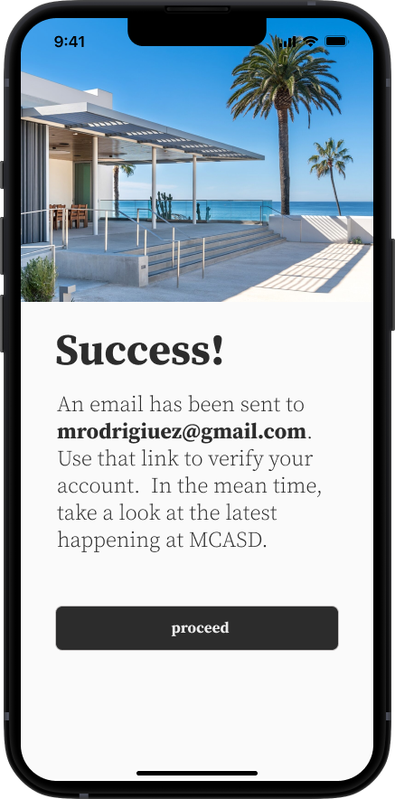
I created a functioning prototype using the following high fidelity screens:














USABILITY TESTING
Redesigning Ticket Selection Screen
I conducted 5 usability tests and gained valuable feedback on my designs. Fortunately, there were no major issues with usability amongst participants. However, 3 out of 5 did highlight a minor issue that could make for an overall better experience. Some participants also noted some suggestions for features or enhancements they would like to see in the future, which are noted in this test report.
-
When purchasing a ticket to an exhibit in the prototype, I noticed that users would often skip over pressing the time selection “10am - 4pm”. They assumed because 10 am - 4pm was the only time you could visit the museum, that they did not need to select that time frame, and instead, moved straight to selecting their quantity of tickets. Once the users realized they were unable to select a quantity of tickets before selecting the time, however, they did so fairly easy.
-
I altered these few screens in the ticket purchase flow to 1. Bold and preselect the 10am -4pm and for the user 2. Add text to confirm for the user why they do not have to select that timeframe.I updated the prototype to reflect this change.

CONCLUSION
Reflections
I feel so grateful to have been able to explore a digital solution for an organization I deeply admire. Reflecting on this process, here is what I learned:
Lessons
Challenge your own thinking - I found I needed to get comfortable with approaching a solution from all angles, and challenging my initial ways of thinking to problem solve efficiently.
Be intentional - Placing intention at the forefront of each step of the research and design process was extremely grounding and crucial to my design process. With each step of the process, I strived to ask myself: “Why is this the best way to approach this issue?” and “How does this fit into the bigger picture”? Doing so helped me remain insight driven, strengthen my story-telling abilities, and ultimately, solidify my final product.
Opportunities for Improvement
Testing Among Existing Members: Although time constraints didn’t allow for it, I would have loved the opportunity to interview and do usability tests on existing members of MCASD who would be most likely to use the app.
Pull from Existing Websites Design System I also would have to pull MCASD’s unique font from their website in order to model the website brand more closely.