
Redesigning Stoxup’s Mobile App to Increase User Engagement
UX/UI redesign for Stoxup, a fintech company that allows users to rate and review stocks.
My Role: UX/UI Designer, Team of 5
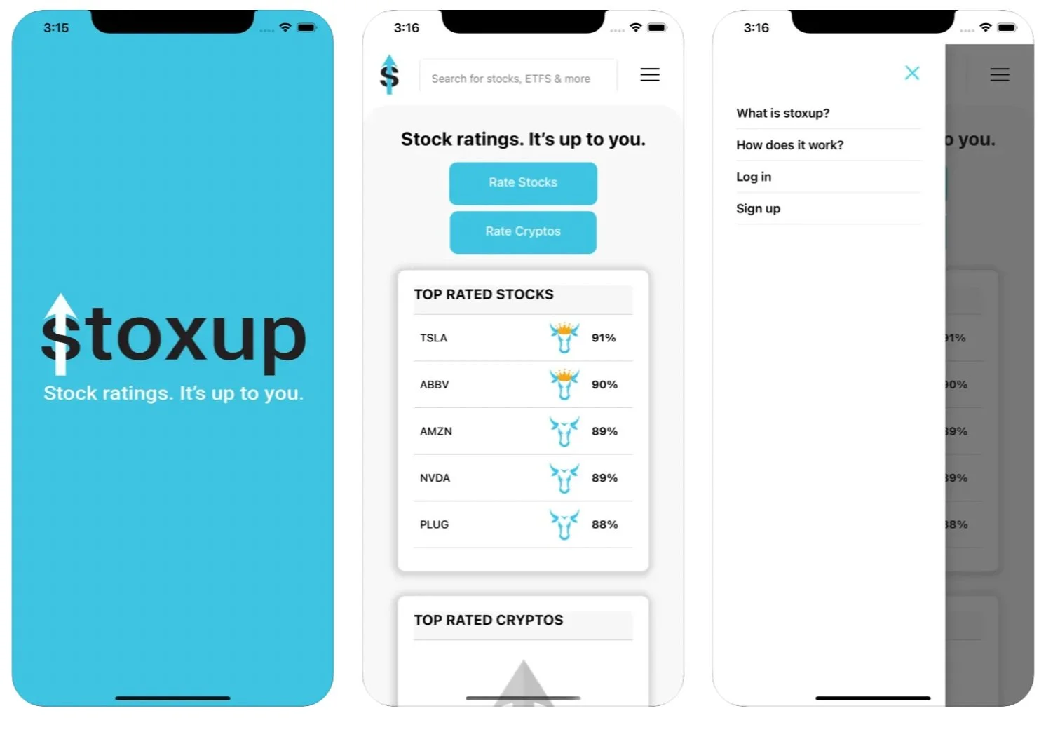
Splash Page

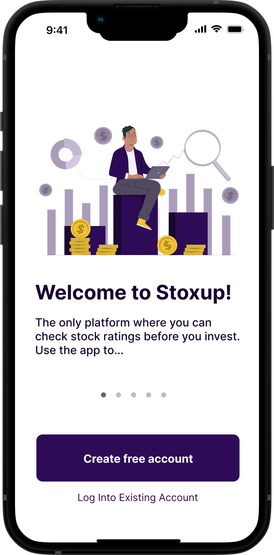
Onboarding Screen

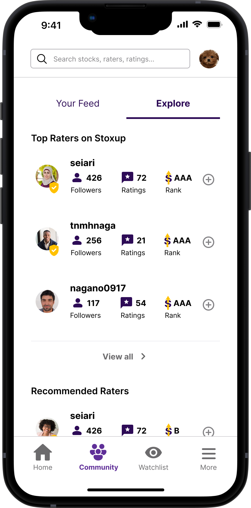
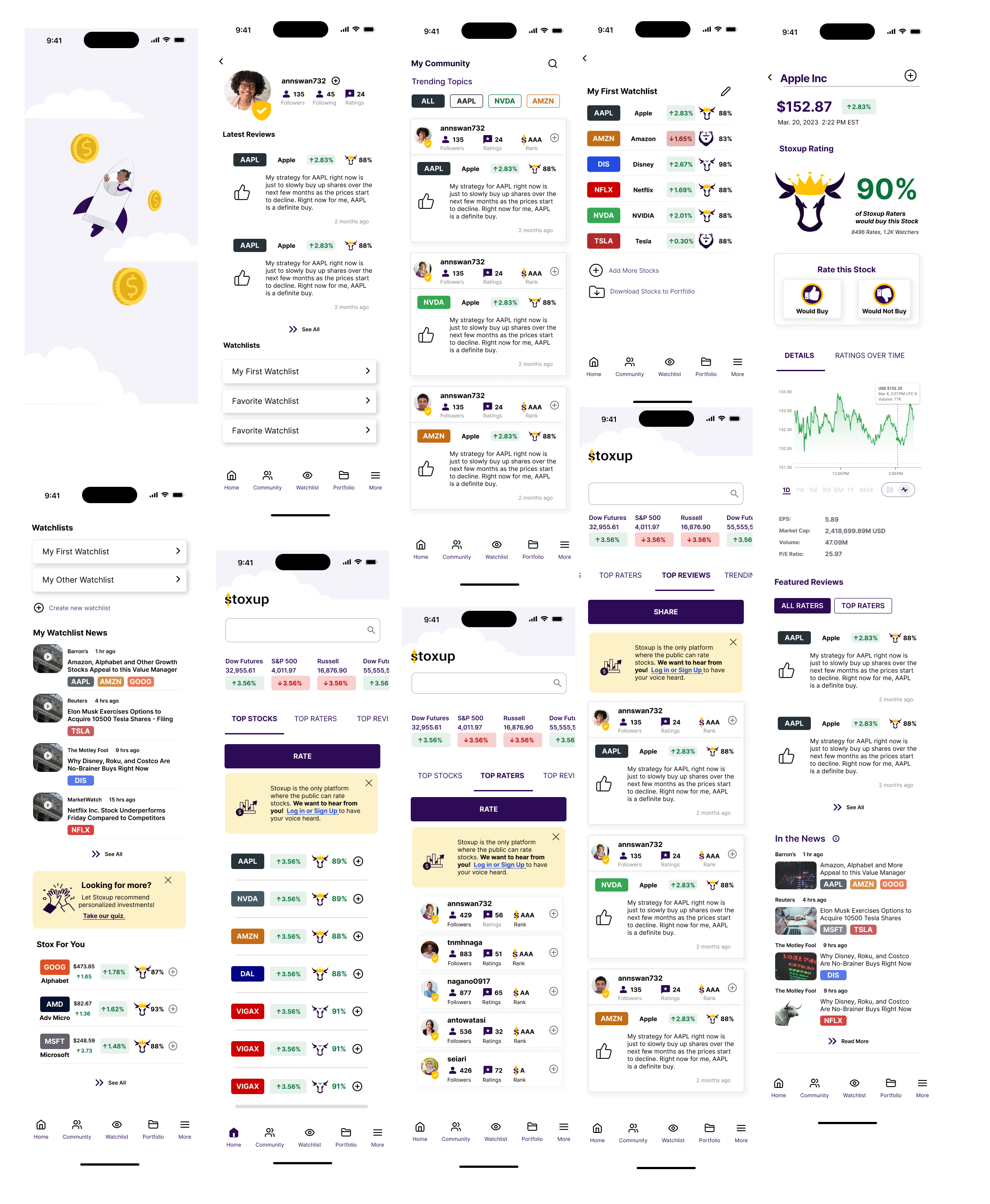
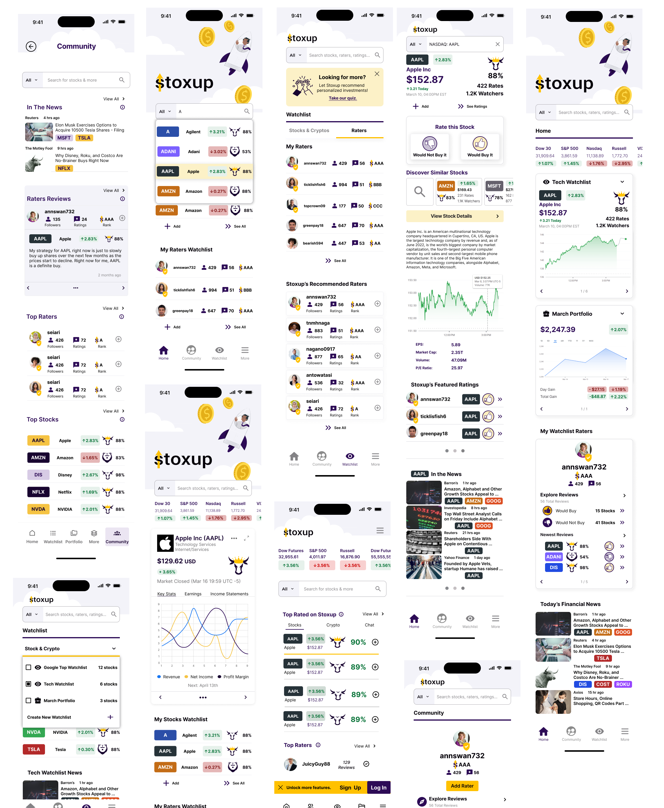
Explore Page

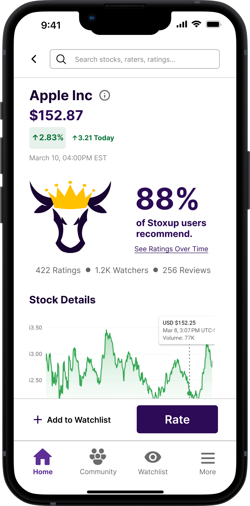
Sample Stock Page

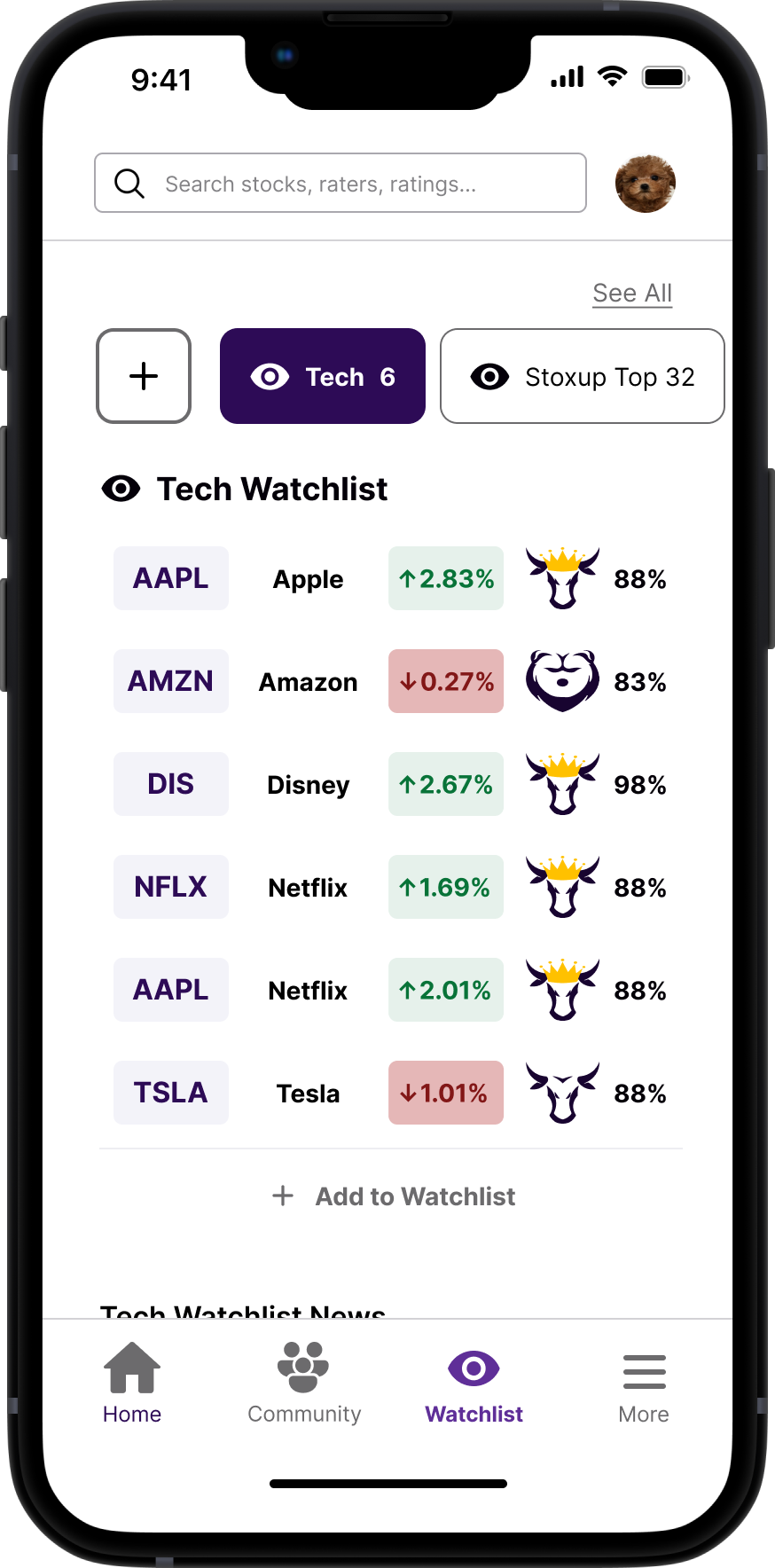
Watchlist Tab

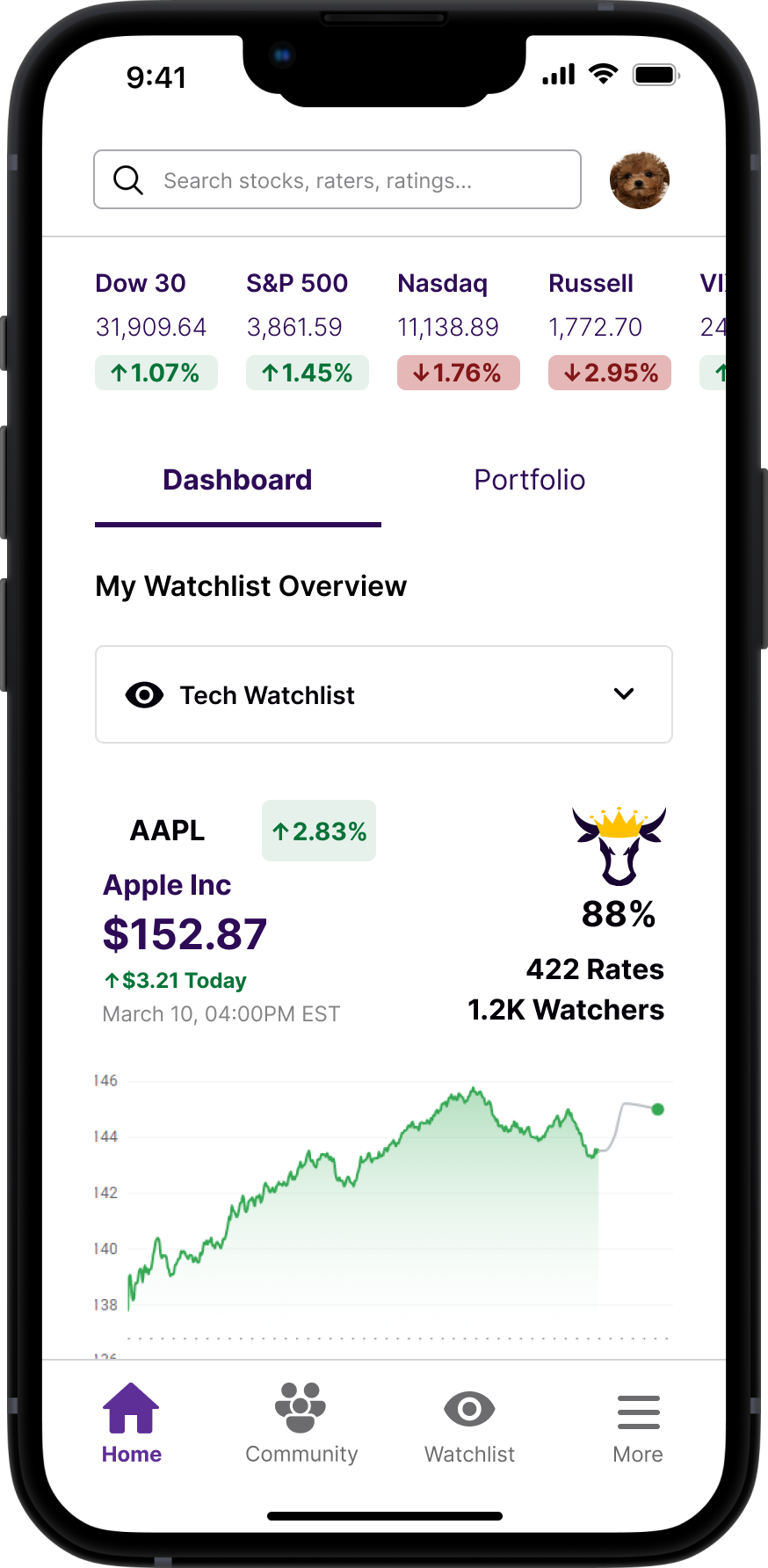
Home Screen

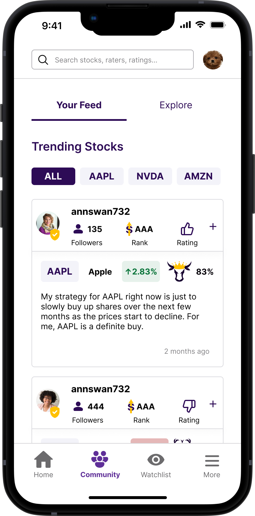
Community Feed

THE CLIENT
“Like Yelp, but for Stocks.”
Stoxup is a fintech company that provides a forum for you to rate and review stocks. Stoxup creates a community of stock raters that shed light on public perception of stocks, letting its users invest smarter.
THE PROBLEM
Stoxup was having difficulty retaining and engaging users on its website.
While users were exploring their pages, they were not leaving reviews or making accounts. As a result, Stoxup sought user feedback on, and a redesign of, their existing website.
THE SOLUTION
A Mobile App to Engage Stoxup Users with Community, and Incentivize Account Creation.
Our team decided to redirect from a redesign of the mobile version of their website to a redesign of their mobile app in order to address and implement solutions to the user testing results more efficiently.

TABLE OF CONTENTS
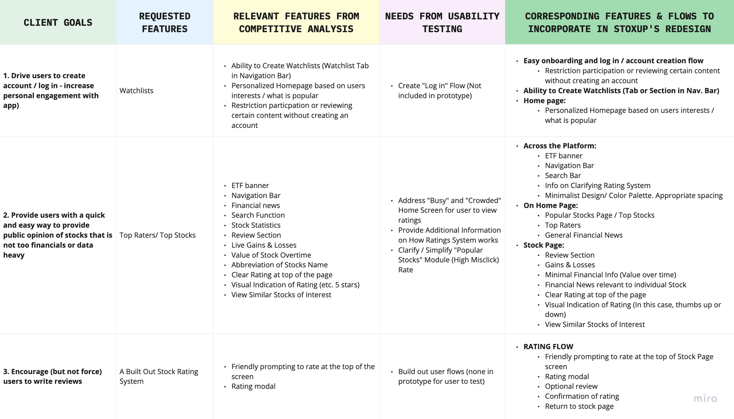
CLIENTS GOALS
Overall, Stoxup was looking to increase its number of account sign-ups and engagement with the app.
While users were exploring their pages, they were not leaving reviews or making accounts. The client named a few features that it hoped to incorporate to fulfill those goals, which are listed below.
COMPETITIVE ANALYSIS
Studying Both Financial and Rating/ Review Websites
Though Stoxup told us they did not have any direct competitors, I conducted a competitive analysis of both financial apps and review/ rating companies to get a better sense of typical flows, and features, that would make Stoxup competitive in this space.
Summary: My research revealed the following as the most important features to incorporate into this project:
Navigation Bar
Financial News
Search Function
ETF Banner
Stock Statistics
Ability to Create Watchlists
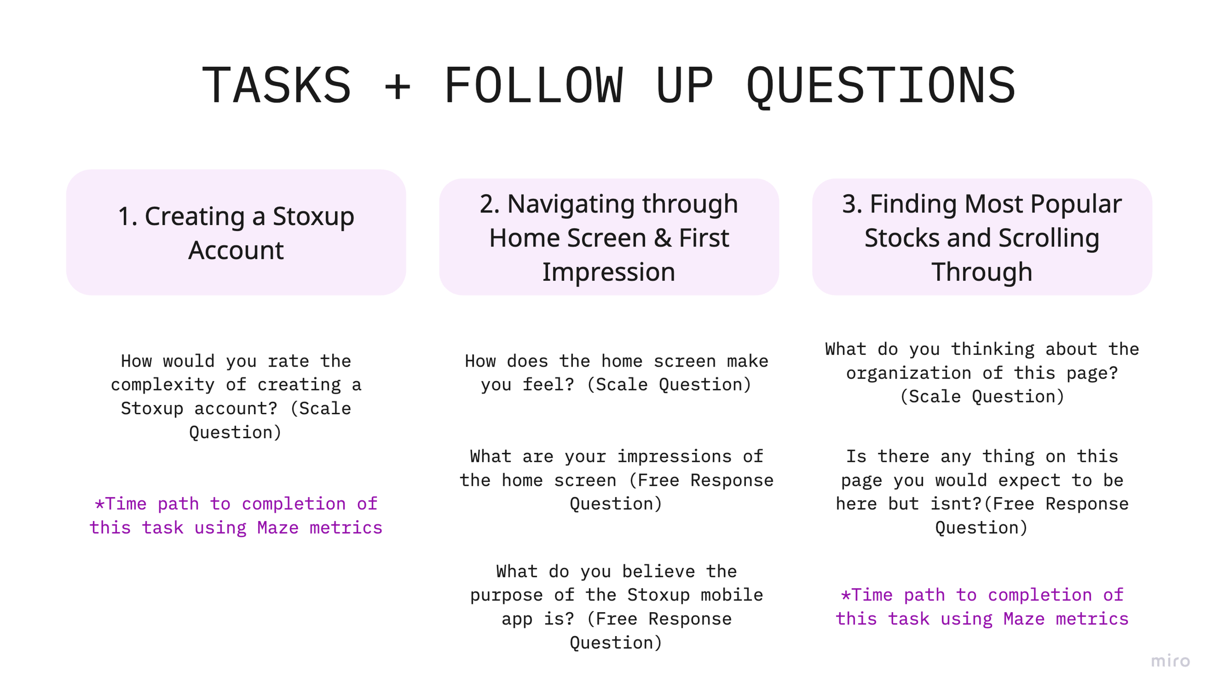
USABILITY TESTING & HEURISTIC ANALYSIS
How Do Users Feel Using Stoxup?
Planning: We created this research plan to outline our research questions, the hypothesis of outcomes, methodology, participant characteristics, and schedule. My hypothesis for usability testing was informed by my informal heuristic evaluation of the prototype.
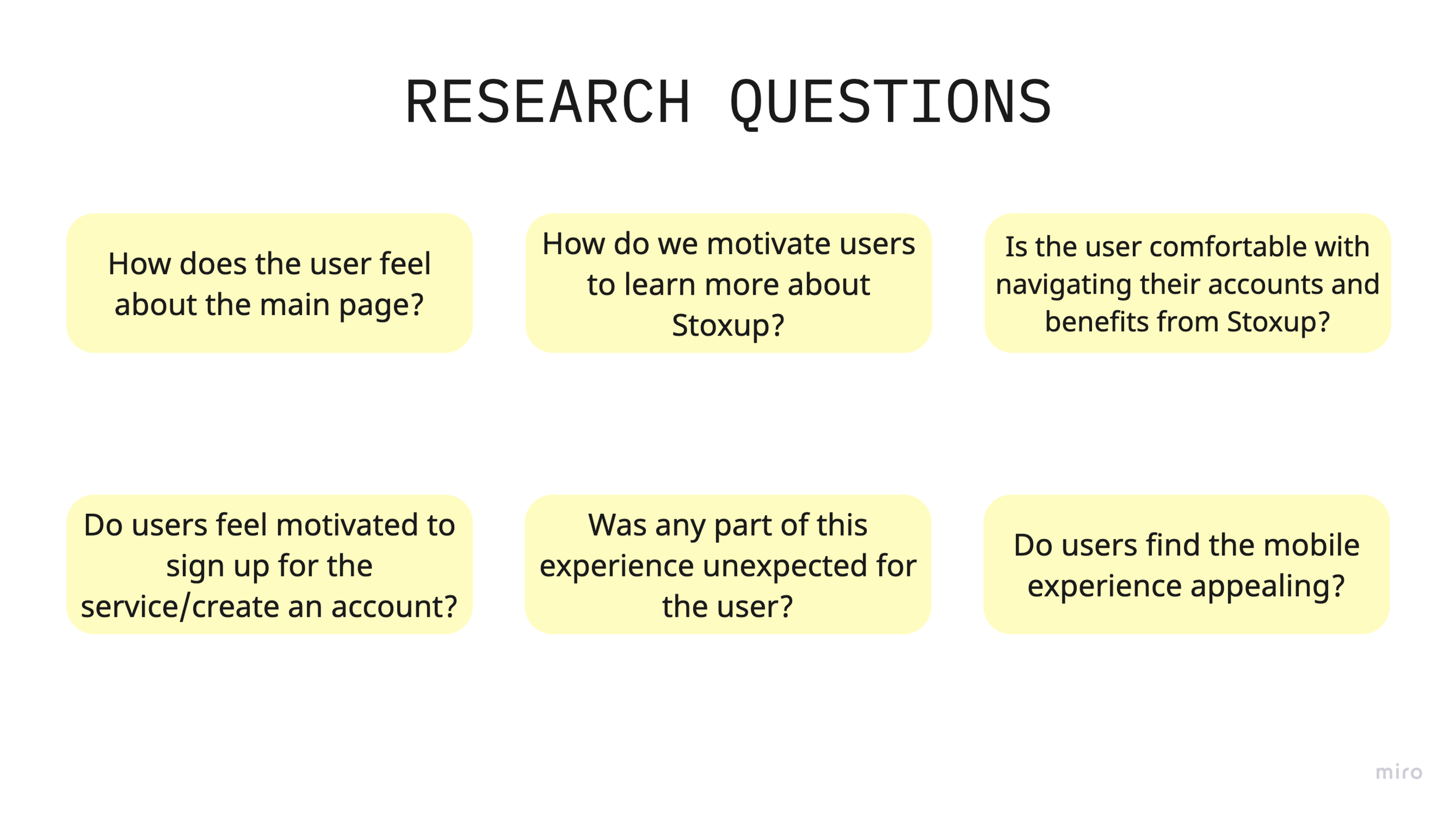
Unmoderated Usability Testing: Once the testing population was confirmed through a screener survey, we performed unmoderated user testing using Maze on seven participants who were aged 18+ and followed or are interested in stocks, cryptocurrency, or financial planning. We documented our results in more detail in this test report.
KEY INSIGHTS
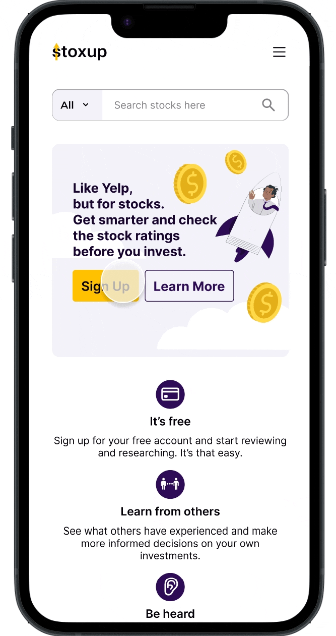
Users are confused by “busy” home screen, lack of detail, &“Popular Stocks” module.
-
The majority of participants noted that they felt the home screen when logged in was “busy” and “crowded”.
Quotes from users:
"I am confused as to whether or not this is the log in state or a mobile version of a web site."
"I like it a lot, might be a little busy. Depending on the audience and age of users, may seem more immature or geared towards younger crowd"
-
Participants had an over 70% misclick rate when asked to interact with the “popular stocks” module.
These findings reveal the module design is not intuitive to the user, and should be reassessed or redesigned.
-
Users also wanted more ways to engage with the most popular stock options: ie more detail around when each stock is the more “popular” + a way to select or engage with most popular stock
Quotes from users:
"Maybe a chip or tab option to select "most popular stocks". etc."
"Maybe some graph options that show what a particular stocks trend is- changeable for day, week, months, quarter and year"
-
Many particpants noted that they would expect more information to be on the Users expressed wanting to know who rated the stocks to verify its validity. Users are more comfortable when they can research the "critics" of each stock.
Quotes from users:
“ It might be nice to know who rated them (whether Morningstar, etc.), but perhaps that information is shown on a future page and not the homescreen.
“[ I expect] [r]atings by percentage of each rating company (i.e. if you were to look up movies you would see something like Rotten Tomatoes 52% or Movie Critics R' Us 73%).”
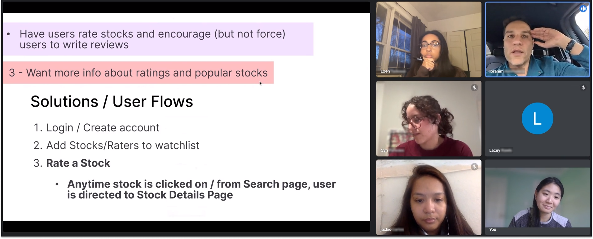
IDEATION
Factoring in stakeholder goals, market standards, user needs, and constraints, I created the following guide for the features and capabilities of the redesign.
Decision to Switch to Mobile App Format
After an analysis of the usability issues and competitive analysis of similar rating and financial products, our team decided it was best to switch the scope of our redesign from the mobile version of the website to a redesign of the mobile app.
A mobile app format would better address the usability issues we uncovered and is more standard practice in this space. Stoxup had already released a rudimentary app, so our team took the time to study its format, organization, and language to incorporate our design.
SITEMAP
Mapping Out The Project Scope
With time, we settled on the organization of information based on client goals and market standards.
CLIENT CHECK-IN
Client Buy-in and Scope Creep
I facilitated a meeting with the client to propose our new changes and direction. I also took the opportunity to ask clarifying questions about Stoxup’s rating system. While in the meeting, he introduced a new feature for us to incorporate; a basic portfolio feature. We compiled the notes from this meeting and began iterating on different design solutions.
HI-FI ITERATIONS
Reconciling Design Differences
With a team of such talented designers, there will always be multiple valid approaches to solving a problem. To come to a consensus on the direction of our designs, we scheduled work sessions in which we each presented our designs, as well as the rationale behind each decision, then as a team selected elements from each design we would incorporate in the final product. Overall, I advocated for 1. minimal design and clear visual hierarchy, 2. integration of features stated in competitive analysis and client goals and 3. For solutions to the users expressed in our usability testing.
My Initial Iterations
Team’s Initial Iterations
DESIGN SYSTEM
Updating Stoxup’s Design System
We organized the inherited style guide and slowly added our finalized components to keep us organized and prepare for developer handoff.
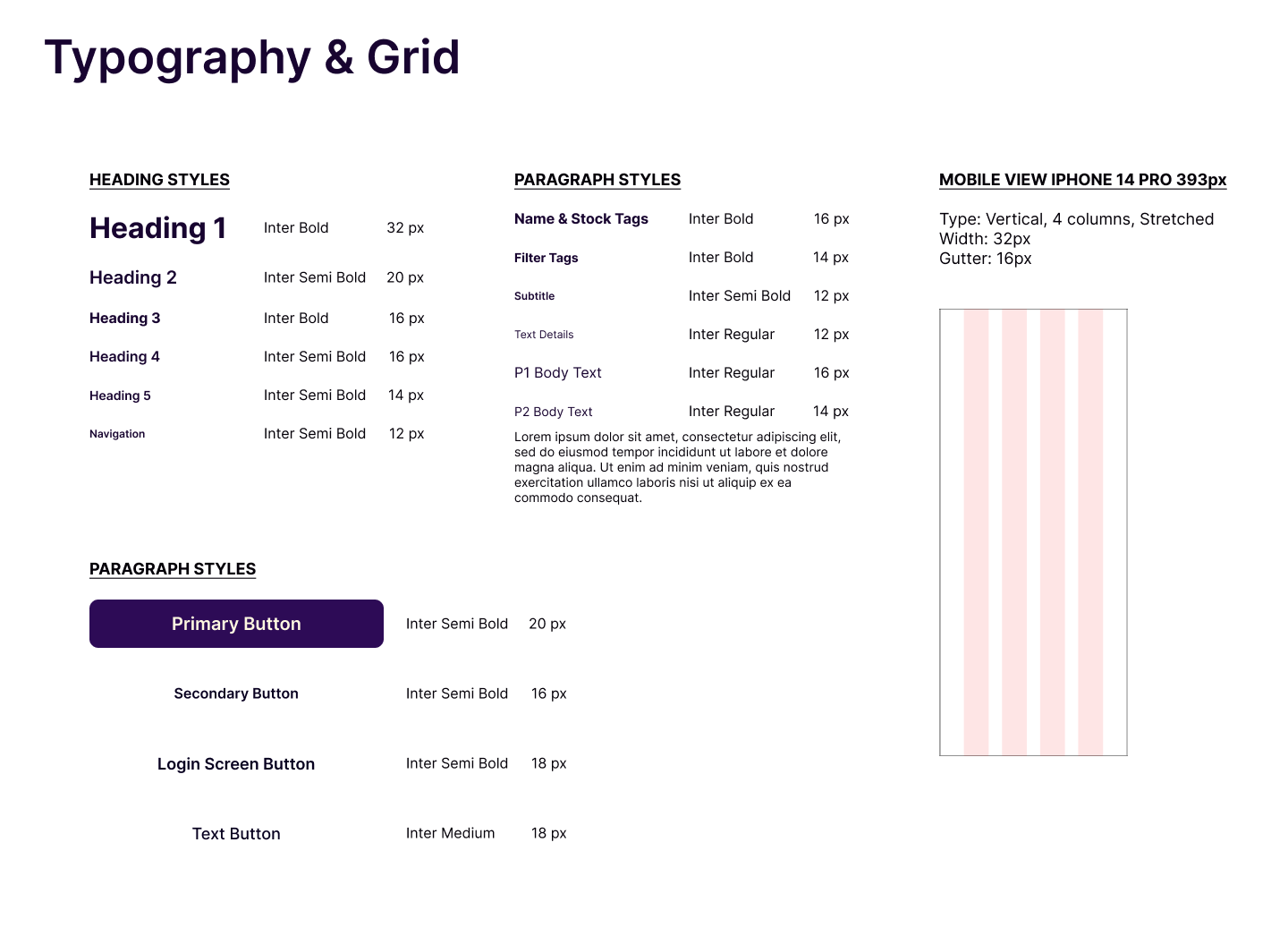
Typography & Grid
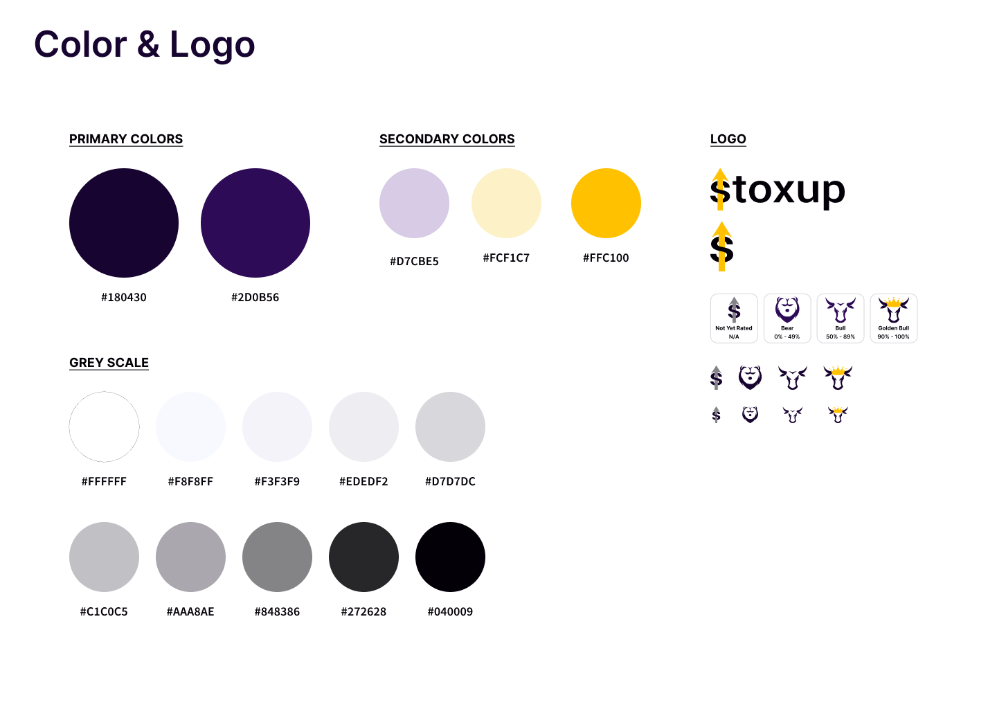
Stoxup Colors and Logos
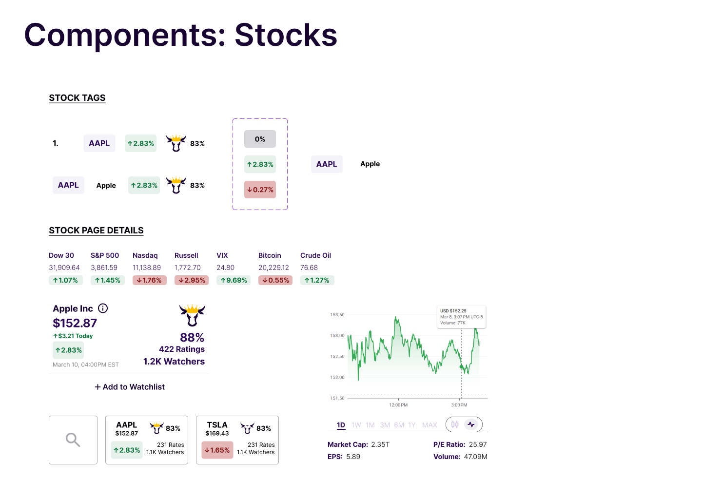
Components Related to Stocks
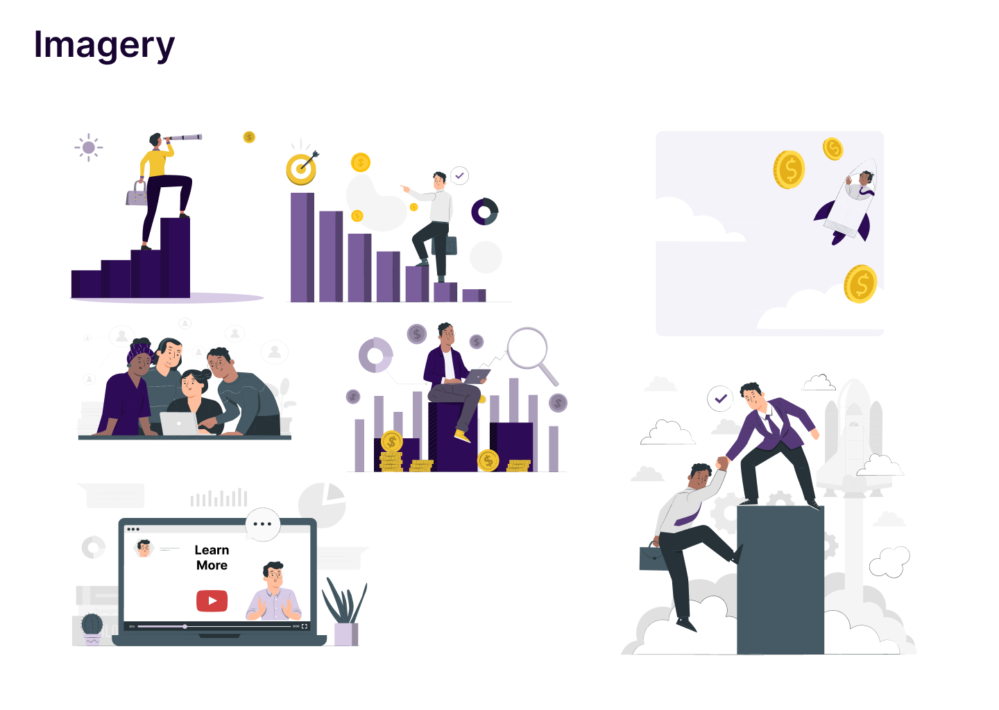
Stoxup Imagery
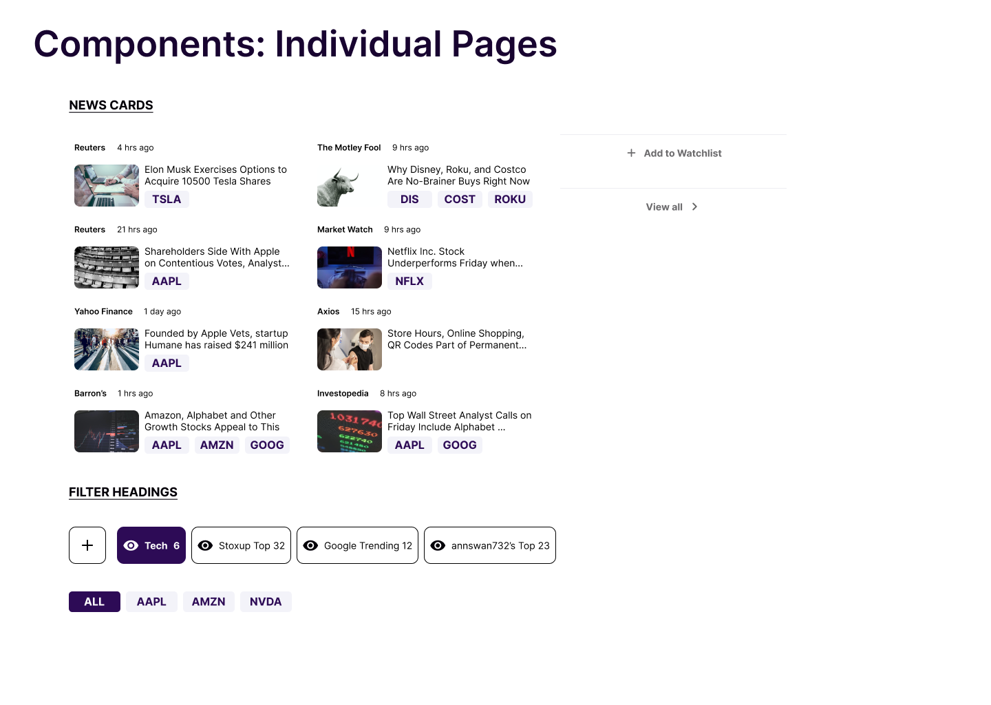
Individual Pages of Components
HI-FIS + PROTOTYPE
Putting It All Together
Our team finally created the following prototype of the screens below.
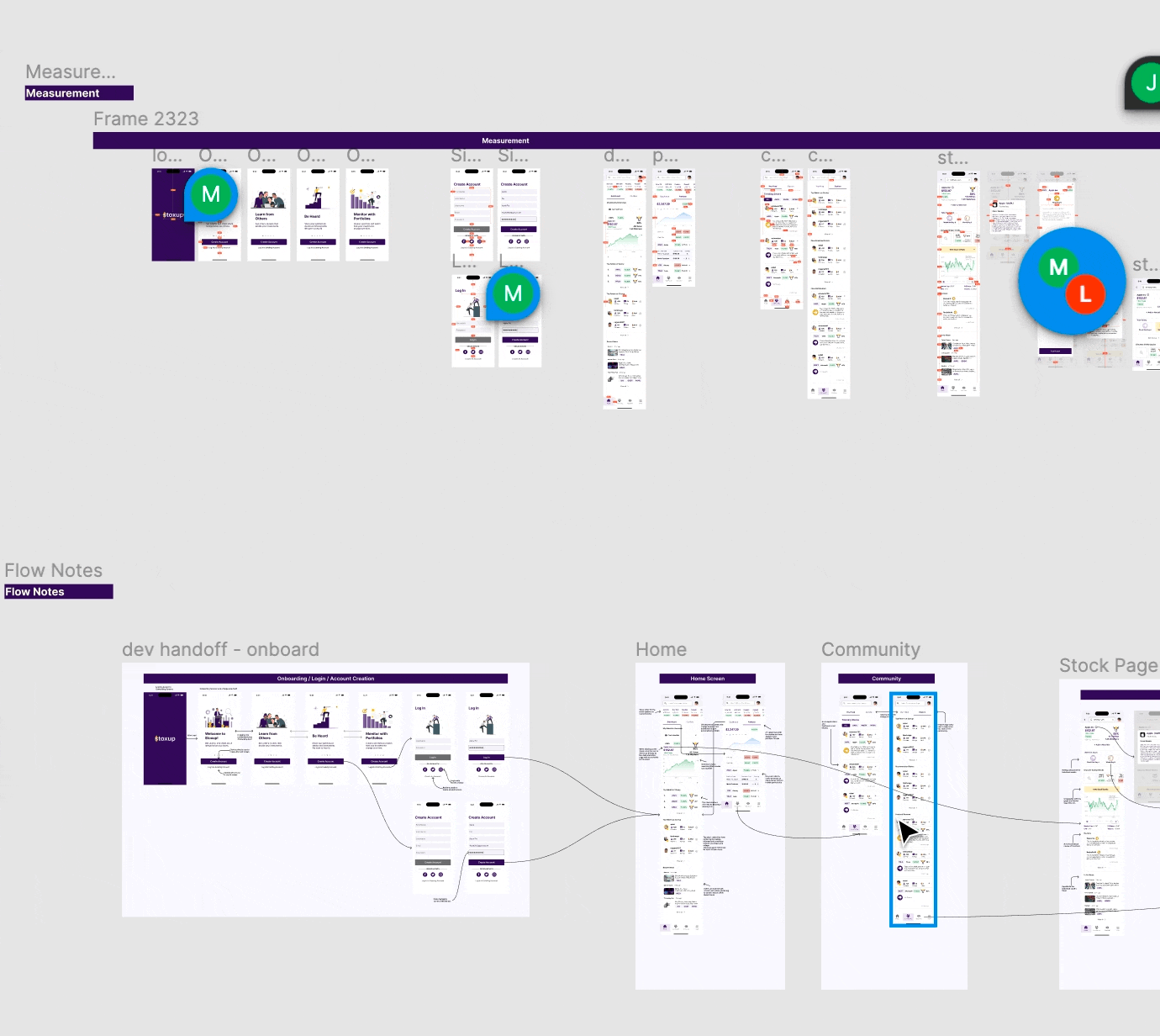
DEVELOPER HANDOFF
Detailed Annotations & Measurements.
Each team member to left detailed annotations of each interaction as well as pixel measurements using the “Measure” Plug-in. We also prepared and organized all components in the prototype by purpose and left detailed notes about the usage of each.
CONCLUSION
Reflections
I had such a great time diving into the FinTech space as a complete outsider. I loved the ability to learn a completely different field and apply my learnings to such a unique product. Reflecting on this process, here is what I learned and what have done differently:
Lessons
Our Differences Make Us Stronger - Many times during this project, our team came up with several variations for our different designs. I believe these differences ultimately allowed us to challenge each other and make better design decisions.
Manage Client Expectations - Since we moved to expand the scope of the project it was important for me to set clear definitions of scope and articulate design decisions.
Opportunities for Improvement
Remaining Questions Interactions with Stoxup Reviews: Due to time constraints, there were some aspects of the app we were unable to flesh out. For example, I wonder if raters might be able to “upvote” or reply to users comments or ratings. This
Larger Scope of Competitive Analysis: I would have loved to take a deeper look at more than 2 review/ rating websites to gauge rating/ review flows.
Next Steps
The client will move to develop the app. I am eager to see the impact of our redesign. As for remaining next steps, I encourage the client to refine the portfolio feature, and build out rater profiles.